A new Data Days event is coming soon!
This time we’re going bigger than ever. Fabric, Power BI, SQL, AI and more. We're covering it all. You won't want to miss it.
Learn more- Power BI forums
- Get Help with Power BI
- Desktop
- Service
- Report Server
- Power Query
- Mobile Apps
- Developer
- DAX Commands and Tips
- Custom Visuals Development Discussion
- Health and Life Sciences
- Power BI Spanish forums
- Translated Spanish Desktop
- Training and Consulting
- Instructor Led Training
- Dashboard in a Day for Women, by Women
- Galleries
- Data Stories Gallery
- Themes Gallery
- Contests Gallery
- QuickViz Gallery
- Quick Measures Gallery
- Visual Calculations Gallery
- Notebook Gallery
- Translytical Task Flow Gallery
- TMDL Gallery
- R Script Showcase
- Webinars and Video Gallery
- Ideas
- Custom Visuals Ideas (read-only)
- Issues
- Issues
- Events
- Upcoming Events
Level up your Power BI skills this month - build one visual each week and tell better stories with data! Get started
- Power BI forums
- Forums
- Get Help with Power BI
- Desktop
- Dual Y axis Line chart Labels
- Subscribe to RSS Feed
- Mark Topic as New
- Mark Topic as Read
- Float this Topic for Current User
- Bookmark
- Subscribe
- Printer Friendly Page
- Mark as New
- Bookmark
- Subscribe
- Mute
- Subscribe to RSS Feed
- Permalink
- Report Inappropriate Content
Dual Y axis Line chart Labels
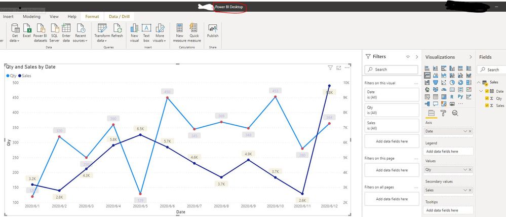
I am facing an issue after I updated from March release to June. I have one dual y-axis line chart which was working perfectly. After the update, the data labels are not showing in the secondary line (It is only showing in one line). My x-axis is date and Categorical type. The y-axes are numbers. I tried all different options to get it working but no luck. Any hint, please!
Solved! Go to Solution.
- Mark as New
- Bookmark
- Subscribe
- Mute
- Subscribe to RSS Feed
- Permalink
- Report Inappropriate Content
I spent couple of hours last night and managed to get the labels back after I reset settings in all the axis and data labels and built them again.
Thanks all for the time to respond and assist.
Regards,
A. Zaher
- Mark as New
- Bookmark
- Subscribe
- Mute
- Subscribe to RSS Feed
- Permalink
- Report Inappropriate Content
Please @mention me in your reply if you want a response.
Copying DAX from this post? Click here for a hack to quickly replace it with your own table names
Has this post solved your problem? Please Accept as Solution so that others can find it quickly and to let the community know your problem has been solved.
If you found this post helpful, please give Kudos C
I work as a Microsoft trainer and consultant, specialising in Power BI and Power Query.
www.excelwithallison.com
- Mark as New
- Bookmark
- Subscribe
- Mute
- Subscribe to RSS Feed
- Permalink
- Report Inappropriate Content
Thanks Allison for your response.
The 'Customize series' is on and I can see the labels in Power BI desktop without any problem but data labels for the secondary line will disappear when I publish the report. I thought I may be messing with font color but I added backgroud to the labels and I was only able to see data/background for one y-axis but not the seconday one.
- Mark as New
- Bookmark
- Subscribe
- Mute
- Subscribe to RSS Feed
- Permalink
- Report Inappropriate Content
Hi @azaher68 ,
I'm sorry I can't reproduce your problem. The below screen shots are what I tested in Power BI Desktop and Power BI Service. Could you please provide the screen shot with the Format pane setting of your line chart in order to make troubleshooting?


Best Regards
Rena
- Mark as New
- Bookmark
- Subscribe
- Mute
- Subscribe to RSS Feed
- Permalink
- Report Inappropriate Content
I spent couple of hours last night and managed to get the labels back after I reset settings in all the axis and data labels and built them again.
Thanks all for the time to respond and assist.
Regards,
A. Zaher
- Mark as New
- Bookmark
- Subscribe
- Mute
- Subscribe to RSS Feed
- Permalink
- Report Inappropriate Content
Hi @azaher68 ,
Thanks for your reply. If your problem has been resolved, could you please mark it as Answered? Thank you.
Best Regards
Rena
- Mark as New
- Bookmark
- Subscribe
- Mute
- Subscribe to RSS Feed
- Permalink
- Report Inappropriate Content
Please @mention me in your reply if you want a response.
Copying DAX from this post? Click here for a hack to quickly replace it with your own table names
Has this post solved your problem? Please Accept as Solution so that others can find it quickly and to let the community know your problem has been solved.
If you found this post helpful, please give Kudos C
I work as a Microsoft trainer and consultant, specialising in Power BI and Power Query.
www.excelwithallison.com
Helpful resources

Power BI Monthly Update - April 2026
Check out the April 2026 Power BI update to learn about new features.

Data Days 2026 coming soon!
Sign up to receive a private message when registration opens and key events begin.

New to Fabric Survey
If you have recently started exploring Fabric, we'd love to hear how it's going. Your feedback can help with product improvements.

| User | Count |
|---|---|
| 37 | |
| 32 | |
| 27 | |
| 24 | |
| 17 |
| User | Count |
|---|---|
| 70 | |
| 50 | |
| 31 | |
| 26 | |
| 22 |
