- Power BI forums
- Get Help with Power BI
- Desktop
- Service
- Report Server
- Power Query
- Mobile Apps
- Developer
- DAX Commands and Tips
- Custom Visuals Development Discussion
- Health and Life Sciences
- Power BI Spanish forums
- Translated Spanish Desktop
- Training and Consulting
- Instructor Led Training
- Dashboard in a Day for Women, by Women
- Galleries
- Data Stories Gallery
- Themes Gallery
- Contests Gallery
- Quick Measures Gallery
- Notebook Gallery
- Translytical Task Flow Gallery
- TMDL Gallery
- R Script Showcase
- Webinars and Video Gallery
- Ideas
- Custom Visuals Ideas (read-only)
- Issues
- Issues
- Events
- Upcoming Events
To celebrate FabCon Vienna, we are offering 50% off select exams. Ends October 3rd. Request your discount now.
- Power BI forums
- Forums
- Get Help with Power BI
- Desktop
- Drilling down a chart using a slicer
- Subscribe to RSS Feed
- Mark Topic as New
- Mark Topic as Read
- Float this Topic for Current User
- Bookmark
- Subscribe
- Printer Friendly Page
- Mark as New
- Bookmark
- Subscribe
- Mute
- Subscribe to RSS Feed
- Permalink
- Report Inappropriate Content
Drilling down a chart using a slicer
Hey there,
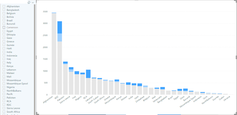
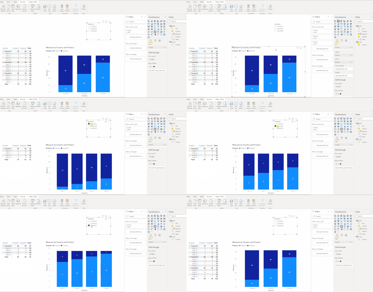
I am displaying data in a stacked-column chart that can either be viewed by countries, or if we drill down, by cities.
I have drill-down activated on the chart, and so if I click on one country column it will drill-down and show the data for the cities of that country. That works well, I am happy 🙂
My question now: to make it easier for people reading & playing these reports, I'm trying to make a slicer that would do basically the same. My idea would be to have a slicer that lists all the countries, and as the user clicks on a country the chart would refresh and only show the cities.
Solved! Go to Solution.
- Mark as New
- Bookmark
- Subscribe
- Mute
- Subscribe to RSS Feed
- Permalink
- Report Inappropriate Content
Hi @julienvdc ,
Please check:
Sample data:
| Country | City | Product | Value |
| Country1 | City1-1 | Product1 | 1 |
| Country1 | City1-2 | Product1 | 2 |
| Country1 | City1-3 | Product1 | 3 |
| Country1 | City1-4 | Product1 | 4 |
| Country2 | City2-1 | Product1 | 5 |
| Country2 | City2-2 | Product1 | 6 |
| Country2 | City2-3 | Product1 | 7 |
| Country2 | City2-4 | Product1 | 8 |
| Country3 | City3-1 | Product1 | 9 |
| Country3 | City3-2 | Product1 | 10 |
| Country3 | City3-3 | Product1 | 11 |
| Country3 | City3-4 | Product1 | 12 |
| Country1 | City1-1 | Product2 | 12 |
| Country1 | City1-2 | Product2 | 11 |
| Country1 | City1-3 | Product2 | 10 |
| Country1 | City1-4 | Product2 | 9 |
| Country2 | City2-1 | Product2 | 8 |
| Country2 | City2-2 | Product2 | 7 |
| Country2 | City2-3 | Product2 | 6 |
| Country2 | City2-4 | Product2 | 5 |
| Country3 | City3-1 | Product2 | 4 |
| Country3 | City3-2 | Product2 | 3 |
| Country3 | City3-3 | Product2 | 2 |
| Country3 | City3-4 | Product2 | 1 |
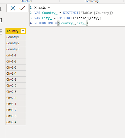
1. Create a x-axis table.
X axis =
VAR Country_ = DISTINCT('Table'[Country])
VAR City_ = DISTINCT('Table'[City])
RETURN UNION(Country_,City_)
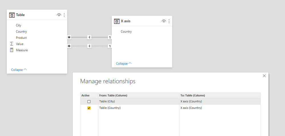
2. Create relationships between "Table" and "X axis" table.
3. Create a measure.
Measure =
IF (
    ISFILTERED ( 'Table'[Country] ),
    CALCULATE (
        SUM ( 'Table'[Value] ),
        USERELATIONSHIP ( 'Table'[City], 'X axis'[Country] )
    ),
    SUM ( 'Table'[Value] )
)
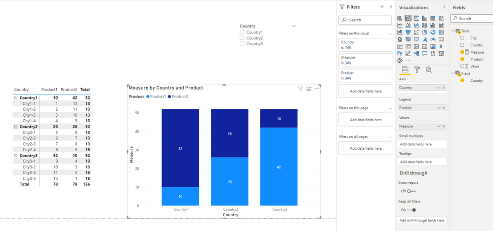
4. Create a Stacked column chart visual.
5. Test.
Best Regards,
Icey
If this post helps, then please consider Accept it as the solution to help the other members find it more quickly.
- Mark as New
- Bookmark
- Subscribe
- Mute
- Subscribe to RSS Feed
- Permalink
- Report Inappropriate Content
Hey @Icey ,
Amazing! From the look of that last .gif that is what I am looking for!
I am just not too sure I understand what that measure is doing. Could you describe it to me?
I forgot to mention that my data is organized into 2 tables:
There is the product table...
EX:
| Product ID | Brand | Location ID |
| 1 | Lenovo | 30 |
| 3 | Dell | 34 |
and the there is the location table which mixes countries and cities
EX:
| Location ID | City | Country |
| 30 | Athens | Greece |
| 34 | Paris | France |
| 1 | France |
Does that make sense?
- Mark as New
- Bookmark
- Subscribe
- Mute
- Subscribe to RSS Feed
- Permalink
- Report Inappropriate Content
Hi @julienvdc ,
I am just not too sure I understand what that measure is doing. Could you describe it to me?
Measure =
IF (
ISFILTERED ( 'Table'[Country] ),
----------------Judge whether a country is selected with the slicer.
CALCULATE (
SUM ( 'Table'[Value] ),
USERELATIONSHIP ( 'Table'[City], 'X axis'[Country] )
),
--------------------------If one country is selected, calculate value based on the inactive relationship('X axis'[Country] -> 'Table'[City]).
SUM ( 'Table'[Value] )
-----------if no country is selected, calculate value based on the active relationship ('X axis'[Country] -> 'Table'[Country]).
)
I forgot to mention that my data is organized into 2 tables:
There is the product table...
EX:
Product ID Brand Location ID 1 Lenovo 30 3 Dell 34
and the there is the location table which mixes countries and cities
EX:
Location ID City Country 30 Athens Greece 34 Paris France 1 France
With right relationships, this doesn't make any difference.
Do I explain clearly?
Best Regards,
Icey
If this post helps, then please consider Accept it as the solution to help the other members find it more quickly.
- Mark as New
- Bookmark
- Subscribe
- Mute
- Subscribe to RSS Feed
- Permalink
- Report Inappropriate Content
Yooooo it's great! Thank you so much, it works 🙂
Magic 😉
Helpful resources
| User | Count |
|---|---|
| 77 | |
| 67 | |
| 65 | |
| 50 | |
| 27 |
