FabCon is coming to Atlanta
Join us at FabCon Atlanta from March 16 - 20, 2026, for the ultimate Fabric, Power BI, AI and SQL community-led event. Save $200 with code FABCOMM.
Register now!- Power BI forums
- Get Help with Power BI
- Desktop
- Service
- Report Server
- Power Query
- Mobile Apps
- Developer
- DAX Commands and Tips
- Custom Visuals Development Discussion
- Health and Life Sciences
- Power BI Spanish forums
- Translated Spanish Desktop
- Training and Consulting
- Instructor Led Training
- Dashboard in a Day for Women, by Women
- Galleries
- Data Stories Gallery
- Themes Gallery
- Contests Gallery
- QuickViz Gallery
- Quick Measures Gallery
- Visual Calculations Gallery
- Notebook Gallery
- Translytical Task Flow Gallery
- TMDL Gallery
- R Script Showcase
- Webinars and Video Gallery
- Ideas
- Custom Visuals Ideas (read-only)
- Issues
- Issues
- Events
- Upcoming Events
Get Fabric Certified for FREE during Fabric Data Days. Don't miss your chance! Request now
- Power BI forums
- Forums
- Get Help with Power BI
- Desktop
- Doughnut chart - total value
- Subscribe to RSS Feed
- Mark Topic as New
- Mark Topic as Read
- Float this Topic for Current User
- Bookmark
- Subscribe
- Printer Friendly Page
- Mark as New
- Bookmark
- Subscribe
- Mute
- Subscribe to RSS Feed
- Permalink
- Report Inappropriate Content
Doughnut chart - total value
Dear all
I can't seem to find option to display total (sum of all) values in doughnut chart, i am used to SalesForce total in the middle, i had good look and still don't know how to add it here - in fact this applies to other charts too. Is this, again, by desing?
- Mark as New
- Bookmark
- Subscribe
- Mute
- Subscribe to RSS Feed
- Permalink
- Report Inappropriate Content
One of the MAIN reasons for using a donut chart rather than a pie chart is for the ability to place the total in the center. Seems like a rather big miss for an option on this visual. A simple setting for Show/Hide on the value and the label would suffice. I really grow tired of all the workarounds I have to do in my powerbi workbooks.
I guess that what happens when you're basically alone in the Gartner magic quadrant.
- Mark as New
- Bookmark
- Subscribe
- Mute
- Subscribe to RSS Feed
- Permalink
- Report Inappropriate Content
+1 reason (on thousand others) things that why I miss Qlikview
- Mark as New
- Bookmark
- Subscribe
- Mute
- Subscribe to RSS Feed
- Permalink
- Report Inappropriate Content
Hey @Ansicone
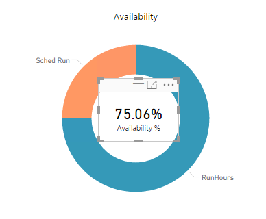
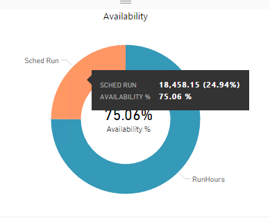
You can use a card chart on the donut, and it ll appear as if the Total value is fit inside the donut, and lets your tooltip for the donut itself as it gets card to backward scene.
- Mark as New
- Bookmark
- Subscribe
- Mute
- Subscribe to RSS Feed
- Permalink
- Report Inappropriate Content
This method is not useful to add card inside the dounut chart when sharing the reprot to the service. At clicking the donut chart, this card visual disappears automatically.
- Mark as New
- Bookmark
- Subscribe
- Mute
- Subscribe to RSS Feed
- Permalink
- Report Inappropriate Content
I have done the same. However the card does not appear when the report is shared with someone.
Am I doing something wrong??
- Mark as New
- Bookmark
- Subscribe
- Mute
- Subscribe to RSS Feed
- Permalink
- Report Inappropriate Content
Cards work great for reports however, they are not included in the dashboard when I "pin visual". Must publish as a full report which means a different look / feel / behavior.
- Mark as New
- Bookmark
- Subscribe
- Mute
- Subscribe to RSS Feed
- Permalink
- Report Inappropriate Content
I find it really weird that adding totals in the middle is not an out of the box option, I cannot believe that would be much work to add... I have been using the card in the middle in the past ass well, but as above already stated this is simply not possible when pinning to a dashboard, which is a core functionality in Power BI.
The only working alternative I found is a custom visual called Ring chart, which is able to add totals and some other stuff.
https://appsource.microsoft.com/en-us/product/power-bi-visuals/WA104380824?tab=Overview
- Mark as New
- Bookmark
- Subscribe
- Mute
- Subscribe to RSS Feed
- Permalink
- Report Inappropriate Content
That's a good one, and it's free!
- Mark as New
- Bookmark
- Subscribe
- Mute
- Subscribe to RSS Feed
- Permalink
- Report Inappropriate Content
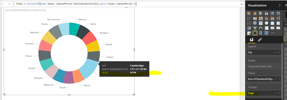
There's field called "ToolTips" and many tricks can be played with it. In you case, create a proper measure and apply it to the field.
- Mark as New
- Bookmark
- Subscribe
- Mute
- Subscribe to RSS Feed
- Permalink
- Report Inappropriate Content
Again, thanks for quick reply. Indeed - this is good workaroud, but totally unusable on the dashboard. Oh well M$.
- Mark as New
- Bookmark
- Subscribe
- Mute
- Subscribe to RSS Feed
- Permalink
- Report Inappropriate Content
I think the standard PowerBI way to display a total here is using a card visual and just sizing it to fit in the middle of the chart. A bit strange, I know, but gets the job done. I believe there's also custom visuals that will do it for you like https://app.powerbi.com/visuals/show/DonutChartGMO1461469098694
Helpful resources

Power BI Monthly Update - November 2025
Check out the November 2025 Power BI update to learn about new features.

Fabric Data Days
Advance your Data & AI career with 50 days of live learning, contests, hands-on challenges, study groups & certifications and more!


