Join us at the 2025 Microsoft Fabric Community Conference
March 31 - April 2, 2025, in Las Vegas, Nevada. Use code MSCUST for a $150 discount! Early bird discount ends December 31.
Register Now- Power BI forums
- Get Help with Power BI
- Desktop
- Service
- Report Server
- Power Query
- Mobile Apps
- Developer
- DAX Commands and Tips
- Custom Visuals Development Discussion
- Health and Life Sciences
- Power BI Spanish forums
- Translated Spanish Desktop
- Training and Consulting
- Instructor Led Training
- Dashboard in a Day for Women, by Women
- Galleries
- Community Connections & How-To Videos
- COVID-19 Data Stories Gallery
- Themes Gallery
- Data Stories Gallery
- R Script Showcase
- Webinars and Video Gallery
- Quick Measures Gallery
- 2021 MSBizAppsSummit Gallery
- 2020 MSBizAppsSummit Gallery
- 2019 MSBizAppsSummit Gallery
- Events
- Ideas
- Custom Visuals Ideas
- Issues
- Issues
- Events
- Upcoming Events
Be one of the first to start using Fabric Databases. View on-demand sessions with database experts and the Microsoft product team to learn just how easy it is to get started. Watch now
- Power BI forums
- Forums
- Get Help with Power BI
- Desktop
- Re: Displaying customer population over time
- Subscribe to RSS Feed
- Mark Topic as New
- Mark Topic as Read
- Float this Topic for Current User
- Bookmark
- Subscribe
- Printer Friendly Page
- Mark as New
- Bookmark
- Subscribe
- Mute
- Subscribe to RSS Feed
- Permalink
- Report Inappropriate Content
Displaying customer population over time
Hi,
I am new to Power BI and the forums, so apologies if this has been answered but I wasn't sure how to frame the question, and couldn't find anything in search.
Say I have a table:
CustomerID | In | Out
xxxxxx | 2018-04-06 11:02:00 | 2018-04-06 11:16:00
Where In and Out are the time they entered and left the store.
With this, how can I create a line chart for a period of time where it displays the number of customers in the store across, say, 15 minute intervals (that is, the X axis would be 2018-04-06 09:00:00, 2018-04-06 09:15:00 ...., and the Y value would be the number of customers in the store at that interval)
Thanks for any advice.
- Mark as New
- Bookmark
- Subscribe
- Mute
- Subscribe to RSS Feed
- Permalink
- Report Inappropriate Content
Hi @lee_,
Based on my test, you can refer to below steps:
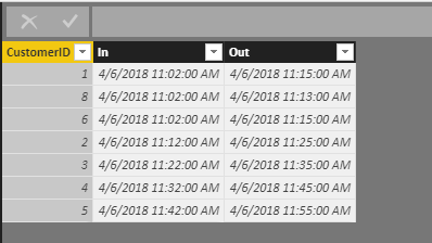
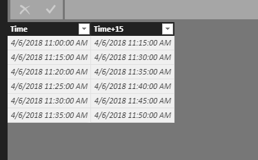
1.I have entered some sample data to test for your problem in below picture and I have created a new table to record the time period.
2.
Create a new measure to calculate your customer amount in different period.
Amount of customer = CALCULATE(COUNT(Sheet1[CustomerID]),FILTER('Sheet1','Sheet1'[In]>=MAX('Sheet2'[Time]) && 'Sheet1'[Out]<=MAX('Sheet2'[Time+15])))
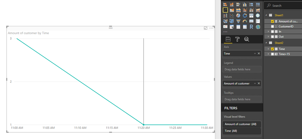
3.Create a Line chart visual and add the [Amount of customer] and [Time] field. Now you can see the result.
You can also download the PBIX file to have a view.
https://www.dropbox.com/s/pmxbwhjihin9m40/Displaying%20customer%20population%20over%20time.pbix?dl=0
Regards,
Daniel He
If this post helps, then please consider Accept it as the solution to help the other members find it more quickly.
- Mark as New
- Bookmark
- Subscribe
- Mute
- Subscribe to RSS Feed
- Permalink
- Report Inappropriate Content
Thanks for the response Daniel,
Unfortunately I don't think this is going to work for my instance where there are 100K+ visits over the course of the year. The chart takes an exceedingly long time to generate.
I tried a different way, creating a table, Times, with a column of 15-minute intervals using:
Time = GENERATESERIES(Date(2017,7,11), DATE(2018,7,1), (1/1440)*15)
and then on that table adding a column
In Store = SUMX(Customers, IF(AND(Customers[In]<=Times[Time], Customers[Out]>Times[Time]),1,0))
Although the extra column took a long time to calculate, the chart was a bit more fluid. Unfortunately, this solution means that I am unable to drill down/slice against other Customer parameters (gender, age, etc).
I suspect I am going to have to re-evaluate my underlying model. But is there a more efficient/dynamic way of doing this in Power BI?
Thanks again.
Helpful resources

Join us at the Microsoft Fabric Community Conference
March 31 - April 2, 2025, in Las Vegas, Nevada. Use code MSCUST for a $150 discount!

We want your feedback!
Your insights matter. That’s why we created a quick survey to learn about your experience finding answers to technical questions.

Microsoft Fabric Community Conference 2025
Arun Ulag shares exciting details about the Microsoft Fabric Conference 2025, which will be held in Las Vegas, NV.

| User | Count |
|---|---|
| 133 | |
| 91 | |
| 88 | |
| 64 | |
| 58 |
| User | Count |
|---|---|
| 201 | |
| 137 | |
| 107 | |
| 72 | |
| 68 |


