Join us at the 2025 Microsoft Fabric Community Conference
March 31 - April 2, 2025, in Las Vegas, Nevada. Use code MSCUST for a $150 discount! Early bird discount ends December 31.
Register Now- Power BI forums
- Get Help with Power BI
- Desktop
- Service
- Report Server
- Power Query
- Mobile Apps
- Developer
- DAX Commands and Tips
- Custom Visuals Development Discussion
- Health and Life Sciences
- Power BI Spanish forums
- Translated Spanish Desktop
- Training and Consulting
- Instructor Led Training
- Dashboard in a Day for Women, by Women
- Galleries
- Community Connections & How-To Videos
- COVID-19 Data Stories Gallery
- Themes Gallery
- Data Stories Gallery
- R Script Showcase
- Webinars and Video Gallery
- Quick Measures Gallery
- 2021 MSBizAppsSummit Gallery
- 2020 MSBizAppsSummit Gallery
- 2019 MSBizAppsSummit Gallery
- Events
- Ideas
- Custom Visuals Ideas
- Issues
- Issues
- Events
- Upcoming Events
Be one of the first to start using Fabric Databases. View on-demand sessions with database experts and the Microsoft product team to learn just how easy it is to get started. Watch now
- Power BI forums
- Forums
- Get Help with Power BI
- Desktop
- Re: Display total on top of stacked chart
- Subscribe to RSS Feed
- Mark Topic as New
- Mark Topic as Read
- Float this Topic for Current User
- Bookmark
- Subscribe
- Printer Friendly Page
- Mark as New
- Bookmark
- Subscribe
- Mute
- Subscribe to RSS Feed
- Permalink
- Report Inappropriate Content
Display total on top of stacked chart
I have a stacked chart and I would like to have display the total for each column. If I in format pane switches "Data Labels" on I get the data label pr part of the stacked column instead of the total for the column.
Can I somehow get the total?
Also can I change the way the data labels are displayed - it is displayed in thousands, but my figures are already in thousands. So I get thousands of thousands?
Solved! Go to Solution.
- Mark as New
- Bookmark
- Subscribe
- Mute
- Subscribe to RSS Feed
- Permalink
- Report Inappropriate Content
- Mark as New
- Bookmark
- Subscribe
- Mute
- Subscribe to RSS Feed
- Permalink
- Report Inappropriate Content
Hi Will.
Thanks for your reply - I will try and make it work 🙂
Best regards
Morten
- Mark as New
- Bookmark
- Subscribe
- Mute
- Subscribe to RSS Feed
- Permalink
- Report Inappropriate Content
I came accross the same issue,
I've made a work around by simply using 'Line and Stacked Column Chart', setting the line value as the total quantity, same result, just have lines running through your graph. Could always change the colour of line to something subtle?
- Mark as New
- Bookmark
- Subscribe
- Mute
- Subscribe to RSS Feed
- Permalink
- Report Inappropriate Content
Elliott, I have tried you solution but labels are not displayed for the "top" series (purple in your case). For the "bottom" series and the line chart they are displayed correctly. It seems I cannot use the same variable for both "Column values" and "Line values". I am using, for example, Sales for both of them. How can I solve this?
- Mark as New
- Bookmark
- Subscribe
- Mute
- Subscribe to RSS Feed
- Permalink
- Report Inappropriate Content
Hi.
Let me explain better...
I have financial data received in different banks. I would like to display Date on X-Axis and Net Income on Y-Axis (divided into the two possible banks). I am using the following configuration for "Line and stacked column chart":
- Shared axis: Date
- Column series: Bank
- Column values: Net Income
- Line values: Net Income
If I let "Line values" empty, labels are OK, but the Total of two columns are not displayed.
When I include "Line values" equals to "Column values", Total is displayed, but labels for top column is empty.
- Mark as New
- Bookmark
- Subscribe
- Mute
- Subscribe to RSS Feed
- Permalink
- Report Inappropriate Content
Hi Glaubeferreria,
Sorry for the late response, have just logged back in after a while out.
I believe I understand what you are trying to explain,
I have just setup a quick template with the similar kind of layout that you are describing.
I believe that this issue could well be with the physical formatting of the graph rather than a data issue.
I believe that the reason you may not be able to see total could be due to the size of your graphs?
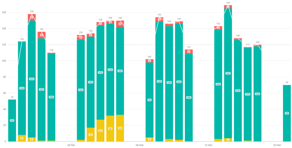
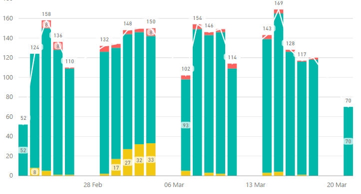
If you see the 2 above screenshots I have taken, I have simply only resized the graphs and as you can see I have lost most of my data labels for my "Green" area.
Unfortunately, I do not believe there is any way around this due to the size formatting of the graph. I would recommend playing around with the size of the graph to see if it makes any difference, you can also try and change the label size but there is a minimum limit of 8pt.
Helpful resources

Join us at the Microsoft Fabric Community Conference
March 31 - April 2, 2025, in Las Vegas, Nevada. Use code MSCUST for a $150 discount!

We want your feedback!
Your insights matter. That’s why we created a quick survey to learn about your experience finding answers to technical questions.

Microsoft Fabric Community Conference 2025
Arun Ulag shares exciting details about the Microsoft Fabric Conference 2025, which will be held in Las Vegas, NV.

| User | Count |
|---|---|
| 119 | |
| 88 | |
| 73 | |
| 67 | |
| 49 |
| User | Count |
|---|---|
| 199 | |
| 141 | |
| 97 | |
| 79 | |
| 68 |


