FabCon is coming to Atlanta
Join us at FabCon Atlanta from March 16 - 20, 2026, for the ultimate Fabric, Power BI, AI and SQL community-led event. Save $200 with code FABCOMM.
Register now!- Power BI forums
- Get Help with Power BI
- Desktop
- Service
- Report Server
- Power Query
- Mobile Apps
- Developer
- DAX Commands and Tips
- Custom Visuals Development Discussion
- Health and Life Sciences
- Power BI Spanish forums
- Translated Spanish Desktop
- Training and Consulting
- Instructor Led Training
- Dashboard in a Day for Women, by Women
- Galleries
- Data Stories Gallery
- Themes Gallery
- Contests Gallery
- QuickViz Gallery
- Quick Measures Gallery
- Visual Calculations Gallery
- Notebook Gallery
- Translytical Task Flow Gallery
- TMDL Gallery
- R Script Showcase
- Webinars and Video Gallery
- Ideas
- Custom Visuals Ideas (read-only)
- Issues
- Issues
- Events
- Upcoming Events
The Power BI Data Visualization World Championships is back! Get ahead of the game and start preparing now! Learn more
- Power BI forums
- Forums
- Get Help with Power BI
- Desktop
- Display time and duration
- Subscribe to RSS Feed
- Mark Topic as New
- Mark Topic as Read
- Float this Topic for Current User
- Bookmark
- Subscribe
- Printer Friendly Page
- Mark as New
- Bookmark
- Subscribe
- Mute
- Subscribe to RSS Feed
- Permalink
- Report Inappropriate Content
Display time and duration
I am trying to display delivery times in the graph in PBI to show operational delivery improvements.
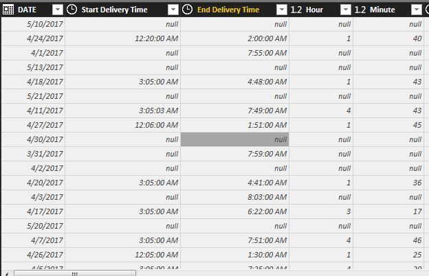
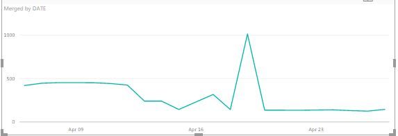
Please see below the data list I am trying to display. I can show it if I change to a decimal but then the numbers are not correct and the Y axis displays incorrectly. I wanted to just show the time as you mouse over the line and the Y axis to display how long it took
I am somewhat new to Power BI but after spending a few days trying to figure this out I am hoping that the community can get me unstuck. I appreciate any help Thank you
- Mark as New
- Bookmark
- Subscribe
- Mute
- Subscribe to RSS Feed
- Permalink
- Report Inappropriate Content
@jcleary wrote:
I am trying to display delivery times in the graph in PBI to show operational delivery improvements.
Please see below the data list I am trying to display. I can show it if I change to a decimal but then the numbers are not correct and the Y axis displays incorrectly. I wanted to just show the time as you mouse over the line and the Y axis to display how long it took
I am somewhat new to Power BI but after spending a few days trying to figure this out I am hoping that the community can get me unstuck. I appreciate any help Thank you
In your table, is there only one row for each DATE?
I think you can create a decimal column that indicate the duration in hours, put this column to the Values field. To see the time format, create a calculated column shows "hh:mm" format and put it in the Tooltips field.
Helpful resources

Power BI Dataviz World Championships
The Power BI Data Visualization World Championships is back! Get ahead of the game and start preparing now!

| User | Count |
|---|---|
| 37 | |
| 37 | |
| 33 | |
| 32 | |
| 29 |
| User | Count |
|---|---|
| 130 | |
| 88 | |
| 82 | |
| 68 | |
| 64 |


