Huge last-minute discounts for FabCon Vienna from September 15-18, 2025
Supplies are limited. Contact info@espc.tech right away to save your spot before the conference sells out.
Get your discount- Power BI forums
- Get Help with Power BI
- Desktop
- Service
- Report Server
- Power Query
- Mobile Apps
- Developer
- DAX Commands and Tips
- Custom Visuals Development Discussion
- Health and Life Sciences
- Power BI Spanish forums
- Translated Spanish Desktop
- Training and Consulting
- Instructor Led Training
- Dashboard in a Day for Women, by Women
- Galleries
- Data Stories Gallery
- Themes Gallery
- Contests Gallery
- Quick Measures Gallery
- Notebook Gallery
- Translytical Task Flow Gallery
- TMDL Gallery
- R Script Showcase
- Webinars and Video Gallery
- Ideas
- Custom Visuals Ideas (read-only)
- Issues
- Issues
- Events
- Upcoming Events
Score big with last-minute savings on the final tickets to FabCon Vienna. Secure your discount
- Power BI forums
- Forums
- Get Help with Power BI
- Desktop
- Display multiple Bar charts dynamically
- Subscribe to RSS Feed
- Mark Topic as New
- Mark Topic as Read
- Float this Topic for Current User
- Bookmark
- Subscribe
- Printer Friendly Page
- Mark as New
- Bookmark
- Subscribe
- Mute
- Subscribe to RSS Feed
- Permalink
- Report Inappropriate Content
Display multiple Bar charts dynamically
Hi,
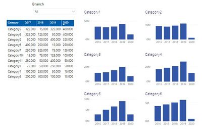
I'm trying to display a simple sales table in the form of Top 6 bar charts to see the trends over the years per category.
I'd like to filter the page by Branch and so each bar chart category needs to be dynamic as the Top 6 categories for each branch aren't the same.
Is there a way to do this? I have tried the 'small multiple line chart' custom visual but it looks far better displayed in bar charts and I don't necessarily want all 6 charts on the same axis. I've also tried the 'column chart with small multiples' custom visual and this is pretty good although you can't customise anything (colour etc)
For the first bar chart I could filter the visual by Top 1 sales for that category but that doesn't work for the remaining 5 bar charts as you can't filter by the second row only.
Any help would be much appreciated as I am struggling on this one!
- Mark as New
- Bookmark
- Subscribe
- Mute
- Subscribe to RSS Feed
- Permalink
- Report Inappropriate Content
Perhaps stacked bar charts with bookmarks for each branch? Would be some work to create but could be done.
Follow on LinkedIn
@ me in replies or I'll lose your thread!!!
Instead of a Kudo, please vote for this idea
Become an expert!: Enterprise DNA
External Tools: MSHGQM
YouTube Channel!: Microsoft Hates Greg
Latest book!: DAX For Humans
DAX is easy, CALCULATE makes DAX hard...
Helpful resources
| User | Count |
|---|---|
| 65 | |
| 60 | |
| 47 | |
| 33 | |
| 32 |
| User | Count |
|---|---|
| 85 | |
| 75 | |
| 56 | |
| 50 | |
| 45 |


