Join us at the 2025 Microsoft Fabric Community Conference
March 31 - April 2, 2025, in Las Vegas, Nevada. Use code MSCUST for a $150 discount! Early bird discount ends December 31.
Register Now- Power BI forums
- Get Help with Power BI
- Desktop
- Service
- Report Server
- Power Query
- Mobile Apps
- Developer
- DAX Commands and Tips
- Custom Visuals Development Discussion
- Health and Life Sciences
- Power BI Spanish forums
- Translated Spanish Desktop
- Training and Consulting
- Instructor Led Training
- Dashboard in a Day for Women, by Women
- Galleries
- Community Connections & How-To Videos
- COVID-19 Data Stories Gallery
- Themes Gallery
- Data Stories Gallery
- R Script Showcase
- Webinars and Video Gallery
- Quick Measures Gallery
- 2021 MSBizAppsSummit Gallery
- 2020 MSBizAppsSummit Gallery
- 2019 MSBizAppsSummit Gallery
- Events
- Ideas
- Custom Visuals Ideas
- Issues
- Issues
- Events
- Upcoming Events
Be one of the first to start using Fabric Databases. View on-demand sessions with database experts and the Microsoft product team to learn just how easy it is to get started. Watch now
- Power BI forums
- Forums
- Get Help with Power BI
- Desktop
- Display All Intervals for x-Axis in Timeline
- Subscribe to RSS Feed
- Mark Topic as New
- Mark Topic as Read
- Float this Topic for Current User
- Bookmark
- Subscribe
- Printer Friendly Page
- Mark as New
- Bookmark
- Subscribe
- Mute
- Subscribe to RSS Feed
- Permalink
- Report Inappropriate Content
Display All Intervals for x-Axis in Timeline
Hello,
I have a timeline in a bar and line chart as shown below.
I made a measure to get the weeks in the months, and I have these numbers displayed as you can see. However, why aren't the weekly intervals all appearing? For instance, why is the 32nd week not appearing on the axis, and then after the 33rd the chart jumps to the 43rd?
If I can't show all the weeks, is it possible for me to have a bar for the past 18 or 24 months from today's date? I just want all the values to be displayed on the chart.
Thank you.
- Mark as New
- Bookmark
- Subscribe
- Mute
- Subscribe to RSS Feed
- Permalink
- Report Inappropriate Content
Hello @v-yiruan-msft
I am just writing to ask if you had a chance to look at the data and if this is making sense.
Thank you.
- Mark as New
- Bookmark
- Subscribe
- Mute
- Subscribe to RSS Feed
- Permalink
- Report Inappropriate Content
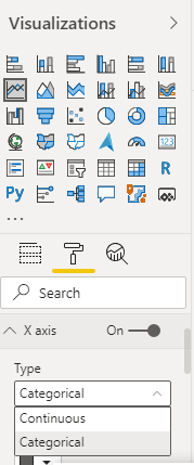
@sheap069 , Your axis type might be continuous . make it categorical and check
At the Microsoft Analytics Community Conference, global leaders and influential voices are stepping up to share their knowledge and help you master the latest in Microsoft Fabric, Copilot, and Purview. ✨
️ November 12th-14th, 2024
Online Event
Register Here
- Mark as New
- Bookmark
- Subscribe
- Mute
- Subscribe to RSS Feed
- Permalink
- Report Inappropriate Content
Hi, I don't see this option under x-axis.
- Mark as New
- Bookmark
- Subscribe
- Mute
- Subscribe to RSS Feed
- Permalink
- Report Inappropriate Content
Hi @sheap069 ,
The Type option with value Continuous and Categorical only show up in Format pane when you put the field with numeric or date data type... How did you set your line and column chart? Which field be put on X axis? Could you please provide some sample data(exclude sensitive data) include in your visual? Thank you.
Best Regards
If this post helps, then please consider Accept it as the solution to help the other members find it more quickly.
- Mark as New
- Bookmark
- Subscribe
- Mute
- Subscribe to RSS Feed
- Permalink
- Report Inappropriate Content
@v-yiruan-msft Hello,
Sorry for the delay, it took some time to make fake data for you. You can find it here.
You will see three tabs. I have Groups, Applications, and then I unpivoted the Applications table to have the dates. I want a count of applications for each group based on the type of Date. I have 2 different group IDs to show you what's wrong.
I want the timeline to show the past 12 months, assuming the current time was February 2020. Group ID 1 has no data from 2019, and while the table is blank, there is oddly Jun 2019 showing up in the axis.
For Group ID 10, there are all the bars except March 2019. Why is there nothing in March?
Also, I would like to have the axis always show all the months. Here is another Group ID, and you can see the months are not all showing.
I really need to have all months displayed on the axis, whether or not there is data.
I made a custom column for the months and made a sort order so the months show up correctly on the chart.
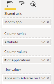
Here are my fields for the chart. The line graph is for a separate value.
Sorry if this is complex. Let me know if I can clarify anything, but I need to have Jan 2019 to Jan 2020 (later I can set 12 months from today) always appear on the graph and not have the x axis change dynamically.
Thank you
Helpful resources

Join us at the Microsoft Fabric Community Conference
March 31 - April 2, 2025, in Las Vegas, Nevada. Use code MSCUST for a $150 discount!

We want your feedback!
Your insights matter. That’s why we created a quick survey to learn about your experience finding answers to technical questions.

Microsoft Fabric Community Conference 2025
Arun Ulag shares exciting details about the Microsoft Fabric Conference 2025, which will be held in Las Vegas, NV.

| User | Count |
|---|---|
| 123 | |
| 85 | |
| 85 | |
| 70 | |
| 51 |
| User | Count |
|---|---|
| 205 | |
| 153 | |
| 97 | |
| 79 | |
| 69 |


