- Subscribe to RSS Feed
- Mark Topic as New
- Mark Topic as Read
- Float this Topic for Current User
- Bookmark
- Subscribe
- Printer Friendly Page
- Mark as New
- Bookmark
- Subscribe
- Mute
- Subscribe to RSS Feed
- Permalink
- Report Inappropriate Content
Deneb Visual Zooming
Hi,
I required some help with making my non-linear regression graph, zoom-able.
I am using the deneb visual app on power bi and I have managed to create a scatterplot using the X Field and Y field values (just removed names for simplicity), and colour coded it using my own selected colours that adapt based on client selection.
However, I now want to make it so that this visual is able to be zoomable as I have seen this feature around the internet. Due to my lack of coding knoweldge especially around the vegalite language, I am struggling to this. Is it possible someone could help me integerate the zoomable feature into my code below (which works completely fine already, just without being able to zoom)?
Please do break down any changes made, as I am a beginner in code and have very little experience currently. Thank you 🙂
For additional background:
In power bi, three categories have been added into the values selection box which are - X FIELD, Y FIELD, CLIENT (formula which allows the colour of the marker to change based on client selection).
Code currently working:
{
  "data": {"name": "dataset"},
  "layer": [
    {
      "mark": {
        "type": "point",
        "filled": true
      },
      "encoding": {
        "x": {
          "field": "X FIELD",
          "type": "quantitative",
          "axis": {"format" : "%"}
        },
        "y": {
          "field": "Y FIELD",
          "type": "quantitative",
          "axis": {"format" : "%"}
        },
        "color": {"field": "CLIENT", "type": "nominal", "legend": null, "scale": {"range":["#006D9E", "#A6E2EF"]}}
      }
    },
    {
      "mark": {
        "type": "line",
        "color": "black"
      },
      "transform": [
        {
          "regression": "Y FIELD",
          "on": "X FIELD",
          "method" : "pow"
        }
      ],
      "encoding": {
        "x": {
          "field": "X FIELD",
          "type": "quantitative"
        },
        "y": {
          "field": "Y FIELD",
          "type": "quantitative"
        }
      }
    },
    {
      "transform": [
        {
          "regression": "Y FIELD",
          "on": "X FIELD",
          "params": true,
          "method" : "pow"
        },
        {"calculate": "'R²: '+format(datum.rSquared, '.2f')", "as": "R2"}
      ],
      "mark": {
        "type": "text",
        "color": "Orange",
        "fontSize" : 16,
        "fontWeight" : "bold",
        "x": "width",
        "align": "right",
        "y": -5
      },
      "encoding": {
        "text": {"type": "nominal", "field": "R2"}
      }
    }
  ]
}
Solved! Go to Solution.
- Mark as New
- Bookmark
- Subscribe
- Mute
- Subscribe to RSS Feed
- Permalink
- Report Inappropriate Content
I have Figured out the solution to this and will paste the code below for anyone who would like to try mimic this.
Essentially, you are able to make a regression graph and make it zoomable but you just have to code within the same Layer ("layer" function). Please take a look below, at the code:
{
  "data": {"name": "dataset"},
  "layer": [
    {
      "mark": {
        "type": "point",
        "filled": true
      },
      "encoding": {
        "x": {
          "field": "X FIELD",
          "type": "quantitative",
          "axis": {"format": "%"}
        },
        "y": {
          "field": "Y FIELD",
          "type": "quantitative",
          "axis": {"format": "%"}
        },
        "color": {
          "field": "CLIENT COLOUR FIELD - IF THIS IS NOT APPLICABLE TO YOU, PLEASE TAKE IT OUT",
          "type": "nominal",
          "legend": null,
          "scale": {
            "range": [
              "#006D9E",
              "#A6E2EF"
            ]
          }
        }
      }
    },
    {
      "mark": {
        "type": "line",
        "color": "black"
      },
      "transform": [
        {
          "regression": "Y FIELD",
          "on": "X FIELD",
          "method": "pow"
        }
      ],
      "encoding": {
        "x": {
          "field": "X FIELD",
          "type": "quantitative"
        },
        "y": {
          "field": "Y FIELD",
          "type": "quantitative"
        }
      }
    },
    {
      "transform": [
        {
          "regression": "Y FIELD",
          "on": "X FIELD",
          "params": true,
          "method": "pow"
        }
      ],
      "mark": "circle",
      "encoding": {
        "x": {
          "field": "X FIELD",
          "type": "quantitative"
        },
        "y": {
          "field": "Y FIELD",
          "type": "quantitative"
        }
      },
      "params": [
        {
          "name": "grid",
          "select": "interval",
          "bind": "scales"
        }
      ]
    }
  ]
}
- Mark as New
- Bookmark
- Subscribe
- Mute
- Subscribe to RSS Feed
- Permalink
- Report Inappropriate Content
Hi , @ShivGC
According to your description, you want to zoom in the Deneb custom visual . Sorry for i am also unfamilar for this custom visual .
As searched , it can zoom in and out by using the mouse wheel .And for the code you can refer to :
Adding Interactive Widgets To Visuals Using Deneb in Power BI | Sandeep Pawar (pawarbi.github.io)
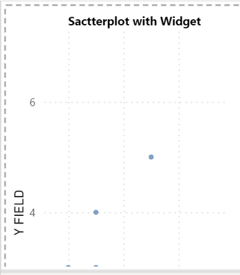
And i also test in my side , this is my test data:
And we can use this code :
{
  "config": {"view": {"continuousWidth": 400, "continuousHeight": 300}},
  "data": {"name": "dataset"},
  "mark": "circle",
  "encoding": {
    "x": {"type": "quantitative", "field": "X FIELD"},
    "y": {"type": "quantitative", "field": "Y FIELD"}
  },
  "height": 200,
  "selection": {
    "selector016": {
      "type": "interval",
      "bind": "scales",
      "encodings": ["x", "y"]
    }
  },
  "title": "Sactterplot with Widget",
  "width": 100,
  "$schema": "https://vega.github.io/schema/vega-lite/v4.8.1.json"
}
Then we can get the result like this:
Thank you for your time and sharing, and thank you for your support and understanding of PowerBI!
Best Regards,
Aniya Zhang
If this post helps, then please consider Accept it as the solution to help the other members find it more quickly
- Mark as New
- Bookmark
- Subscribe
- Mute
- Subscribe to RSS Feed
- Permalink
- Report Inappropriate Content
Is it possible to show me how to add it to this regression code example at the bottom of this page:
- Mark as New
- Bookmark
- Subscribe
- Mute
- Subscribe to RSS Feed
- Permalink
- Report Inappropriate Content
HI , @ShivGC
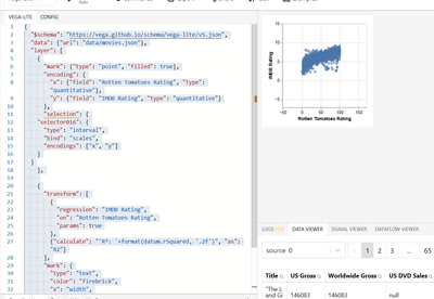
You can try this code if it can help you :
{
  "$schema": "https://vega.github.io/schema/vega-lite/v5.json",
  "data": {"url": "data/movies.json"},
  "layer": [
    {
      "mark": {"type": "point", "filled": true},
      "encoding": {
        "x": {"field": "Rotten Tomatoes Rating", "type": "quantitative"},
        "y": {"field": "IMDB Rating", "type": "quantitative"}
      },
      "selection": {
    "selector016": {
      "type": "interval",
      "bind": "scales",
      "encodings": ["x", "y"]
    }
  }
    },

    {
      "transform": [
        {
          "regression": "IMDB Rating",
          "on": "Rotten Tomatoes Rating",
          "params": true
        },
        {"calculate": "'R²: '+format(datum.rSquared, '.2f')", "as": "R2"}
      ],
      "mark": {
        "type": "text",
        "color": "firebrick",
        "x": "width",
        "align": "right",
        "y": -5
      },
      "encoding": {"text": {"type": "nominal", "field": "R2"}}
    }
  ]
}
Thank you for your time and sharing, and thank you for your support and understanding of PowerBI!
Best Regards,
Aniya Zhang
If this post helps, then please consider Accept it as the solution to help the other members find it more quickly
- Mark as New
- Bookmark
- Subscribe
- Mute
- Subscribe to RSS Feed
- Permalink
- Report Inappropriate Content
Hi,
Unfortunately, this is not what I am looking for. I am able to get a typical scatter plot which I am able to zoom in and out of, however, the idea is too add a non-linear regression line to the graph.
This is done on power bi:
{
  "data": {"name": "dataset"},
  "params": [
    {
      "name": "grid",
      "select": "interval",
      "bind": "scales"
    }
  ],
  "mark": "circle",
  "encoding": {
    "x": {
      "field": "X Field",
      "type": "quantitative"
    },
    "y": {
      "field": "Y Field",
      "type": "quantitative"
    }
  }
}
Now, the aim is to add a regression line to it, so that I can zoom into the regression line and see points a little clearer.
Helpful resources

Join us at the Microsoft Fabric Community Conference
March 31 - April 2, 2025, in Las Vegas, Nevada. Use code MSCUST for a $150 discount!

Microsoft Fabric Community Conference 2025
Arun Ulag shares exciting details about the Microsoft Fabric Conference 2025, which will be held in Las Vegas, NV.

| User | Count |
|---|---|
| 127 | |
| 84 | |
| 59 | |
| 59 | |
| 44 |
| User | Count |
|---|---|
| 180 | |
| 119 | |
| 82 | |
| 70 | |
| 54 |


