- Power BI forums
- Updates
- News & Announcements
- Get Help with Power BI
- Desktop
- Service
- Report Server
- Power Query
- Mobile Apps
- Developer
- DAX Commands and Tips
- Custom Visuals Development Discussion
- Health and Life Sciences
- Power BI Spanish forums
- Translated Spanish Desktop
- Power Platform Integration - Better Together!
- Power Platform Integrations (Read-only)
- Power Platform and Dynamics 365 Integrations (Read-only)
- Training and Consulting
- Instructor Led Training
- Dashboard in a Day for Women, by Women
- Galleries
- Community Connections & How-To Videos
- COVID-19 Data Stories Gallery
- Themes Gallery
- Data Stories Gallery
- R Script Showcase
- Webinars and Video Gallery
- Quick Measures Gallery
- 2021 MSBizAppsSummit Gallery
- 2020 MSBizAppsSummit Gallery
- 2019 MSBizAppsSummit Gallery
- Events
- Ideas
- Custom Visuals Ideas
- Issues
- Issues
- Events
- Upcoming Events
- Community Blog
- Power BI Community Blog
- Custom Visuals Community Blog
- Community Support
- Community Accounts & Registration
- Using the Community
- Community Feedback
Register now to learn Fabric in free live sessions led by the best Microsoft experts. From Apr 16 to May 9, in English and Spanish.
- Power BI forums
- Forums
- Get Help with Power BI
- Desktop
- Dates on vertical axis?
- Subscribe to RSS Feed
- Mark Topic as New
- Mark Topic as Read
- Float this Topic for Current User
- Bookmark
- Subscribe
- Printer Friendly Page
- Mark as New
- Bookmark
- Subscribe
- Mute
- Subscribe to RSS Feed
- Permalink
- Report Inappropriate Content
Dates on vertical axis?
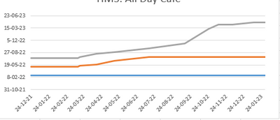
I have a graph in Excel where you can see the shifting of deadline-dates over time. How do I recreate it in PBI?
| Date Report | Date Milestone | Fase |
| 24-12-2021 | 25-2-2022 | VO |
| 24-12-2021 | 6-5-2022 | DO |
| 24-12-2021 | 15-7-2022 | TO |
| 15-3-2022 | 25-2-2022 | VO |
| 15-3-2022 | 6-5-2022 | DO |
| 15-3-2022 | 15-7-2022 | TO |
| 18-3-2022 | 25-2-2022 | VO |
| 18-3-2022 | 13-5-2022 | DO |
| 18-3-2022 | 22-7-2022 | TO |
| 15-4-2022 | 25-2-2022 | VO |
| 15-4-2022 | 24-5-2022 | DO |
| 15-4-2022 | 16-8-2022 | TO |
| 16-5-2022 | 25-2-2022 | VO |
| 16-5-2022 | 20-6-2022 | DO |
| 16-5-2022 | 29-8-2022 | TO |
| 15-7-2022 | 25-2-2022 | VO |
| 15-7-2022 | 22-7-2022 | DO |
| 15-7-2022 | 30-9-2022 | TO |
| 14-9-2022 | 25-2-2022 | VO |
| 14-9-2022 | 22-7-2022 | DO |
| 14-9-2022 | 11-11-2022 | TO |
| 25-10-2022 | 25-2-2022 | VO |
| 25-10-2022 | 22-7-2022 | DO |
| 25-10-2022 | 10-3-2023 | TO |
| 11-11-2022 | 25-2-2022 | VO |
| 11-11-2022 | 22-7-2022 | DO |
| 11-11-2022 | 13-4-2023 | TO |
| 5-12-2022 | 25-2-2022 | VO |
| 5-12-2022 | 22-7-2022 | DO |
| 5-12-2022 | 13-4-2023 | TO |
| 11-1-2023 | 25-2-2022 | VO |
| 11-1-2023 | 22-7-2022 | DO |
| 11-1-2023 | 28-4-2023 | TO |
| 30-1-2023 | 25-2-2022 | VO |
| 30-1-2023 | 22-7-2022 | DO |
| 30-1-2023 | 28-4-2023 | TO |
Update: Added info:
1. The y-axis shows the deadlines in time
2. The x-axis shows the report-dates
3. The lines are the different milestones, shown in the third column.
So for example, Milestone "VO" is stable, it was predicted to be "25-02-2022" in the first report on 24-12-2021, and hasn't moved since. However Milestone "TO" was planned at "25-07-2022" in the first report, but has shifted backwards significantly and was planned at "28-04-2023" in the report of 30-01-2023
Solved! Go to Solution.
- Mark as New
- Bookmark
- Subscribe
- Mute
- Subscribe to RSS Feed
- Permalink
- Report Inappropriate Content
- Mark as New
- Bookmark
- Subscribe
- Mute
- Subscribe to RSS Feed
- Permalink
- Report Inappropriate Content
- Mark as New
- Bookmark
- Subscribe
- Mute
- Subscribe to RSS Feed
- Permalink
- Report Inappropriate Content
Yes that worked! Too bad it isn't native PBI, while Excel doesn't even blink to perform this trick.
- Mark as New
- Bookmark
- Subscribe
- Mute
- Subscribe to RSS Feed
- Permalink
- Report Inappropriate Content
I think you need to explain a couple of things about the graph.
1. What does the y-axis show?
2. What does the x-axis show?
3. What does the three diffrent lines show?
- Mark as New
- Bookmark
- Subscribe
- Mute
- Subscribe to RSS Feed
- Permalink
- Report Inappropriate Content
1. The y-axis shows the deadlines in time
2. The x-axis shows the report-dates
3. The lines are the different milestones, shown in the third column.
So for example, Milestone "VO" is stable, it was predicted to be "25-02-2022" in the first report on 24-12-2021, and hasn't moved since. However Milestone "TO" was planned at "25-07-2022" in the first report, but has shifted backwards significantly and was planned at "28-04-2023" in the report of 30-01-2023
- Mark as New
- Bookmark
- Subscribe
- Mute
- Subscribe to RSS Feed
- Permalink
- Report Inappropriate Content
Ok @hulsbergenw I think you might have some follow up questions to this answer although some of it you can solve with the help of google.
1. I would import the tabel you have to a power BI report
2. I would add a calender tabel to you power BI report
3. I would create a connection between the date report and the in the calender tabel.
I would make a line chart with date from the calender tabel (month-year) in x-axis, the reporte date in y-axis and the data from colum with diffrent milestones in Legend.
I hope this will get you in right direction.
- Mark as New
- Bookmark
- Subscribe
- Mute
- Subscribe to RSS Feed
- Permalink
- Report Inappropriate Content
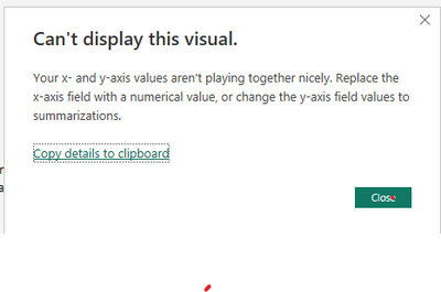
Thanks for helping. I have tried all this. There seems to be a fundamental difference between PBI and Excel, I get the following error:
It appear that PBI requires one of the axis to be numerical and can't handle the date value as such. So a measer like MAX(Date Milestone) doesn't work.
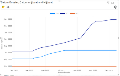
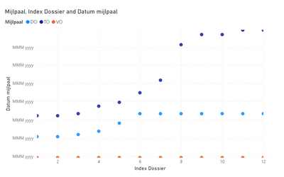
In the end I kind of got it working by adding an index per Report date and using the XY-scatter. However the y-axis looks weird and no lines.
(Can I upload PBIX-files?)
- Mark as New
- Bookmark
- Subscribe
- Mute
- Subscribe to RSS Feed
- Permalink
- Report Inappropriate Content
You can edit the x-axis and y-axis by pressing the diagram and pick format visual.
Here you have a lot of options to edit the x-axis I think the best way to solve it is just to play a bit around with the options.
- Mark as New
- Bookmark
- Subscribe
- Mute
- Subscribe to RSS Feed
- Permalink
- Report Inappropriate Content
I've tried it all, but Power BI just isn't capable of formatting a y-axis as date. A custum graph did it in the end.
Helpful resources

Microsoft Fabric Learn Together
Covering the world! 9:00-10:30 AM Sydney, 4:00-5:30 PM CET (Paris/Berlin), 7:00-8:30 PM Mexico City

Power BI Monthly Update - April 2024
Check out the April 2024 Power BI update to learn about new features.

| User | Count |
|---|---|
| 109 | |
| 106 | |
| 88 | |
| 74 | |
| 69 |
| User | Count |
|---|---|
| 123 | |
| 112 | |
| 95 | |
| 83 | |
| 73 |


