Fabric Data Days starts November 4th!
Advance your Data & AI career with 50 days of live learning, dataviz contests, hands-on challenges, study groups & certifications and more!
Get registered- Power BI forums
- Get Help with Power BI
- Desktop
- Service
- Report Server
- Power Query
- Mobile Apps
- Developer
- DAX Commands and Tips
- Custom Visuals Development Discussion
- Health and Life Sciences
- Power BI Spanish forums
- Translated Spanish Desktop
- Training and Consulting
- Instructor Led Training
- Dashboard in a Day for Women, by Women
- Galleries
- Data Stories Gallery
- Themes Gallery
- Contests Gallery
- Quick Measures Gallery
- Visual Calculations Gallery
- Notebook Gallery
- Translytical Task Flow Gallery
- TMDL Gallery
- R Script Showcase
- Webinars and Video Gallery
- Ideas
- Custom Visuals Ideas (read-only)
- Issues
- Issues
- Events
- Upcoming Events
Get Fabric Certified for FREE during Fabric Data Days. Don't miss your chance! Learn more
- Power BI forums
- Forums
- Get Help with Power BI
- Desktop
- Dates on vertical axis?
- Subscribe to RSS Feed
- Mark Topic as New
- Mark Topic as Read
- Float this Topic for Current User
- Bookmark
- Subscribe
- Printer Friendly Page
- Mark as New
- Bookmark
- Subscribe
- Mute
- Subscribe to RSS Feed
- Permalink
- Report Inappropriate Content
Dates on vertical axis?
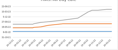
I have a graph in Excel where you can see the shifting of deadline-dates over time. How do I recreate it in PBI?
| Date Report | Date Milestone | Fase |
| 24-12-2021 | 25-2-2022 | VO |
| 24-12-2021 | 6-5-2022 | DO |
| 24-12-2021 | 15-7-2022 | TO |
| 15-3-2022 | 25-2-2022 | VO |
| 15-3-2022 | 6-5-2022 | DO |
| 15-3-2022 | 15-7-2022 | TO |
| 18-3-2022 | 25-2-2022 | VO |
| 18-3-2022 | 13-5-2022 | DO |
| 18-3-2022 | 22-7-2022 | TO |
| 15-4-2022 | 25-2-2022 | VO |
| 15-4-2022 | 24-5-2022 | DO |
| 15-4-2022 | 16-8-2022 | TO |
| 16-5-2022 | 25-2-2022 | VO |
| 16-5-2022 | 20-6-2022 | DO |
| 16-5-2022 | 29-8-2022 | TO |
| 15-7-2022 | 25-2-2022 | VO |
| 15-7-2022 | 22-7-2022 | DO |
| 15-7-2022 | 30-9-2022 | TO |
| 14-9-2022 | 25-2-2022 | VO |
| 14-9-2022 | 22-7-2022 | DO |
| 14-9-2022 | 11-11-2022 | TO |
| 25-10-2022 | 25-2-2022 | VO |
| 25-10-2022 | 22-7-2022 | DO |
| 25-10-2022 | 10-3-2023 | TO |
| 11-11-2022 | 25-2-2022 | VO |
| 11-11-2022 | 22-7-2022 | DO |
| 11-11-2022 | 13-4-2023 | TO |
| 5-12-2022 | 25-2-2022 | VO |
| 5-12-2022 | 22-7-2022 | DO |
| 5-12-2022 | 13-4-2023 | TO |
| 11-1-2023 | 25-2-2022 | VO |
| 11-1-2023 | 22-7-2022 | DO |
| 11-1-2023 | 28-4-2023 | TO |
| 30-1-2023 | 25-2-2022 | VO |
| 30-1-2023 | 22-7-2022 | DO |
| 30-1-2023 | 28-4-2023 | TO |
Update: Added info:
1. The y-axis shows the deadlines in time
2. The x-axis shows the report-dates
3. The lines are the different milestones, shown in the third column.
So for example, Milestone "VO" is stable, it was predicted to be "25-02-2022" in the first report on 24-12-2021, and hasn't moved since. However Milestone "TO" was planned at "25-07-2022" in the first report, but has shifted backwards significantly and was planned at "28-04-2023" in the report of 30-01-2023
Solved! Go to Solution.
- Mark as New
- Bookmark
- Subscribe
- Mute
- Subscribe to RSS Feed
- Permalink
- Report Inappropriate Content
- Mark as New
- Bookmark
- Subscribe
- Mute
- Subscribe to RSS Feed
- Permalink
- Report Inappropriate Content
im really shocked to see powerbi as top BI tool surpassing tableau, with so much of limitations, while in tableau we can do so much custom work no limitation, now i really doubt the ranking of BI tools in magic quadrant chart.
- Mark as New
- Bookmark
- Subscribe
- Mute
- Subscribe to RSS Feed
- Permalink
- Report Inappropriate Content
I have tried this but am still unable to get dates on the axis
can anyone help me with this, I was trying to plot a line graph and try to do the same
- Mark as New
- Bookmark
- Subscribe
- Mute
- Subscribe to RSS Feed
- Permalink
- Report Inappropriate Content
- Mark as New
- Bookmark
- Subscribe
- Mute
- Subscribe to RSS Feed
- Permalink
- Report Inappropriate Content
Thank you for your reply, it worked and got the desired output.
- Mark as New
- Bookmark
- Subscribe
- Mute
- Subscribe to RSS Feed
- Permalink
- Report Inappropriate Content
Y-axis on a line chart will not accept date values.
- Mark as New
- Bookmark
- Subscribe
- Mute
- Subscribe to RSS Feed
- Permalink
- Report Inappropriate Content
Hi @Anonymous ,
Sorry for not giving enough clarification. I was talking about Advanced Line Chart custom visual and not the native one.
Thanks.
- Mark as New
- Bookmark
- Subscribe
- Mute
- Subscribe to RSS Feed
- Permalink
- Report Inappropriate Content
- Mark as New
- Bookmark
- Subscribe
- Mute
- Subscribe to RSS Feed
- Permalink
- Report Inappropriate Content
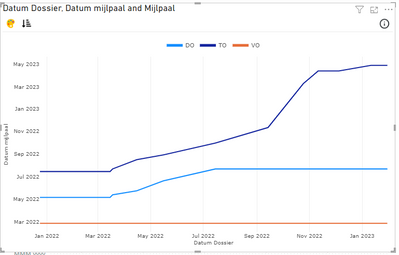
Yes that worked! Too bad it isn't native PBI, while Excel doesn't even blink to perform this trick.
- Mark as New
- Bookmark
- Subscribe
- Mute
- Subscribe to RSS Feed
- Permalink
- Report Inappropriate Content
Hi
i am looking for the same solution can you please please provide the solution howyou achived it
Thanks In advance
- Mark as New
- Bookmark
- Subscribe
- Mute
- Subscribe to RSS Feed
- Permalink
- Report Inappropriate Content
I think you need to explain a couple of things about the graph.
1. What does the y-axis show?
2. What does the x-axis show?
3. What does the three diffrent lines show?
- Mark as New
- Bookmark
- Subscribe
- Mute
- Subscribe to RSS Feed
- Permalink
- Report Inappropriate Content
1. The y-axis shows the deadlines in time
2. The x-axis shows the report-dates
3. The lines are the different milestones, shown in the third column.
So for example, Milestone "VO" is stable, it was predicted to be "25-02-2022" in the first report on 24-12-2021, and hasn't moved since. However Milestone "TO" was planned at "25-07-2022" in the first report, but has shifted backwards significantly and was planned at "28-04-2023" in the report of 30-01-2023
- Mark as New
- Bookmark
- Subscribe
- Mute
- Subscribe to RSS Feed
- Permalink
- Report Inappropriate Content
Ok @Anonymous I think you might have some follow up questions to this answer although some of it you can solve with the help of google.
1. I would import the tabel you have to a power BI report
2. I would add a calender tabel to you power BI report
3. I would create a connection between the date report and the in the calender tabel.
I would make a line chart with date from the calender tabel (month-year) in x-axis, the reporte date in y-axis and the data from colum with diffrent milestones in Legend.
I hope this will get you in right direction.
- Mark as New
- Bookmark
- Subscribe
- Mute
- Subscribe to RSS Feed
- Permalink
- Report Inappropriate Content
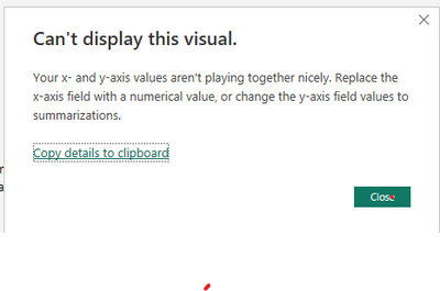
Thanks for helping. I have tried all this. There seems to be a fundamental difference between PBI and Excel, I get the following error:
It appear that PBI requires one of the axis to be numerical and can't handle the date value as such. So a measer like MAX(Date Milestone) doesn't work.
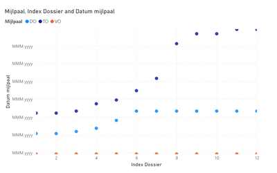
In the end I kind of got it working by adding an index per Report date and using the XY-scatter. However the y-axis looks weird and no lines.
(Can I upload PBIX-files?)
- Mark as New
- Bookmark
- Subscribe
- Mute
- Subscribe to RSS Feed
- Permalink
- Report Inappropriate Content
You can edit the x-axis and y-axis by pressing the diagram and pick format visual.
Here you have a lot of options to edit the x-axis I think the best way to solve it is just to play a bit around with the options.
- Mark as New
- Bookmark
- Subscribe
- Mute
- Subscribe to RSS Feed
- Permalink
- Report Inappropriate Content
I've tried it all, but Power BI just isn't capable of formatting a y-axis as date. A custum graph did it in the end.
Helpful resources

Fabric Data Days
Advance your Data & AI career with 50 days of live learning, contests, hands-on challenges, study groups & certifications and more!

Power BI Monthly Update - October 2025
Check out the October 2025 Power BI update to learn about new features.


