FabCon is coming to Atlanta
Join us at FabCon Atlanta from March 16 - 20, 2026, for the ultimate Fabric, Power BI, AI and SQL community-led event. Save $200 with code FABCOMM.
Register now!- Power BI forums
- Get Help with Power BI
- Desktop
- Service
- Report Server
- Power Query
- Mobile Apps
- Developer
- DAX Commands and Tips
- Custom Visuals Development Discussion
- Health and Life Sciences
- Power BI Spanish forums
- Translated Spanish Desktop
- Training and Consulting
- Instructor Led Training
- Dashboard in a Day for Women, by Women
- Galleries
- Data Stories Gallery
- Themes Gallery
- Contests Gallery
- QuickViz Gallery
- Quick Measures Gallery
- Visual Calculations Gallery
- Notebook Gallery
- Translytical Task Flow Gallery
- TMDL Gallery
- R Script Showcase
- Webinars and Video Gallery
- Ideas
- Custom Visuals Ideas (read-only)
- Issues
- Issues
- Events
- Upcoming Events
Get Fabric Certified for FREE during Fabric Data Days. Don't miss your chance! Request now
- Power BI forums
- Forums
- Get Help with Power BI
- Desktop
- Date on y-axis
- Subscribe to RSS Feed
- Mark Topic as New
- Mark Topic as Read
- Float this Topic for Current User
- Bookmark
- Subscribe
- Printer Friendly Page
- Mark as New
- Bookmark
- Subscribe
- Mute
- Subscribe to RSS Feed
- Permalink
- Report Inappropriate Content
Date on y-axis
Hey Community,
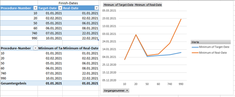
I am trying to build an dashboard to watch our production. We already realized it with Excel as you can see in the attached image. What I would like to see in the graph is the difference between the planned-process and the target-process, so an evaluation of production orders. Now I am trying to realize it in PowerBI but I am not able to put the date on the y-axis and the procedure-numbers on the x-axis.
In Excel I already had to "fake" the data and choose the "minimum of target-date", otherwise excel always wanted to "sum" or "number of.." the dates.
Hope you can help me, already searched a lot but never found someone with the same problem.
Thank you!!
10 | 01.01.2021 | 01.01.2021 |
| 20 | 02.02.2021 | 02.02.2021 |
| 50 | 05.01.2021 | 06.01.2021 |
| 60 | 06.01.2021 | 08.01.2021 |
| 740 | 07.01.2021 | 22.01.2021 |
| 990 | 10.01.2021 | 22.02.2021 |
Solved! Go to Solution.
- Mark as New
- Bookmark
- Subscribe
- Mute
- Subscribe to RSS Feed
- Permalink
- Report Inappropriate Content
@Anonymous , In power bi you can not have columns in both axis. Check for some X-Y visual in custom visual
https://appsource.microsoft.com/en-us/marketplace/apps?product=power-bi-visuals
- Mark as New
- Bookmark
- Subscribe
- Mute
- Subscribe to RSS Feed
- Permalink
- Report Inappropriate Content
@amitchandak thank you for your answer! I alreday expected something like that and already searched for some custom visuals but did not found anything. So there is no other option?
- Mark as New
- Bookmark
- Subscribe
- Mute
- Subscribe to RSS Feed
- Permalink
- Report Inappropriate Content
@Anonymous , In power bi you can not have columns in both axis. Check for some X-Y visual in custom visual
https://appsource.microsoft.com/en-us/marketplace/apps?product=power-bi-visuals
- Mark as New
- Bookmark
- Subscribe
- Mute
- Subscribe to RSS Feed
- Permalink
- Report Inappropriate Content
Helpful resources

Power BI Monthly Update - November 2025
Check out the November 2025 Power BI update to learn about new features.

Fabric Data Days
Advance your Data & AI career with 50 days of live learning, contests, hands-on challenges, study groups & certifications and more!


