Join us at the 2025 Microsoft Fabric Community Conference
March 31 - April 2, 2025, in Las Vegas, Nevada. Use code MSCUST for a $150 discount! Early bird discount ends December 31.
Register Now- Power BI forums
- Get Help with Power BI
- Desktop
- Service
- Report Server
- Power Query
- Mobile Apps
- Developer
- DAX Commands and Tips
- Custom Visuals Development Discussion
- Health and Life Sciences
- Power BI Spanish forums
- Translated Spanish Desktop
- Training and Consulting
- Instructor Led Training
- Dashboard in a Day for Women, by Women
- Galleries
- Community Connections & How-To Videos
- COVID-19 Data Stories Gallery
- Themes Gallery
- Data Stories Gallery
- R Script Showcase
- Webinars and Video Gallery
- Quick Measures Gallery
- 2021 MSBizAppsSummit Gallery
- 2020 MSBizAppsSummit Gallery
- 2019 MSBizAppsSummit Gallery
- Events
- Ideas
- Custom Visuals Ideas
- Issues
- Issues
- Events
- Upcoming Events
Be one of the first to start using Fabric Databases. View on-demand sessions with database experts and the Microsoft product team to learn just how easy it is to get started. Watch now
- Power BI forums
- Forums
- Get Help with Power BI
- Desktop
- Re: Date & Time hierarchy: how to show and drill d...
- Subscribe to RSS Feed
- Mark Topic as New
- Mark Topic as Read
- Float this Topic for Current User
- Bookmark
- Subscribe
- Printer Friendly Page
- Mark as New
- Bookmark
- Subscribe
- Mute
- Subscribe to RSS Feed
- Permalink
- Report Inappropriate Content
Date & Time hierarchy: how to show and drill down?
Hello,
The recommended way to model datetime dimension in Power BI is to split into two Dimensions
1) Date Dimension
2) Time Dimension
This is sensible in terms modelling. However, visual presentation of this does not look nice or intuitive.
An example is here:
How to Use Time and Date Dimensions in a Power BI Model - RADACAD
https://radacad.com/how-to-use-time-and-date-dimensions-in-a-power-bi-model
The main problem here is that X-axis hierarchy is not "datetime" type.
Is this the standard and recommended way to visually show a datetime hierarchy that can be drilled down?
If there are sample pbix available online that have addressed this issue, I am keen to have a look.
Thanks
- Mark as New
- Bookmark
- Subscribe
- Mute
- Subscribe to RSS Feed
- Permalink
- Report Inappropriate Content
Hi Surm,
I have battled this same problem for a long time. I made a similar question nearly a year ago and got no satisfactory answer other than "not possible". Have a read: https://community.powerbi.com/t5/Desktop/Continuous-X-axis-using-Date-and-Time-dimension/td-p/230676...
In short, the problem comes with drilling down from a date to a time. PowerBI's behaviour is to combine the date and a time into a STRING not a DATETIME, and therefore it does not see how it's possible to display it as a continuous axis.
As far as I am aware, there is no way around this other than creating a datetime dimension, which gets very big, and doesn't follow best practice.
I have no idea why this problem isn't being posted about more!!!
Good luck. Please let me know if you figure out how to do it.
- Mark as New
- Bookmark
- Subscribe
- Mute
- Subscribe to RSS Feed
- Permalink
- Report Inappropriate Content
Struggling with same - solutions I've seen are sub-optimal. This should be an out-of-the-box option. In Tableau, this is trivial.
- Mark as New
- Bookmark
- Subscribe
- Mute
- Subscribe to RSS Feed
- Permalink
- Report Inappropriate Content
Hi, @Surm ;
If the above one can't help you get the desired result, please provide some sample data in your tables (exclude sensitive data) with Text format and your expected result with backend logic and special examples. It is better if you can share a simplified pbix file. You can refer the following link to upload the file to the community. Thank you.
How to upload PBI in Community
Best Regards,
Community Support Team _ Yalan Wu
If this post helps, then please consider Accept it as the solution to help the other members find it more quickly.
- Mark as New
- Bookmark
- Subscribe
- Mute
- Subscribe to RSS Feed
- Permalink
- Report Inappropriate Content
Hi @v-yalanwu-msft ,
Here I have attached the pbix and an Excel workbook to demonstrate the problem with showing Date/Time hierarchy on X-axis.
Here is the URL to download (from Onedrive):
| https://1drv.ms/f/s!AnmrXDyD1CyDkX7m1AoZfYmSY-4X |
'Fact Value' table has the below data gaps: 2020-Jan-10 to 2020-Jan-20 |
What is required:
1) X-axis: Year/Month/Date/Hour/Minute/Second hierarchy. That is, we start with "Year" level and be able to drill-down to "Seconds" level.
2) When drilling down, there are two conceptually possible behaviours.
2.1) Keep the length of X-axis as the same, so there will not be a horizontal scroll bar to browse the X-axis. X-axis has to be scaled up or down automatically to occupy the allocated space in the visual. All data points will be plotted, however, since there is no space to display all X-axis labels, only some labels will be shown. This is the behaviour when "datetime" column is put on X-axis and set X to "Continuous".
Please help me set up this behavior when X-axis has the above Date/Time hierarchy
2.2) Extend the X-axis to include all individual X-axis labels by adding a horizontal scroll bar. This the behaviour when X-axis is set to "Categorical", however, when this is done, the below issue must not occur. (That is, 2020-March and 2020-Apr must not be omitted from X-axis)
Please help me set up this behavior when X-axis has the above Date/Time hierarchy
3) X-axis has to be of "continuous" type because "Date/Time" is a continuous. What that means is, when there is no data for certain dates, the line chart must still maintain those gaps in X-axis. In this example, the X-axis must NOT have 2020-Feb and 2020-May next to each other. 2020-March and 2020-Apr must appear on X-axis because time is "continuous"
Please help me set up this behavior when X-axis has the above Date/Time hierarchy.
CC: @BinaryBotany
- Mark as New
- Bookmark
- Subscribe
- Mute
- Subscribe to RSS Feed
- Permalink
- Report Inappropriate Content
Hi, @Surm ;
I think your link is a good idea, if you want to split two columns. you could only change the [datetime] column show:
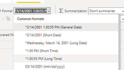
1.original table.
2.change the format.(to Long time)
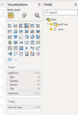
3. add this column to visual twice.
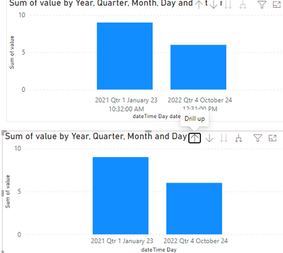
The final show:
Best Regards,
Community Support Team _ Yalan Wu
If this post helps, then please consider Accept it as the solution to help the other members find it more quickly.
- Mark as New
- Bookmark
- Subscribe
- Mute
- Subscribe to RSS Feed
- Permalink
- Report Inappropriate Content
Thanks for your suggestion, however, the solution you proposed has the below problem.
The DateTime dimension is a single table, which is a "no-no" according to the Power BI /SSAS Tabular dimensional modelling best practices.
Helpful resources

Join us at the Microsoft Fabric Community Conference
March 31 - April 2, 2025, in Las Vegas, Nevada. Use code MSCUST for a $150 discount!

We want your feedback!
Your insights matter. That’s why we created a quick survey to learn about your experience finding answers to technical questions.

Microsoft Fabric Community Conference 2025
Arun Ulag shares exciting details about the Microsoft Fabric Conference 2025, which will be held in Las Vegas, NV.

| User | Count |
|---|---|
| 134 | |
| 91 | |
| 89 | |
| 64 | |
| 58 |
| User | Count |
|---|---|
| 201 | |
| 137 | |
| 107 | |
| 72 | |
| 68 |


