Get Fabric certified for FREE!
Don't miss your chance to take the Fabric Data Engineer (DP-600) exam for FREE! Find out how by watching the DP-600 session on-demand now through April 28th.
Learn more- Power BI forums
- Get Help with Power BI
- Desktop
- Service
- Report Server
- Power Query
- Mobile Apps
- Developer
- DAX Commands and Tips
- Custom Visuals Development Discussion
- Health and Life Sciences
- Power BI Spanish forums
- Translated Spanish Desktop
- Training and Consulting
- Instructor Led Training
- Dashboard in a Day for Women, by Women
- Galleries
- Data Stories Gallery
- Themes Gallery
- Contests Gallery
- QuickViz Gallery
- Quick Measures Gallery
- Visual Calculations Gallery
- Notebook Gallery
- Translytical Task Flow Gallery
- TMDL Gallery
- R Script Showcase
- Webinars and Video Gallery
- Ideas
- Custom Visuals Ideas (read-only)
- Issues
- Issues
- Events
- Upcoming Events
Join the FabCon + SQLCon recap series. Up next: Power BI, Real-Time Intelligence, IQ and AI, and Data Factory take center stage. All sessions are available on-demand after the live show. Register now
- Power BI forums
- Forums
- Get Help with Power BI
- Desktop
- Re: Data Table Percentage Question
- Subscribe to RSS Feed
- Mark Topic as New
- Mark Topic as Read
- Float this Topic for Current User
- Bookmark
- Subscribe
- Printer Friendly Page
- Mark as New
- Bookmark
- Subscribe
- Mute
- Subscribe to RSS Feed
- Permalink
- Report Inappropriate Content
Data Table Percentage Question
Hello,
I am hoping that someone on here can guide me in the right direction with this issue.
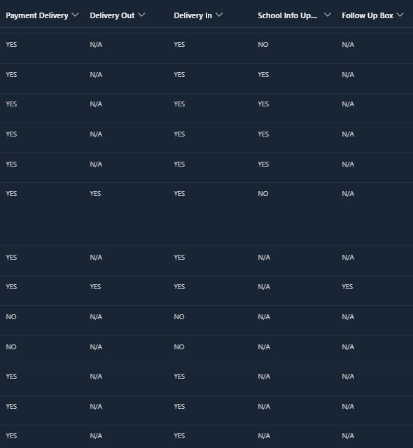
I have a data with multiple columns (QA Items) and with each column, there are only three responses: Yes, No, N/A.
I can write DAX expression measure to get the accuracy percentages for each, but where I remain stuck is how to present this in a visual, preferably in a stacked bar graph that shows the accuracy percentages (see example below for other table):
Here is a sample of part of my data table in SharePoint that I am using as a source:
Yes = It was there
No = it was not there
N/A = it did not apply
I'm at a loss as to where to go next. I was thinking if I need to create a calculated table, but I'm not very skilled on how to do that - so seeing if anyone out there has any ideas?
Solved! Go to Solution.
- Mark as New
- Bookmark
- Subscribe
- Mute
- Subscribe to RSS Feed
- Permalink
- Report Inappropriate Content
@ianallen13 I would probably unpivot the data and then create the %'s in a measure.
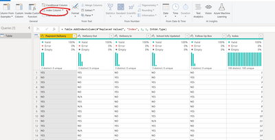
1. In "Transform data"/Power Query, if there is no ID column, I'd create one using "Add column" > "Index Column"
2. Then I would select all the columns except for the Index
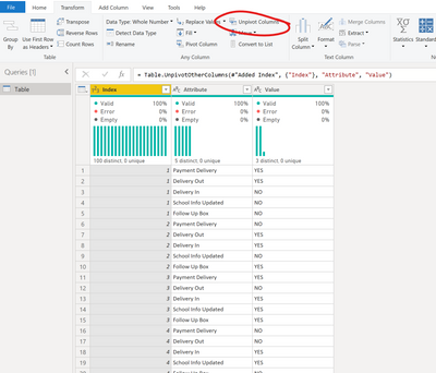
3. Then go to "Transform" > "Unpivot Columns"
4. Now I have "Attribute" which is my headers before, and "Value" which is the data inside.
5. Close and Apply to get back to the visual layer
6. I created a measure to count the number of responses using the Index column,
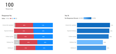
7. Now I can create a 100% stacked bar chart,
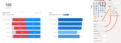
or more measures to determine the Yes % and create charts:
I've attached the PBIX so you can take a look.
Respectfully,
Zoe Douglas (DataZoe)
Follow me on LinkedIn at https://www.linkedin.com/in/zoedouglas-data
See my reports and blog at https://www.datazoepowerbi.com/
- Mark as New
- Bookmark
- Subscribe
- Mute
- Subscribe to RSS Feed
- Permalink
- Report Inappropriate Content
Hello,
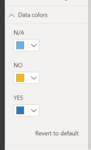
Unfortunately I do not have that option:
- Mark as New
- Bookmark
- Subscribe
- Mute
- Subscribe to RSS Feed
- Permalink
- Report Inappropriate Content
@ianallen13 yes, for that one you are limited to just picking one for each of the options. 🙂 It's the other one that has the fancy options.
Respectfully,
Zoe Douglas (DataZoe)
Follow me on LinkedIn at https://www.linkedin.com/in/zoedouglas-data
See my reports and blog at https://www.datazoepowerbi.com/
- Mark as New
- Bookmark
- Subscribe
- Mute
- Subscribe to RSS Feed
- Permalink
- Report Inappropriate Content
Sorry to sound dumb, but what is the other one? Each visual that I have chosen does not have that option for this. So far, I can do only select that when I create a table or matrix in PBI
- Mark as New
- Bookmark
- Subscribe
- Mute
- Subscribe to RSS Feed
- Permalink
- Report Inappropriate Content
Thank you! Yes, I just filtered out the N/A's and it worked perfectly. Thank you again so much for your help.
Now the only other thing I cannot figure out - I saw that you were able to do some conditional formatting to the bar graph, but when I try to do that - I am not presented with the option. Any thoughts?
- Mark as New
- Bookmark
- Subscribe
- Mute
- Subscribe to RSS Feed
- Permalink
- Report Inappropriate Content
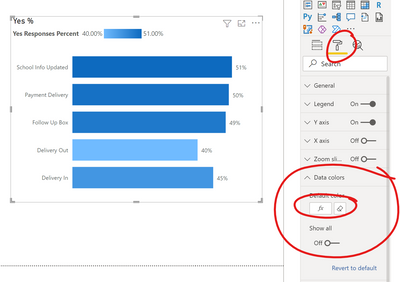
@ianallen13 For the bar chart, to get the gradient option you go to "Data colors" and pick the little "Fx" button. This allows you to pass it a measure and choose how to color it.
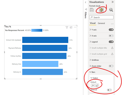
and in the preview of the new visualization pane, it's here:
I chose gradient, but you can also impliment rules too, so you can highlight when it drops below or above a certain percent also. You can also base it on a different measure than the one used in the bar. Lots of options! 🙂
Respectfully,
Zoe Douglas (DataZoe)
Follow me on LinkedIn at https://www.linkedin.com/in/zoedouglas-data
See my reports and blog at https://www.datazoepowerbi.com/
- Mark as New
- Bookmark
- Subscribe
- Mute
- Subscribe to RSS Feed
- Permalink
- Report Inappropriate Content
Thank you for this and for the example file, but I do have an issue...
The calculations showing are indicating the percentage of YES's for each attribute, but I don't want the N/A's to count in the overall calculations.
e.g.
If I have "School Info Updated" with 166 responses:
N/A: 141
NO: 6
YES: 19
I don't want it to be 19/166, but I want it to be 19/25 = 76%. Do I have to do a new measure for each attribute then?
- Mark as New
- Bookmark
- Subscribe
- Mute
- Subscribe to RSS Feed
- Permalink
- Report Inappropriate Content
Disregard this - I answered my own question.
- Mark as New
- Bookmark
- Subscribe
- Mute
- Subscribe to RSS Feed
- Permalink
- Report Inappropriate Content
@ianallen13 what was your solution so others can also find it helpful?
The way I usually do this is either change the measure or simply remove the N/A's entirely, either in Power Query or in the all pages filter in the filter pane. To change the measure I use this approach:
Yes Responses Percent = DIVIDE(CALCULATE([Responses],'Table'[Value]="YES"),CALCULATE([Responses],'Table'[Value] in {"YES","NO"}))
Respectfully,
Zoe Douglas (DataZoe)
Follow me on LinkedIn at https://www.linkedin.com/in/zoedouglas-data
See my reports and blog at https://www.datazoepowerbi.com/
- Mark as New
- Bookmark
- Subscribe
- Mute
- Subscribe to RSS Feed
- Permalink
- Report Inappropriate Content
@ianallen13 I would probably unpivot the data and then create the %'s in a measure.
1. In "Transform data"/Power Query, if there is no ID column, I'd create one using "Add column" > "Index Column"
2. Then I would select all the columns except for the Index
3. Then go to "Transform" > "Unpivot Columns"
4. Now I have "Attribute" which is my headers before, and "Value" which is the data inside.
5. Close and Apply to get back to the visual layer
6. I created a measure to count the number of responses using the Index column,
7. Now I can create a 100% stacked bar chart,

or more measures to determine the Yes % and create charts:
I've attached the PBIX so you can take a look.
Respectfully,
Zoe Douglas (DataZoe)
Follow me on LinkedIn at https://www.linkedin.com/in/zoedouglas-data
See my reports and blog at https://www.datazoepowerbi.com/
Helpful resources

Power BI Monthly Update - April 2026
Check out the April 2026 Power BI update to learn about new features.

New to Fabric Survey
If you have recently started exploring Fabric, we'd love to hear how it's going. Your feedback can help with product improvements.

Power BI DataViz World Championships - June 2026
A new Power BI DataViz World Championship is coming this June! Don't miss out on submitting your entry.

| User | Count |
|---|---|
| 48 | |
| 40 | |
| 38 | |
| 20 | |
| 17 |
| User | Count |
|---|---|
| 68 | |
| 65 | |
| 30 | |
| 26 | |
| 25 |

