FabCon is coming to Atlanta
Join us at FabCon Atlanta from March 16 - 20, 2026, for the ultimate Fabric, Power BI, AI and SQL community-led event. Save $200 with code FABCOMM.
Register now!- Power BI forums
- Get Help with Power BI
- Desktop
- Service
- Report Server
- Power Query
- Mobile Apps
- Developer
- DAX Commands and Tips
- Custom Visuals Development Discussion
- Health and Life Sciences
- Power BI Spanish forums
- Translated Spanish Desktop
- Training and Consulting
- Instructor Led Training
- Dashboard in a Day for Women, by Women
- Galleries
- Data Stories Gallery
- Themes Gallery
- Contests Gallery
- Quick Measures Gallery
- Notebook Gallery
- Translytical Task Flow Gallery
- TMDL Gallery
- R Script Showcase
- Webinars and Video Gallery
- Ideas
- Custom Visuals Ideas (read-only)
- Issues
- Issues
- Events
- Upcoming Events
To celebrate FabCon Vienna, we are offering 50% off select exams. Ends October 3rd. Request your discount now.
- Power BI forums
- Forums
- Get Help with Power BI
- Desktop
- DAX formula help
- Subscribe to RSS Feed
- Mark Topic as New
- Mark Topic as Read
- Float this Topic for Current User
- Bookmark
- Subscribe
- Printer Friendly Page
- Mark as New
- Bookmark
- Subscribe
- Mute
- Subscribe to RSS Feed
- Permalink
- Report Inappropriate Content
DAX formula help
I have 3 column in my data. Two of them are date column. Learning Date Completed and Course date Completed.
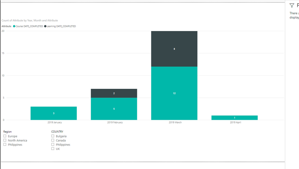
Now i need to create a line graph in which x axix sould be month from January-2019 and it should go on. And one line should show the count of month for Learning Date Completed and the other for Course date Completed. Below is the data set.
| COUNTRY | Region | Learning DATE_COMPLETED | Course DATE_COMPLETED |
| Canada | North America | ||
| Canada | North America | March-2019 | |
| Canada | North America | February-2019 | January-2019 |
| Canada | North America | February-2019 | |
| Bulgaria | Europe | March-2019 | March-2019 |
| Bulgaria | Europe | March-2019 | |
| Philippines | Philippines | March-2019 | March-2019 |
| Philippines | Philippines | March-2019 | March-2019 |
| Philippines | Philippines | March-2019 | March-2019 |
| Bulgaria | Europe | March-2019 | |
| Bulgaria | Europe | February-2019 | |
| Bulgaria | Europe | ||
| Bulgaria | Europe | February-2019 | |
| Bulgaria | Europe | ||
| Bulgaria | Europe | February-2019 | |
| Bulgaria | Europe | ||
| Bulgaria | Europe | ||
| Bulgaria | Europe | ||
| Bulgaria | Europe | ||
| Bulgaria | Europe | April-2019 | |
| Bulgaria | Europe | ||
| UK | Europe | ||
| UK | Europe | January-2019 | |
| UK | Europe | ||
| UK | Europe | February-2019 | |
| Bulgaria | Europe | ||
| Canada | North America | ||
| Canada | North America | ||
| UK | Europe | ||
| Bulgaria | Europe | ||
| Bulgaria | Europe | ||
| Bulgaria | Europe | ||
| Bulgaria | Europe | ||
| Philippines | Philippines | March-2019 | March-2019 |
| Philippines | Philippines | March-2019 | March-2019 |
| Canada | North America | February-2019 | January-2019 |
| Canada | North America | March-2019 | |
| UK | Europe | ||
| Bulgaria | Europe | ||
| Bulgaria | Europe | ||
| Bulgaria | Europe | ||
| Bulgaria | Europe | ||
| Bulgaria | Europe | ||
| Philippines | Philippines | March-2019 | March-2019 |
| UK | Europe | ||
| UK | Europe | ||
| Bulgaria | Europe | ||
| Bulgaria | Europe | March-2019 | March-2019 |
| Bulgaria | Europe |
I have 2 filter on top which are Country and Region. Please help
- Mark as New
- Bookmark
- Subscribe
- Mute
- Subscribe to RSS Feed
- Permalink
- Report Inappropriate Content
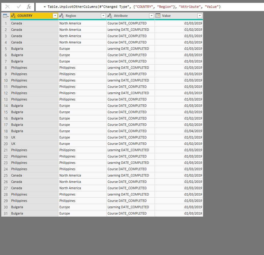
If you have 2 dates yo will need to unpivot them to join them to 1 date dimension.
If you go to edit queries and select the 2 date columsn and select unpivot. You can then join the 1 value column to date dimension and use the attribute column as the legend.
- Mark as New
- Bookmark
- Subscribe
- Mute
- Subscribe to RSS Feed
- Permalink
- Report Inappropriate Content
You need to create a date table that you use for your x-axis, then make two relationships to your data table for each date field


