FabCon is coming to Atlanta
Join us at FabCon Atlanta from March 16 - 20, 2026, for the ultimate Fabric, Power BI, AI and SQL community-led event. Save $200 with code FABCOMM.
Register now!- Power BI forums
- Get Help with Power BI
- Desktop
- Service
- Report Server
- Power Query
- Mobile Apps
- Developer
- DAX Commands and Tips
- Custom Visuals Development Discussion
- Health and Life Sciences
- Power BI Spanish forums
- Translated Spanish Desktop
- Training and Consulting
- Instructor Led Training
- Dashboard in a Day for Women, by Women
- Galleries
- Data Stories Gallery
- Themes Gallery
- Contests Gallery
- QuickViz Gallery
- Quick Measures Gallery
- Visual Calculations Gallery
- Notebook Gallery
- Translytical Task Flow Gallery
- TMDL Gallery
- R Script Showcase
- Webinars and Video Gallery
- Ideas
- Custom Visuals Ideas (read-only)
- Issues
- Issues
- Events
- Upcoming Events
Get Fabric Certified for FREE during Fabric Data Days. Don't miss your chance! Request now
- Power BI forums
- Forums
- Get Help with Power BI
- Desktop
- DAX Measure - Status and value change in time
- Subscribe to RSS Feed
- Mark Topic as New
- Mark Topic as Read
- Float this Topic for Current User
- Bookmark
- Subscribe
- Printer Friendly Page
- Mark as New
- Bookmark
- Subscribe
- Mute
- Subscribe to RSS Feed
- Permalink
- Report Inappropriate Content
DAX Measure - Status and value change in time
Hello Experts
My datasource looks like following
| Case_ID | Date | Status_ID | Amount |
| 1 | 01.09.2021 | 0 | 300 |
| 1 | 05.09.2021 | 3 | 320 |
| 1 | 06.09.2021 | 3 | 320 |
| 2 | 05.09.2021 | 3 | 100 |
| 3 | 02.09.2021 | 0 | 200 |
| 3 | 07.09.2021 | 2 | 200 |
Case_ID identify a unique business case for that the status and amount changes in time. A new record for a particular date exist only if either status or amount for the Case_ID changes. The requirement is to create visuals (table and chart) that show the total per status and day like following:
| 0 | 1 | 2 | 3 | |
| 01.09.2021 | 300 | |||
| 02.09.2021 | 500 | |||
| 03.09.2021 | 500 | |||
| 04.09.2021 | 500 | |||
| 05.09.2021 | 200 | 320 | 200 | |
| 06.09.2021 | 200 | 420 | ||
| 07.09.2021 | 200 | 420 | ||
| 08.09.2021 | 200 | 420 | ||
| ... | 200 | 420 |
I have found several blogs how to handle semi additive measures but non handling a similar case.
Can anyone help how to define the DAX formula?
EDIT:
I try to describe the problem a bit further:
New record to the source data is added if and only if there is an update either for Amount or Status_ID for the Case_ID.
For example for the Case_ID = 1 was created 1.9. with Status_ID = 0 and Amount = 300. Then it was updated on 5.9. to Status_ID = 2 and Amount = 300 and finally 6.9. to Status_ID = 3, Amount = 300 (unchanged).
This means that on 1.-4.9. the Status_ID was 0 and Amount = 300, 5.9. it was Status_ID = 2, Amount=320 and 6.9. until the end of the calendar it was Status_ID = 3, Amount = 320.
The best measure I could find is following:
Last Amount =
        VAR lastKnownAmount =
            CALCULATETABLE (
                SUMMARIZE (
                    History,
                    History[Case_ID],
                    History[Status_ID],
                    "LastKnownAmount", LASTNONBLANKVALUE ( 'Date'[Date], SUM ( History[Amount] ) )
                ),
                FILTER ( ALL ( 'Date' ), 'Date'[Date] <= MAX ( 'Date'[Date] )
                )
            )
        RETURN
            SUMX ( lastKnownAmount, [LastKnownAmount] )
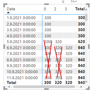
It finds the last amount for all combinations Case_ID and Status_ID and fill it to all the dates till the end of the calendar. The output filtered for Case_ID = looks following:
But I cannot get rid of the red crossed figures.
EDIT 2:
I was able to do some progress on this topic. I have added a new calculated column "Next date" to the datasource that contains the date of the next record for the same Case_ID or last date of the calendar if there is no next record:
NextDate =
VAR lastKnownDate =
    MAX ( 'Date'[Date] )
VAR next =
    CALCULATE (
        FIRSTNONBLANK ( 'History'[Date], 1 ),
        FILTER (
            History,
            (
                'History'[Date] > EARLIER ( History[Date] )
                    && ( 'History'[Case_ID] = EARLIER ( 'History'[Case_ID] ) )
            )
        )
    )
RETURN
    IF ( ISBLANK ( next ), lastKnownDate, next )
Now each record is valid for the range >= Date and <NextDate. I struggle in constructing the measure.
- Mark as New
- Bookmark
- Subscribe
- Mute
- Subscribe to RSS Feed
- Permalink
- Report Inappropriate Content
Hi @jirim
Based on your datasource table and expected table, I cannot find the relationship or calculation logic between them, could you give us the calculation logic of output value? So that we can give you specific measure. I also find an article about Semi-Additive Measures in DAX
https://www.sqlbi.com/articles/semi-additive-measures-in-dax/
-
maybe you can try the measure with this structure
Total=calculate(sum(table[Amount]),Filter(All(table),table[Status_ID]=min(table[Status_ID])&&[your date period]))
Best Regards,
Community Support Team _Tang
If this post helps, please consider Accept it as the solution to help the other members find it more quickly.
- Mark as New
- Bookmark
- Subscribe
- Mute
- Subscribe to RSS Feed
- Permalink
- Report Inappropriate Content
Hi @v-xiaotang,
thank you for your feedback. I have updated the question with better explanation of the problem. I do not understand the logic in your DAX code. I have updated it to my data - the source table is "History" and the calendar table is "Date" like following:
Total =
CALCULATE (
    SUM ( History[Amount] ),
    FILTER (
        ALL ( history ),
        history[Status_ID] = MIN ( history[Status_ID] )
            && [Date]
    )
)
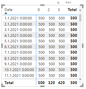
Unfortunately the result does not give much sense. If I make a date/Status_ID table filtered for Case_ID = 1 as in the question the output looks like following:
- Mark as New
- Bookmark
- Subscribe
- Mute
- Subscribe to RSS Feed
- Permalink
- Report Inappropriate Content
Hi @VahidDM
my question was probably not clear. I do not know how to build the messure in DAX that would give the results as in the sample output table.
- Mark as New
- Bookmark
- Subscribe
- Mute
- Subscribe to RSS Feed
- Permalink
- Report Inappropriate Content
Hi @jirim
Try to use Matrix visual and set it as below:
If this post helps, please consider accepting it as the solution to help the other members find it more quickly.
Appreciate your Kudos🙏!!
Helpful resources

Power BI Monthly Update - November 2025
Check out the November 2025 Power BI update to learn about new features.

Fabric Data Days
Advance your Data & AI career with 50 days of live learning, contests, hands-on challenges, study groups & certifications and more!


