FabCon is coming to Atlanta
Join us at FabCon Atlanta from March 16 - 20, 2026, for the ultimate Fabric, Power BI, AI and SQL community-led event. Save $200 with code FABCOMM.
Register now!- Power BI forums
- Get Help with Power BI
- Desktop
- Service
- Report Server
- Power Query
- Mobile Apps
- Developer
- DAX Commands and Tips
- Custom Visuals Development Discussion
- Health and Life Sciences
- Power BI Spanish forums
- Translated Spanish Desktop
- Training and Consulting
- Instructor Led Training
- Dashboard in a Day for Women, by Women
- Galleries
- Data Stories Gallery
- Themes Gallery
- Contests Gallery
- QuickViz Gallery
- Quick Measures Gallery
- Visual Calculations Gallery
- Notebook Gallery
- Translytical Task Flow Gallery
- TMDL Gallery
- R Script Showcase
- Webinars and Video Gallery
- Ideas
- Custom Visuals Ideas (read-only)
- Issues
- Issues
- Events
- Upcoming Events
The Power BI Data Visualization World Championships is back! Get ahead of the game and start preparing now! Learn more
- Power BI forums
- Forums
- Get Help with Power BI
- Desktop
- Custom leaflet map, control zoom level
- Subscribe to RSS Feed
- Mark Topic as New
- Mark Topic as Read
- Float this Topic for Current User
- Bookmark
- Subscribe
- Printer Friendly Page
- Mark as New
- Bookmark
- Subscribe
- Mute
- Subscribe to RSS Feed
- Permalink
- Report Inappropriate Content
Custom leaflet map, control zoom level
Hi,
I have created a custom visualisation using the R leaflet plugin. I have issues making the interaction between the map and the other Power BI visualisations work nicely. If I filter my data by clicking a graph, the zoom level of my map is reset.
Any suggestions on how I can prevent this?
Any help is much appreciated!
Thanks!
Solved! Go to Solution.
- Mark as New
- Bookmark
- Subscribe
- Mute
- Subscribe to RSS Feed
- Permalink
- Report Inappropriate Content
Hi @Anonymous ,
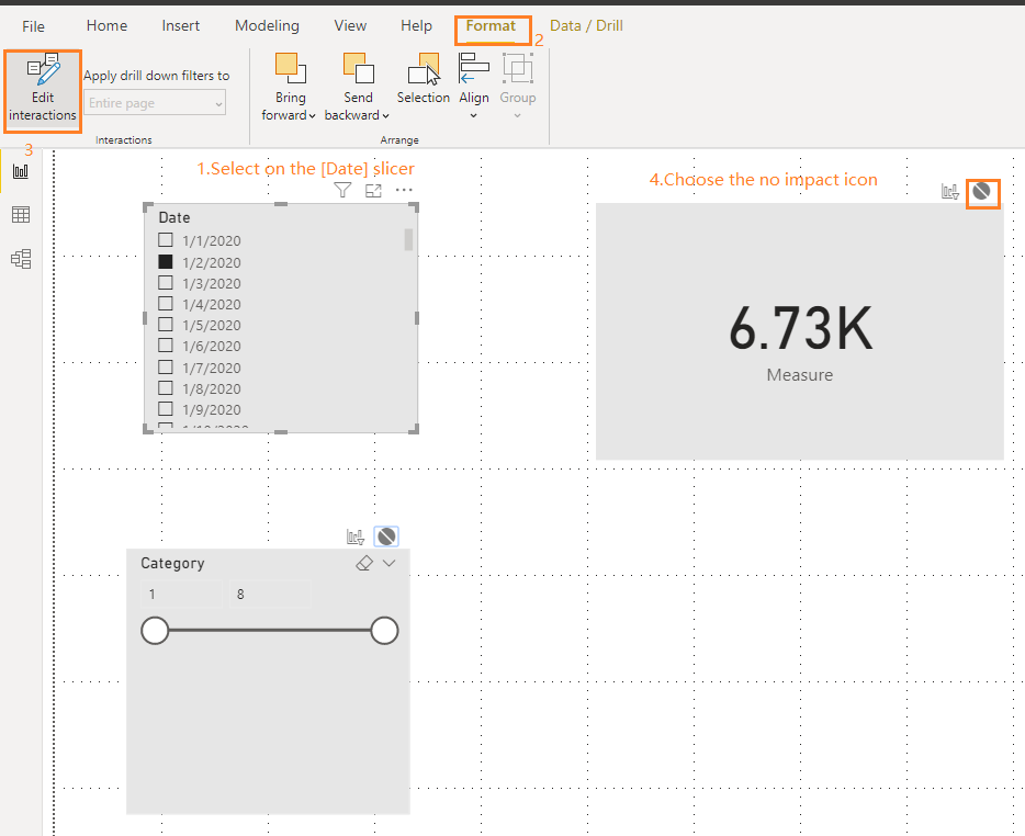
You may use "Edit interactions" feature to choose which visuals to be filtered by one special visual, just select on the graph, go to Format ->Edit interactions, then choose the "no impact" icon for the map visual.
For example:
Reference:
https://docs.microsoft.com/en-us/power-bi/service-reports-visual-interactions .
Best Regards,
Amy
Community Support Team _ Amy
If this post helps, then please consider Accept it as the solution to help the other members find it more quickly.
- Mark as New
- Bookmark
- Subscribe
- Mute
- Subscribe to RSS Feed
- Permalink
- Report Inappropriate Content
- Mark as New
- Bookmark
- Subscribe
- Mute
- Subscribe to RSS Feed
- Permalink
- Report Inappropriate Content
Hi,
I developed it myself with this plugin:
https://github.com/microsoft/PowerBI-visuals
I think I need to edit the visual.ts somehow - but don't know exactly what to change.
- Mark as New
- Bookmark
- Subscribe
- Mute
- Subscribe to RSS Feed
- Permalink
- Report Inappropriate Content
Hi @Anonymous ,
See if this helps
https://community.powerbi.com/t5/Desktop/PowerBI-Desktop-and-leaflet/m-p/826005
https://community.powerbi.com/t5/Developer/Power-Bi-Leaflet-tiles-not-showing-properly/m-p/346215
Regards,
HN
- Mark as New
- Bookmark
- Subscribe
- Mute
- Subscribe to RSS Feed
- Permalink
- Report Inappropriate Content
Thanks for sharing, but unforturantly, this does not solve my problem.
Mayby this explains my problem better.
- Mark as New
- Bookmark
- Subscribe
- Mute
- Subscribe to RSS Feed
- Permalink
- Report Inappropriate Content
Hi @Anonymous ,
Would you like the custom leaflet map interact with the graph, or not?
Best Regards,
Amy
- Mark as New
- Bookmark
- Subscribe
- Mute
- Subscribe to RSS Feed
- Permalink
- Report Inappropriate Content
Hi @v-xicai
I would like that it is only the dataset the updates, but not the zoom level of the map. For an example, if I click a graph that filters the data based on a year, I would like that only that dataset updates, but not the zoom level of the map.
- Mark as New
- Bookmark
- Subscribe
- Mute
- Subscribe to RSS Feed
- Permalink
- Report Inappropriate Content
Hi @Anonymous ,
You may use "Edit interactions" feature to choose which visuals to be filtered by one special visual, just select on the graph, go to Format ->Edit interactions, then choose the "no impact" icon for the map visual.
For example:
Reference:
https://docs.microsoft.com/en-us/power-bi/service-reports-visual-interactions .
Best Regards,
Amy
Community Support Team _ Amy
If this post helps, then please consider Accept it as the solution to help the other members find it more quickly.
Helpful resources

Power BI Monthly Update - November 2025
Check out the November 2025 Power BI update to learn about new features.

Fabric Data Days
Advance your Data & AI career with 50 days of live learning, contests, hands-on challenges, study groups & certifications and more!


