FabCon is coming to Atlanta
Join us at FabCon Atlanta from March 16 - 20, 2026, for the ultimate Fabric, Power BI, AI and SQL community-led event. Save $200 with code FABCOMM.
Register now!- Power BI forums
- Get Help with Power BI
- Desktop
- Service
- Report Server
- Power Query
- Mobile Apps
- Developer
- DAX Commands and Tips
- Custom Visuals Development Discussion
- Health and Life Sciences
- Power BI Spanish forums
- Translated Spanish Desktop
- Training and Consulting
- Instructor Led Training
- Dashboard in a Day for Women, by Women
- Galleries
- Data Stories Gallery
- Themes Gallery
- Contests Gallery
- QuickViz Gallery
- Quick Measures Gallery
- Visual Calculations Gallery
- Notebook Gallery
- Translytical Task Flow Gallery
- TMDL Gallery
- R Script Showcase
- Webinars and Video Gallery
- Ideas
- Custom Visuals Ideas (read-only)
- Issues
- Issues
- Events
- Upcoming Events
The Power BI Data Visualization World Championships is back! Get ahead of the game and start preparing now! Learn more
- Power BI forums
- Forums
- Get Help with Power BI
- Desktop
- Custom cross-filtering and highlighting?
- Subscribe to RSS Feed
- Mark Topic as New
- Mark Topic as Read
- Float this Topic for Current User
- Bookmark
- Subscribe
- Printer Friendly Page
- Mark as New
- Bookmark
- Subscribe
- Mute
- Subscribe to RSS Feed
- Permalink
- Report Inappropriate Content
Custom cross-filtering and highlighting?
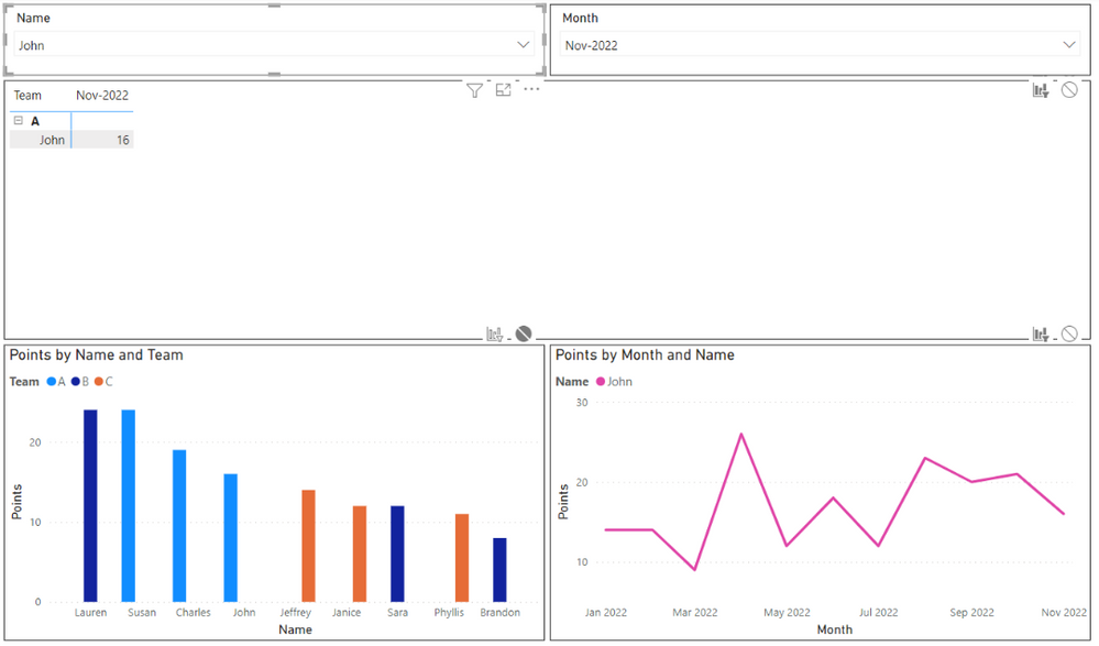
Hello, this is a simplified version of what I'm trying to do: I'm creating a report on a person, where all visuals are populated based on the name is selected from the main slicer, and from the report month slicer. However, editing the interactions doesn't give me what I'm looking for with the bottom 2 visuals.
For the the bottom left visual, I want it to be filtered for month (i.e. just show Nov 2022 data). But I also want it to filter for all members of Team A (since we've chosen John in the slicer, and he's on Team A), and I want it to highlight John among the other Team A members. Any advice on how to set this up?
For the bottom right visual, I want it to be filtered for name (i.e. show John only). But rather than showing a single data point for Nov 2022, I want the line graph to show the trend in John's points over the past 6 months, as of the selected month (i.e. Jun-Nov 2022, since Nov 2022 is selected from the slicer). Any advice on how to set this up?
Thanks for your help. I'm new to this, so apologies if I'm missing an easy solution.
- Mark as New
- Bookmark
- Subscribe
- Mute
- Subscribe to RSS Feed
- Permalink
- Report Inappropriate Content
Hi @rpshanley
Thanks for reaching out to us.
>> want it to highlight John among the other Team A members.
you can create a measure to realize it. please refer to conditional formatting, Apply conditional table formatting in Power BI - Power BI | Microsoft Learn
Power BI: Using a measure to set up conditional formatting - Xylos Learning
Best Regards,
Community Support Team _Tang
If this post helps, please consider Accept it as the solution to help the other members find it more quickly.
Helpful resources

Power BI Dataviz World Championships
The Power BI Data Visualization World Championships is back! Get ahead of the game and start preparing now!

| User | Count |
|---|---|
| 41 | |
| 38 | |
| 36 | |
| 31 | |
| 28 |
| User | Count |
|---|---|
| 128 | |
| 88 | |
| 79 | |
| 68 | |
| 63 |


