FabCon is coming to Atlanta
Join us at FabCon Atlanta from March 16 - 20, 2026, for the ultimate Fabric, Power BI, AI and SQL community-led event. Save $200 with code FABCOMM.
Register now!- Power BI forums
- Get Help with Power BI
- Desktop
- Service
- Report Server
- Power Query
- Mobile Apps
- Developer
- DAX Commands and Tips
- Custom Visuals Development Discussion
- Health and Life Sciences
- Power BI Spanish forums
- Translated Spanish Desktop
- Training and Consulting
- Instructor Led Training
- Dashboard in a Day for Women, by Women
- Galleries
- Data Stories Gallery
- Themes Gallery
- Contests Gallery
- QuickViz Gallery
- Quick Measures Gallery
- Visual Calculations Gallery
- Notebook Gallery
- Translytical Task Flow Gallery
- TMDL Gallery
- R Script Showcase
- Webinars and Video Gallery
- Ideas
- Custom Visuals Ideas (read-only)
- Issues
- Issues
- Events
- Upcoming Events
The Power BI Data Visualization World Championships is back! Get ahead of the game and start preparing now! Learn more
- Power BI forums
- Forums
- Get Help with Power BI
- Desktop
- Creating multi select slicer measure for a dynamic...
- Subscribe to RSS Feed
- Mark Topic as New
- Mark Topic as Read
- Float this Topic for Current User
- Bookmark
- Subscribe
- Printer Friendly Page
- Mark as New
- Bookmark
- Subscribe
- Mute
- Subscribe to RSS Feed
- Permalink
- Report Inappropriate Content
Creating multi select slicer measure for a dynamic line chart
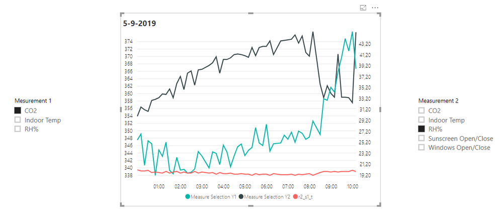
Hi all, I have been successfully been able to make a dynamically customizable dual y-axis line chart using measures and slicing it. But, I want to hear if it can be taken to the next level and using the slicers to make multi select, and hence get multiple lines rather than the current limit of 2 selections.
Current setup is using SWITCH and a manually entered table to direct to the data source.
This is where I am at -
Any way to upgrade on the current DAX query to get to a multi select dual axis line chart?
Thanks, Ziyad
Solved! Go to Solution.
- Mark as New
- Bookmark
- Subscribe
- Mute
- Subscribe to RSS Feed
- Permalink
- Report Inappropriate Content
HI, @Anonymous
You could try this way as below:
For all your basic measure add a if conditional like below:
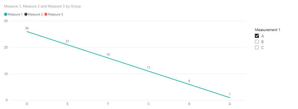
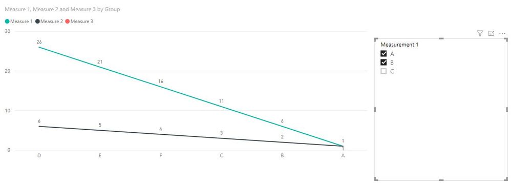
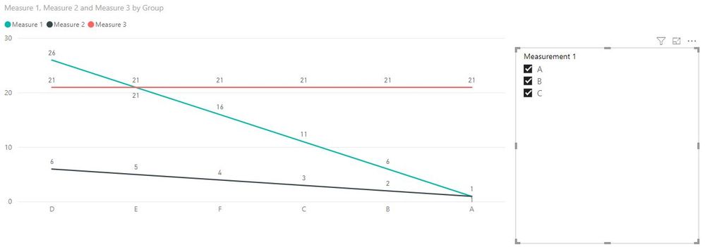
Measure 1 = IF("A" IN VALUES('Y axis 1'[Measurement 1]), CALCULATE(SUM(Table1[Index])))
Measure 2 = IF("B" IN VALUES('Y axis 1'[Measurement 1]),CALCULATE(SUM(Table1[Sales])))
Measure 3 = IF("C" IN VALUES('Y axis 1'[Measurement 1]), CALCULATE(SUM(Table1[Sales]),ALL(Table1)))
Then drag all these measrue into line Values.
Result:
You could use the same logic for 'Y axis 2',
Here is sample pbix file, please try it.
Best Regards,
Lin
If this post helps, then please consider Accept it as the solution to help the other members find it more quickly.
- Mark as New
- Bookmark
- Subscribe
- Mute
- Subscribe to RSS Feed
- Permalink
- Report Inappropriate Content
Similar to the above use case for adding dynamic measure for a line chart, how do I create a measure to select columns dynamically based on the selection I make in the measure.
For Eg: I have three measures A,B,C. Upon selecting A,B -> I get a table like below
| Content | A | B |
Just selecting B:
| Content | B |
Selecting B,C
| Content | B | C |
and so on..
- Mark as New
- Bookmark
- Subscribe
- Mute
- Subscribe to RSS Feed
- Permalink
- Report Inappropriate Content
HI, @Anonymous
You could try this way as below:
For all your basic measure add a if conditional like below:
Measure 1 = IF("A" IN VALUES('Y axis 1'[Measurement 1]), CALCULATE(SUM(Table1[Index])))
Measure 2 = IF("B" IN VALUES('Y axis 1'[Measurement 1]),CALCULATE(SUM(Table1[Sales])))
Measure 3 = IF("C" IN VALUES('Y axis 1'[Measurement 1]), CALCULATE(SUM(Table1[Sales]),ALL(Table1)))
Then drag all these measrue into line Values.
Result:
You could use the same logic for 'Y axis 2',
Here is sample pbix file, please try it.
Best Regards,
Lin
If this post helps, then please consider Accept it as the solution to help the other members find it more quickly.
- Mark as New
- Bookmark
- Subscribe
- Mute
- Subscribe to RSS Feed
- Permalink
- Report Inappropriate Content
How would you show only selected slicer value on legend? any idea?
Helpful resources

Power BI Dataviz World Championships
The Power BI Data Visualization World Championships is back! Get ahead of the game and start preparing now!

| User | Count |
|---|---|
| 38 | |
| 38 | |
| 37 | |
| 28 | |
| 28 |
| User | Count |
|---|---|
| 124 | |
| 89 | |
| 73 | |
| 66 | |
| 65 |


