Join us at FabCon Vienna from September 15-18, 2025
The ultimate Fabric, Power BI, SQL, and AI community-led learning event. Save €200 with code FABCOMM.
Get registered- Power BI forums
- Get Help with Power BI
- Desktop
- Service
- Report Server
- Power Query
- Mobile Apps
- Developer
- DAX Commands and Tips
- Custom Visuals Development Discussion
- Health and Life Sciences
- Power BI Spanish forums
- Translated Spanish Desktop
- Training and Consulting
- Instructor Led Training
- Dashboard in a Day for Women, by Women
- Galleries
- Data Stories Gallery
- Themes Gallery
- Contests Gallery
- Quick Measures Gallery
- Notebook Gallery
- Translytical Task Flow Gallery
- TMDL Gallery
- R Script Showcase
- Webinars and Video Gallery
- Ideas
- Custom Visuals Ideas (read-only)
- Issues
- Issues
- Events
- Upcoming Events
Enhance your career with this limited time 50% discount on Fabric and Power BI exams. Ends September 15. Request your voucher.
- Power BI forums
- Forums
- Get Help with Power BI
- Desktop
- Creating chart for Count by Count of Count
- Subscribe to RSS Feed
- Mark Topic as New
- Mark Topic as Read
- Float this Topic for Current User
- Bookmark
- Subscribe
- Printer Friendly Page
- Mark as New
- Bookmark
- Subscribe
- Mute
- Subscribe to RSS Feed
- Permalink
- Report Inappropriate Content
Creating chart for Count by Count of Count
Hello I have been struggling to create a chart the way I wanted to for a while now and thought I would ask for help as I can't find any concrete answers.
I have a table formatted as follows
| Date | Name | Valid | Price |
| 1/1/2023 | John | Yes | $1 |
| 1/1/2023 | John | No | $4 |
| 1/1/2023 | Jane | Yes | $1 |
| 1/2/2023 | John | Yes | $3 |
| 1/2/2023 | Gary | No | $2 |
The chart I am looking to display has two slicers that need to apply to it, Date and Valid (I have already created a calendar table and linked it appropriately).
What I am looking to display is a histgram that shows:
X-Axis: The summed price
Y-Axis: The number of Names that had a summed price of x in the selected date range on the Y axis
So in this example
Date Range: 1/1/2023-1/1/2023, Valid: Yes
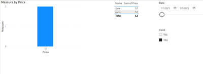
Expect bar of height 2 at price 1 because there are two people who have a total price of 1 in that range of time
Date Range: 1/1/2023-1/2/2023, Valid: No
Expect to see a bar of height 1 at price 2 and 4.
Date Range: 1/1/2023-1/2/2023, Valid: Yes or No
Expect bar of height 1 at price 8, 2, and 1
etc
Solved! Go to Solution.
- Mark as New
- Bookmark
- Subscribe
- Mute
- Subscribe to RSS Feed
- Permalink
- Report Inappropriate Content
Hi @cduggan ,
Please try:
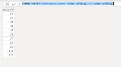
First create a new table for x-axis:
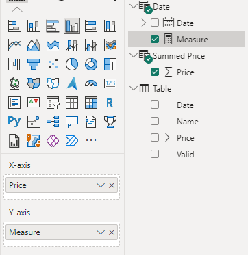
Summed Price = GENERATESERIES(MIN('Table'[Price]),SUM('Table'[Price]))Then apply the measure to the chart:
Measure =
var _a = SUMMARIZE('Table','Table'[Name],"Price",SUM('Table'[Price]))
return CALCULATE(COUNT('Table'[Name]),FILTER(_a,[Price]=SELECTEDVALUE('Summed Price'[Price])))
Final output:
Best Regards,
Jianbo Li
If this post helps, then please consider Accept it as the solution to help the other members find it more quickly.
Helpful resources
| User | Count |
|---|---|
| 71 | |
| 63 | |
| 60 | |
| 49 | |
| 26 |
| User | Count |
|---|---|
| 117 | |
| 75 | |
| 62 | |
| 55 | |
| 43 |


