Join us at the 2025 Microsoft Fabric Community Conference
Microsoft Fabric Community Conference 2025, March 31 - April 2, Las Vegas, Nevada. Use code FABINSIDER for a $400 discount.
Register now- Power BI forums
- Get Help with Power BI
- Desktop
- Service
- Report Server
- Power Query
- Mobile Apps
- Developer
- DAX Commands and Tips
- Custom Visuals Development Discussion
- Health and Life Sciences
- Power BI Spanish forums
- Translated Spanish Desktop
- Training and Consulting
- Instructor Led Training
- Dashboard in a Day for Women, by Women
- Galleries
- Webinars and Video Gallery
- Data Stories Gallery
- Themes Gallery
- Power BI DataViz World Championships Gallery
- Quick Measures Gallery
- R Script Showcase
- COVID-19 Data Stories Gallery
- Community Connections & How-To Videos
- 2021 MSBizAppsSummit Gallery
- 2020 MSBizAppsSummit Gallery
- 2019 MSBizAppsSummit Gallery
- Events
- Ideas
- Custom Visuals Ideas
- Issues
- Issues
- Events
- Upcoming Events
The Power BI DataViz World Championships are on! With four chances to enter, you could win a spot in the LIVE Grand Finale in Las Vegas. Show off your skills.
- Power BI forums
- Forums
- Get Help with Power BI
- Desktop
- Creating Up / Down Bars in visualisation
- Subscribe to RSS Feed
- Mark Topic as New
- Mark Topic as Read
- Float this Topic for Current User
- Bookmark
- Subscribe
- Printer Friendly Page
- Mark as New
- Bookmark
- Subscribe
- Mute
- Subscribe to RSS Feed
- Permalink
- Report Inappropriate Content
Creating an Excel "Up Down" Bar chart replica in Power BI
I've been struggling with this for a while and I am posting my first question to this forum hoping for brains trust assistance.
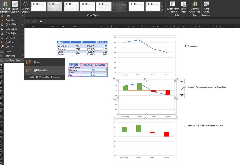
I've been trying to replicate a "Up/Down" bar chart in Power BI showing the difference of a ratio from parity or 1. Essentially it is used to track ratios of two metrics ( A and B or A/B) to each other. If the ratio is 1, then A = B , if it is less than 1 ( say 0.8) then there could be say an overestimation of B the demoninator and if it is greater than 1, then A could be overestimated.
An example of data could be as such.
| Store | A | B | Ratio A : B |
| Alice Springs | 3041 | 2533.95 | 1.20 |
| Brisbane | 8742 | 6723.95 | 1.30 |
| Cairns | 1031 | 1085.01 | 0.95 |
| Darwin | 8269 | 10208.09 | 0.81 |
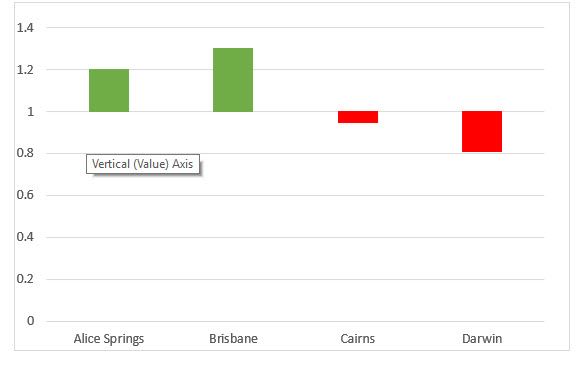
This type of chart is relatively easy to plot in Excel by plotting two lines - one series is the ratio of A:B and the other is parity (1) , and then selecting Up/Down bars in the Design Menu, and then setting the two lines to "no line". The key point is that the values "hang off" y=1.
I know enough in Power BI to be dangerous but I can't seem to replicate this visualisation. I am quite happy to do normal variance plots, but certain people HAVE to see the graph as in my screen shot ( labelled 3)
I have begun delving into using ggplot and custom R visuals and lots to pick up.
My question is has anyone tried this before in Power BI? Any pointers at all would be so very appreciated.
Solved! Go to Solution.
- Mark as New
- Bookmark
- Subscribe
- Mute
- Subscribe to RSS Feed
- Permalink
- Report Inappropriate Content
Hi @mwimberger
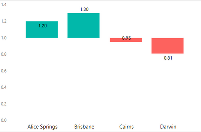
Here is a suggestion that I hope is close to what you want.
It is a similar approach to the "old-fashioned" way of creating waterfall or Gantt charts in Excel and produces a visual like this:
- Assuming your table contains a column Ratio A : B already, create a series of measures:
Average Ratio =
AVERAGE ( Data[Ratio A : B] ) //Arbitrary aggregation if each row is a data point

Difference from 1 =
[Average Ratio] - 1

Blank space =
MIN ( 1, [Average Ratio] )

Difference from 1 Absolute (Pos) =
MAX ( [Difference from 1], 0 )

Difference from 1 Absolute (Neg) =
- MIN ( [Difference from 1], 0 )
- Create a Line and Stacked Column Chart
(or you could just use a Stacked Column Chart if you don't need data labels) - Put Store on the Shared Axis
- Put Blank Space, Difference from 1 Absolute (Pos), and Difference from 1 Absolute (Neg) in Column Values
- Put Average Ratio in Line Values
(this is just to allow data labels showing the ratio itself) - Adjust Data colors so that Difference from 1 Absolute (Pos) and Difference from 1 Absolute (Neg) are appropriate colours, and Blank space is white (or other background colour)
- Change the line Stroke Width to zero
- Add data labels (if required) just for the Average Ratio series
- I also played with a report page tooltip, to ensure only the ratio is displayed in the tooltip (this could be tweaked)
One drawback is that the Blank space column values can't be transparent (at the moment anyway) so they have to be white (or a background colour), which means gridlines don't display nicely.
There could well be another custom visual out there that would b more suitable but I couldn't get any to work suitably (played with some of the Gantt & bullet visuals).
Regards,
Owen 🙂
- Mark as New
- Bookmark
- Subscribe
- Mute
- Subscribe to RSS Feed
- Permalink
- Report Inappropriate Content
You may try adding the following calculated columns, then drag to Value and Color saturation.
Column =
Table1[Ratio A : B] - 1
Column 2 =
SIGN ( Table1[Column] )
If this post helps, then please consider Accept it as the solution to help the other members find it more quickly.
- Mark as New
- Bookmark
- Subscribe
- Mute
- Subscribe to RSS Feed
- Permalink
- Report Inappropriate Content
Hi there community!
Been struggling with this for a whiile and I am posting my first question to this forum hoping for Brains Trust assistance
I've been trying to replicate a "Up/Down" bar chart in Power BI showing the difference of a ratio from parity or 1 (example below)
Essentially it is used to track ratios of two metrics ( A and B or A/B) to each other. If the ratio is 1, then A = B , if it is less than 1 ( say 0.8) then there could be say an overestimation of B the demoninator and if it is greater than 1, then A could be overestimated.
An example of data could be as such.
| Store | A | B | Ratio A : B |
| Alice Springs | 3041 | 2533.95 | 1.20 |
| Brisbane | 8742 | 6723.95 | 1.30 |
| Cairns | 1031 | 1085.01 | 0.95 |
| Darwin | 8269 | 10208.09 | 0.81 |
This type of chart is relatively easy to plot in Excel by plotting two lines - one series is the ratio of A:B and the other is parity (1) , and then selecting Up/Down bars in the Design Menu, and then setting the two lines to "No Line". The key point is that the values "hang off" y=1.
I know enough in Power BI to be dangerous but I can't seem to replicate this visualisation. I am quite happy to do normal variance plots, but certain people HAVE to see the graph as in my screen shot ( labelled 3)
I have begun delving into using ggplot and custom R visuals and still lots to pick up!
My question is has anyone tried making this visualisation before in Power BI? Any pointers at all would be hugely appreciated.
Thanks in advance from sunny (weirdly) Melbourne ![]()
- Mark as New
- Bookmark
- Subscribe
- Mute
- Subscribe to RSS Feed
- Permalink
- Report Inappropriate Content
Hi there community!
Been struggling with this for a whiile and I am posting my first question to this forum hoping for Brains Trust assistance
I've been trying to replicate a "Up/Down" bar chart in Power BI showing the difference of a ratio from parity or 1 (example below)
Essentially it is used to track ratios of two metrics ( A and B or A/B) to each other. If the ratio is 1, then A = B , if it is less than 1 ( say 0.8) then there could be say an overestimation of B the demoninator and if it is greater than 1, then A could be overestimated.
An example of data could be as such.
| Store | A | B | Ratio A : B |
| Alice Springs | 3041 | 2533.95 | 1.20 |
| Brisbane | 8742 | 6723.95 | 1.30 |
| Cairns | 1031 | 1085.01 | 0.95 |
| Darwin | 8269 | 10208.09 | 0.81 |
This type of chart is relatively easy to plot in Excel by plotting two lines - one series is the ratio of A:B and the other is parity (1) , and then selecting Up/Down bars in the Design Menu, and then setting the two lines to "No Line". The key point is that the values "hang off" y=1.
I know enough in Power BI to be dangerous but I can't seem to replicate this visualisation. I am quite happy to do normal variance plots, but certain people HAVE to see the graph as in my screen shot ( labelled 3)
I have begun delving into using ggplot and custom R visuals and still lots to pick up!
My question is has anyone tried making this visualisation before in Power BI? Any pointers at all would be hugely appreciated.
Thanks in advance from sunny (weirdly) Melbourne
- Mark as New
- Bookmark
- Subscribe
- Mute
- Subscribe to RSS Feed
- Permalink
- Report Inappropriate Content
Hi @mwimberger
Here is a suggestion that I hope is close to what you want.
It is a similar approach to the "old-fashioned" way of creating waterfall or Gantt charts in Excel and produces a visual like this:
- Assuming your table contains a column Ratio A : B already, create a series of measures:
Average Ratio =
AVERAGE ( Data[Ratio A : B] ) //Arbitrary aggregation if each row is a data point

Difference from 1 =
[Average Ratio] - 1

Blank space =
MIN ( 1, [Average Ratio] )

Difference from 1 Absolute (Pos) =
MAX ( [Difference from 1], 0 )

Difference from 1 Absolute (Neg) =
- MIN ( [Difference from 1], 0 )
- Create a Line and Stacked Column Chart
(or you could just use a Stacked Column Chart if you don't need data labels) - Put Store on the Shared Axis
- Put Blank Space, Difference from 1 Absolute (Pos), and Difference from 1 Absolute (Neg) in Column Values
- Put Average Ratio in Line Values
(this is just to allow data labels showing the ratio itself) - Adjust Data colors so that Difference from 1 Absolute (Pos) and Difference from 1 Absolute (Neg) are appropriate colours, and Blank space is white (or other background colour)
- Change the line Stroke Width to zero
- Add data labels (if required) just for the Average Ratio series
- I also played with a report page tooltip, to ensure only the ratio is displayed in the tooltip (this could be tweaked)
One drawback is that the Blank space column values can't be transparent (at the moment anyway) so they have to be white (or a background colour), which means gridlines don't display nicely.
There could well be another custom visual out there that would b more suitable but I couldn't get any to work suitably (played with some of the Gantt & bullet visuals).
Regards,
Owen 🙂
- Mark as New
- Bookmark
- Subscribe
- Mute
- Subscribe to RSS Feed
- Permalink
- Report Inappropriate Content
Hi Owen
Your help has been instrumental in solving this issue for me. Thank you!!
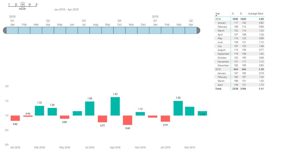
I managed to successfully adjust the visualization to deal with dates.
Here is a link for anyone that would like to use this as another example.
Cheers
Manfred
- Mark as New
- Bookmark
- Subscribe
- Mute
- Subscribe to RSS Feed
- Permalink
- Report Inappropriate Content
Hi Manfred - looks like you solved the date version before I saw your reply - good work 🙂
Glad I could help 🙂
Cheers
Owen
- Mark as New
- Bookmark
- Subscribe
- Mute
- Subscribe to RSS Feed
- Permalink
- Report Inappropriate Content
Owen, this is awesome. I have a question in terms of the X Axis and this is my bad . I tried to give a simple explanation and used arbitary categories on the axis (Alice Springs etc) and assumed I could modify it from there.
If the axis was a date , or a date hierachy, would this still work? I tried to modify the measures and created another visualisation , but it falls over. ![]()
Here is a variation of the table , with dates
| Date | A | B | Ratio A : B |
| 1/01/2018 | 117 | 142 | 0.82 |
| 1/02/2018 | 108 | 113 | 0.96 |
| 1/03/2018 | 152 | 114 | 1.33 |
| 1/04/2018 | 137 | 109 | 1.26 |
| 1/05/2018 | 110 | 123 | 0.89 |
| 1/06/2018 | 139 | 121 | 1.15 |
| 1/07/2018 | 197 | 133 | 1.48 |
| 1/08/2018 | 115 | 150 | 0.77 |
| 1/09/2018 | 176 | 108 | 1.63 |
| 1/10/2018 | 132 | 195 | 0.68 |
| 1/11/2018 | 131 | 117 | 1.12 |
| 1/12/2018 | 182 | 195 | 0.93 |
| 1/01/2019 | 147 | 185 | 0.79 |
| 1/02/2019 | 160 | 107 | 1.50 |
| 1/03/2019 | 196 | 151 | 1.30 |
| 1/04/2019 | 139 | 121 | 1.15 |
Thank you so much for your help so far!
Cheers
Manfred
Helpful resources

Join us at the Microsoft Fabric Community Conference
March 31 - April 2, 2025, in Las Vegas, Nevada. Use code MSCUST for a $150 discount!

Power BI Monthly Update - February 2025
Check out the February 2025 Power BI update to learn about new features.

Join our Community Sticker Challenge 2025
If you love stickers, then you will definitely want to check out our Community Sticker Challenge!

| User | Count |
|---|---|
| 84 | |
| 69 | |
| 68 | |
| 39 | |
| 37 |


