FabCon is coming to Atlanta
Join us at FabCon Atlanta from March 16 - 20, 2026, for the ultimate Fabric, Power BI, AI and SQL community-led event. Save $200 with code FABCOMM.
Register now!- Power BI forums
- Get Help with Power BI
- Desktop
- Service
- Report Server
- Power Query
- Mobile Apps
- Developer
- DAX Commands and Tips
- Custom Visuals Development Discussion
- Health and Life Sciences
- Power BI Spanish forums
- Translated Spanish Desktop
- Training and Consulting
- Instructor Led Training
- Dashboard in a Day for Women, by Women
- Galleries
- Data Stories Gallery
- Themes Gallery
- Contests Gallery
- QuickViz Gallery
- Quick Measures Gallery
- Visual Calculations Gallery
- Notebook Gallery
- Translytical Task Flow Gallery
- TMDL Gallery
- R Script Showcase
- Webinars and Video Gallery
- Ideas
- Custom Visuals Ideas (read-only)
- Issues
- Issues
- Events
- Upcoming Events
The Power BI Data Visualization World Championships is back! Get ahead of the game and start preparing now! Learn more
- Power BI forums
- Forums
- Get Help with Power BI
- Desktop
- Creating a percentage graph
- Subscribe to RSS Feed
- Mark Topic as New
- Mark Topic as Read
- Float this Topic for Current User
- Bookmark
- Subscribe
- Printer Friendly Page
- Mark as New
- Bookmark
- Subscribe
- Mute
- Subscribe to RSS Feed
- Permalink
- Report Inappropriate Content
Creating a percentage graph
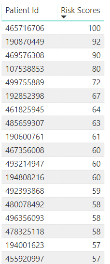
I am attempting to show a distribution of patient risk across a 1 - 100 scale. I can produce the following graph that shows deitentified patient ids and their total risk score.
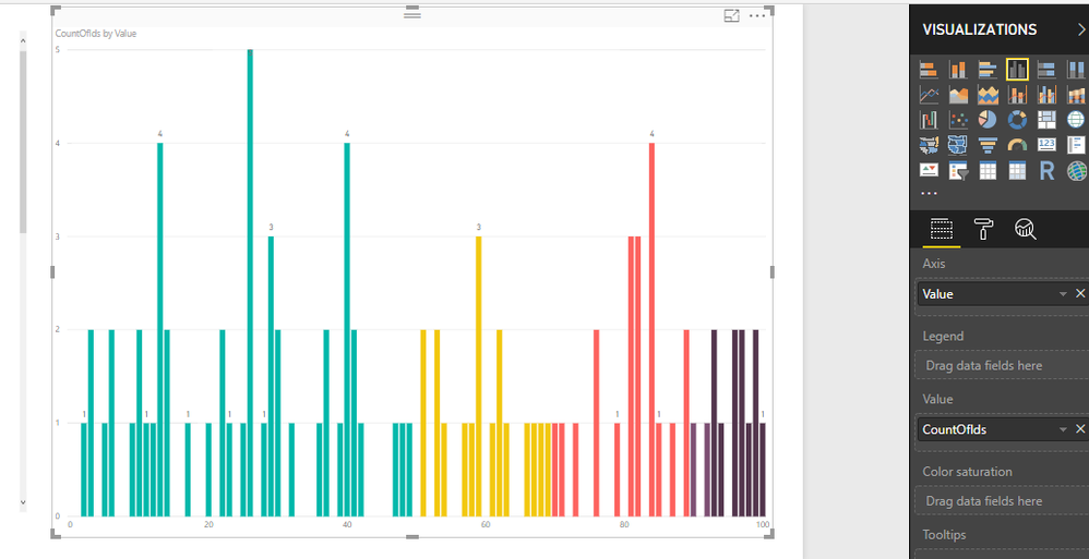
What I would ultimately like to do with this data is create the following chart showing the total percentage on the x axis and the count of patients in each bucket.
I just cannot seem to figure out how to use accomplish this. It appears that a good use case for this is binning, but my final output is a calculated field and the option for a new group is not available. Any suggestions?
- Mark as New
- Bookmark
- Subscribe
- Mute
- Subscribe to RSS Feed
- Permalink
- Report Inappropriate Content
Hmmm... I am not getting much feedback on this.
Can anyone tell me if it is possible to take a result set (from a view) (calculated from several calculated measures) like the following:
and turn it into a new table? I am sure that I could then use binning to achieve the visual that I need.
- Mark as New
- Bookmark
- Subscribe
- Mute
- Subscribe to RSS Feed
- Permalink
- Report Inappropriate Content
Hi, If your BINs are 0 to 100 and Risk Score is a WholeNumber between 0 to 100. You can try with this:
1. Create a Table with Bins:
Modeling--New Table
Bins = GENERATESERIES(0;100;1 )
2. Create a CountofPatientID
CountOfIds =
CALCULATE (
    COUNT ( Table2[PatientID] );
    FILTER ( Table2; [AVG Risk Score] = SELECTEDVALUE ( Bins[Value] ) )
)
AVG Risk Score is your measure
3. Insert a Visual:
To select the colors you can work with Data Colors (But you need to assign to each bin the color )
Let me know if works on your side
Regards
Victor
Lima . Peru
Lima - Peru
- Mark as New
- Bookmark
- Subscribe
- Mute
- Subscribe to RSS Feed
- Permalink
- Report Inappropriate Content
Hi @powerdev,
Aggree with the solution you mentioned that to use "Bin" to generate new group. But what do you mean "my final output is a calculated field and the option for a new group is not available"? After creating a bin based on a specific field, it will dynamically add a calculated column in table view, you just need to add this new field into X-axis of column chart.
Regards,
Yuliana Gu
If this post helps, then please consider Accept it as the solution to help the other members find it more quickly.
- Mark as New
- Bookmark
- Subscribe
- Mute
- Subscribe to RSS Feed
- Permalink
- Report Inappropriate Content
Thanks @v-yulgu-msft for the reply.
What I mean is that the "Risk Score" column above is itself a calculated measure. When I select it and try to select "New Group" from the menu it is greyed out. I am thinking that creating a group from a calculated measure isn't possible. Is this correct?
Helpful resources

Power BI Dataviz World Championships
The Power BI Data Visualization World Championships is back! Get ahead of the game and start preparing now!

| User | Count |
|---|---|
| 38 | |
| 36 | |
| 33 | |
| 32 | |
| 29 |
| User | Count |
|---|---|
| 129 | |
| 88 | |
| 79 | |
| 68 | |
| 63 |


