Join us at FabCon Vienna from September 15-18, 2025
The ultimate Fabric, Power BI, SQL, and AI community-led learning event. Save €200 with code FABCOMM.
Get registered- Power BI forums
- Get Help with Power BI
- Desktop
- Service
- Report Server
- Power Query
- Mobile Apps
- Developer
- DAX Commands and Tips
- Custom Visuals Development Discussion
- Health and Life Sciences
- Power BI Spanish forums
- Translated Spanish Desktop
- Training and Consulting
- Instructor Led Training
- Dashboard in a Day for Women, by Women
- Galleries
- Data Stories Gallery
- Themes Gallery
- Contests Gallery
- Quick Measures Gallery
- Notebook Gallery
- Translytical Task Flow Gallery
- TMDL Gallery
- R Script Showcase
- Webinars and Video Gallery
- Ideas
- Custom Visuals Ideas (read-only)
- Issues
- Issues
- Events
- Upcoming Events
Enhance your career with this limited time 50% discount on Fabric and Power BI exams. Ends August 31st. Request your voucher.
- Power BI forums
- Forums
- Get Help with Power BI
- Desktop
- Creating a new table and use in visual not getting...
- Subscribe to RSS Feed
- Mark Topic as New
- Mark Topic as Read
- Float this Topic for Current User
- Bookmark
- Subscribe
- Printer Friendly Page
- Mark as New
- Bookmark
- Subscribe
- Mute
- Subscribe to RSS Feed
- Permalink
- Report Inappropriate Content
Creating a new table and use in visual not getting filtered
I created a new table where I grouped entries in the original data source, then I used this table in a filter. Now I have a slicer and am using this slicer in my page, and it's filtering all other visuals except for this visual that is using the table in its values. Is this normal? How can we fix it?
- Mark as New
- Bookmark
- Subscribe
- Mute
- Subscribe to RSS Feed
- Permalink
- Report Inappropriate Content
I have a similar problem. I've created a linked table in power query, grouped in by and then created a visual table on the board. And all the page's filters do not work with this new table. I've check the iteractions in the Format, everything is on.
In the end, I had to create dimentional tables, relate them to the major and grouped tables and create new filters based on these dimetional tables.
- Mark as New
- Bookmark
- Subscribe
- Mute
- Subscribe to RSS Feed
- Permalink
- Report Inappropriate Content
Hi @DevM01 ,
Do you have an active relationship between these table?
Please try to create a relationship with 'year' column and see if the problem was solved.
Best Regards,
Jay
- Mark as New
- Bookmark
- Subscribe
- Mute
- Subscribe to RSS Feed
- Permalink
- Report Inappropriate Content
Maybe the is nothing to filter ? You could create another visual (not the pie chart) to check what the details of the pie chart and see if its wrong or not.
Without some details and pictures i wont be able to help anymore. Bacause of the lack of info and details I am basically guessing what the problem can be
- Mark as New
- Bookmark
- Subscribe
- Mute
- Subscribe to RSS Feed
- Permalink
- Report Inappropriate Content
Sorry dont get it
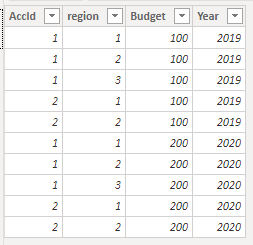
My simple table
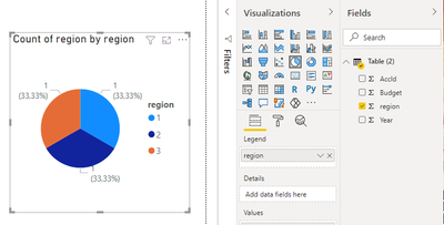
My PieChart
You want slicers ?
- Mark as New
- Bookmark
- Subscribe
- Mute
- Subscribe to RSS Feed
- Permalink
- Report Inappropriate Content
Hi @Anonymous I have a slicer already for the year, to filter years. Now when I filter based on the years, it filters other visuals on the page, but it doesn't filter the visual I created from the new table.
- Mark as New
- Bookmark
- Subscribe
- Mute
- Subscribe to RSS Feed
- Permalink
- Report Inappropriate Content
Then i think we would more info.
Your data model and some sample data would help
- Mark as New
- Bookmark
- Subscribe
- Mute
- Subscribe to RSS Feed
- Permalink
- Report Inappropriate Content
@Anonymous So my data model includes these values:
AccountID, Region, Budget, Year
Account ID is not unique, so it can be repeated. I want to group by all account IDs, then show a pie chart representing all regions. So what I did was creating a table with this formula:
NewRegions = GROUPBY(reqs, reqs[AccountID], reqs[Region])
This gave me a table with all regions grouped by account ID. I added this to a pie chart where legend = Region and Values = Count of Region
I think it's not filtering because I didn't include the year with the GROUPBY formula since my new table doesn't include a year column, so I changed my formula to this:
NewRegions = GROUPBY(reqs, reqs[AccountID], reqs[Region], reqs[Year])
But it didn't work as well with the filtering, moreover the data coming like this is wrong, since I have around 3 entries for each AccountID and now I have the number of records X 3.
- Mark as New
- Bookmark
- Subscribe
- Mute
- Subscribe to RSS Feed
- Permalink
- Report Inappropriate Content
Select the visual from which you are selecting
Go To Format in your Ribbon
Select Edit interactions
If the stop sign is turned on the interaction between the visuals is disabled. Enable it
- Mark as New
- Bookmark
- Subscribe
- Mute
- Subscribe to RSS Feed
- Permalink
- Report Inappropriate Content
@Anonymous which visual? the slicer or the visual where I have the table? I selected both, and disabled the stop sign on both, nothing happened.
Helpful resources
| User | Count |
|---|---|
| 77 | |
| 75 | |
| 36 | |
| 31 | |
| 29 |
| User | Count |
|---|---|
| 93 | |
| 81 | |
| 57 | |
| 48 | |
| 48 |


