FabCon is coming to Atlanta
Join us at FabCon Atlanta from March 16 - 20, 2026, for the ultimate Fabric, Power BI, AI and SQL community-led event. Save $200 with code FABCOMM.
Register now!- Power BI forums
- Get Help with Power BI
- Desktop
- Service
- Report Server
- Power Query
- Mobile Apps
- Developer
- DAX Commands and Tips
- Custom Visuals Development Discussion
- Health and Life Sciences
- Power BI Spanish forums
- Translated Spanish Desktop
- Training and Consulting
- Instructor Led Training
- Dashboard in a Day for Women, by Women
- Galleries
- Data Stories Gallery
- Themes Gallery
- Contests Gallery
- QuickViz Gallery
- Quick Measures Gallery
- Visual Calculations Gallery
- Notebook Gallery
- Translytical Task Flow Gallery
- TMDL Gallery
- R Script Showcase
- Webinars and Video Gallery
- Ideas
- Custom Visuals Ideas (read-only)
- Issues
- Issues
- Events
- Upcoming Events
The Power BI Data Visualization World Championships is back! Get ahead of the game and start preparing now! Learn more
- Power BI forums
- Forums
- Get Help with Power BI
- Desktop
- Re: Create column filled with measures
- Subscribe to RSS Feed
- Mark Topic as New
- Mark Topic as Read
- Float this Topic for Current User
- Bookmark
- Subscribe
- Printer Friendly Page
- Mark as New
- Bookmark
- Subscribe
- Mute
- Subscribe to RSS Feed
- Permalink
- Report Inappropriate Content
Create column filled with measures
I have multiple measures (six in total, representing quarters of a year Q1,Q2,etc) that are counts from a column. I would like to create a new column with these six values and add the the column to an existing table of 6 rows x n columns. Is this possible?
Later I will get more measures from recent Quarter Q1 of 2018 and I would like to add this information as a new row to the table. I would appreciate advice for this problem too.
Thanks,
Oskari
- Mark as New
- Bookmark
- Subscribe
- Mute
- Subscribe to RSS Feed
- Permalink
- Report Inappropriate Content
Hi @OskariNi,
You cannot add measures in a column.
You can drag these measures in a table or matrix along with your other columns to get the result.
If you desire to achieve calculation at row level, then you should create Calculated Columns instead of measures.
It woule be better if you post some sample data and explain what your output should be like, then we will be able to help you precisely.
Prateek Raina
- Mark as New
- Bookmark
- Subscribe
- Mute
- Subscribe to RSS Feed
- Permalink
- Report Inappropriate Content
Here is a excel version of the table I want to generate in power BI. The markerd values are these measures I calculated from a larger dataset using COUNTA and FILTER in the following way
Q12015 delay over 2h = CALCULATE(COUNTA(Test[Delay]);FILTER(ALL(Test[Delay]);Test[Delay]>0,08333335);FILTER(ALL(Test[Date].[Year]);Test[Date].[Year]=2015);FILTER(ALL(Test[Date].[MonthNo]);Test[Date].[MonthNo]<7))
Now that I have these measures I would like to generate a table as in the picture and add the measures as columns circled with blue, I don't know if the Calculated Columns work because I need to put a different DAX function for each row (because the Quarter changes)
- Mark as New
- Bookmark
- Subscribe
- Mute
- Subscribe to RSS Feed
- Permalink
- Report Inappropriate Content
Hi @OskariNi,
Here is how you can do it in Power BI:
1. Pull in your columns required for the measure calculation and other columns if you need to showcase them in the table.
2. When the data is loaded in Power BI, right click on your table and Create Measure. Use the same DAX to create your 3 measures which you used in Excel.
3. When all the measures are created, Drag a table visual on the canvas.
4. Drag all the 5 columns which you showcased in the screenshot.
5. Now start dragging your 3 measures, you will see the exact same table as it was in Excel.
Let me know if you face any issues.
Prateek Raina
- Mark as New
- Bookmark
- Subscribe
- Mute
- Subscribe to RSS Feed
- Permalink
- Report Inappropriate Content
Hi @prateekraina,
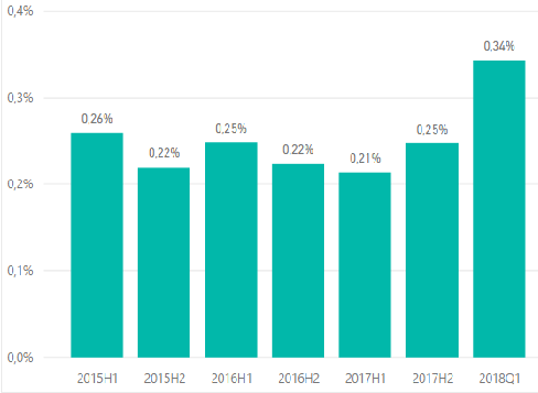
Thank's for the reply. The thing is that I don't really want to see the table on the canvas. I wan't to have the table as data in the FIELDS part and then use it to draw a bar chart like this:
Thanks, Oskari
- Mark as New
- Bookmark
- Subscribe
- Mute
- Subscribe to RSS Feed
- Permalink
- Report Inappropriate Content
Hi @OskariNi,
Well, that will simply increase the data size of the report.
You can create the bar chart without having to do so.
Still, if you want to do that only, then you need to create Calculated Columns instead of measure to achieve that. However, i doubt that you present DAX formula may not work as is, you will have to change it to get same results as measure.
If you want to go with ideal scenario, you must use measures.
Prateek Raina
- Mark as New
- Bookmark
- Subscribe
- Mute
- Subscribe to RSS Feed
- Permalink
- Report Inappropriate Content
Hi, @prateekraina
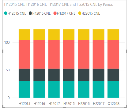
How can I create a bar chart if the X-axis is defined with a column of periods (H1,H2...) and the values are defined with measures. I can't figure it out. If I just add the measures individually in the Values field the result is this
- Mark as New
- Bookmark
- Subscribe
- Mute
- Subscribe to RSS Feed
- Permalink
- Report Inappropriate Content
I am sorry but I am not able to undertstand what you actually require.
Columns in the snapshot of excel are something else and what you are showing in chart is different.
Please tell you requirement clearly as in What do you want in X Axis and What in Y.
Provide some sample data/screenshots so that we can help you better.
Prateek Raina
- Mark as New
- Bookmark
- Subscribe
- Mute
- Subscribe to RSS Feed
- Permalink
- Report Inappropriate Content
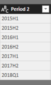
Lets say I have these percentage values that are in the first bar chart above (0,26% 0,22% 0,25%...) as 7 measures. Then I have a Column that has the corresponding 7 periods
So I am asking if I can create a bar chart with these 7 measures (VALUES) and one column (AXIS)?
Can power BI somehow link these measures and column cells (ex 0,26% is the value for period 2015H1). If not can I create a new column that has the 7 measures in 7 cells and use this column as VALUES in the bar chart?
Oskari
Helpful resources

Power BI Dataviz World Championships
The Power BI Data Visualization World Championships is back! Get ahead of the game and start preparing now!

| User | Count |
|---|---|
| 37 | |
| 37 | |
| 33 | |
| 32 | |
| 29 |
| User | Count |
|---|---|
| 130 | |
| 88 | |
| 82 | |
| 68 | |
| 64 |


