FabCon is coming to Atlanta
Join us at FabCon Atlanta from March 16 - 20, 2026, for the ultimate Fabric, Power BI, AI and SQL community-led event. Save $200 with code FABCOMM.
Register now!- Power BI forums
- Get Help with Power BI
- Desktop
- Service
- Report Server
- Power Query
- Mobile Apps
- Developer
- DAX Commands and Tips
- Custom Visuals Development Discussion
- Health and Life Sciences
- Power BI Spanish forums
- Translated Spanish Desktop
- Training and Consulting
- Instructor Led Training
- Dashboard in a Day for Women, by Women
- Galleries
- Data Stories Gallery
- Themes Gallery
- Contests Gallery
- QuickViz Gallery
- Quick Measures Gallery
- Visual Calculations Gallery
- Notebook Gallery
- Translytical Task Flow Gallery
- TMDL Gallery
- R Script Showcase
- Webinars and Video Gallery
- Ideas
- Custom Visuals Ideas (read-only)
- Issues
- Issues
- Events
- Upcoming Events
The Power BI Data Visualization World Championships is back! Get ahead of the game and start preparing now! Learn more
- Power BI forums
- Forums
- Get Help with Power BI
- Desktop
- Create a graph comparing values of two sliced subg...
- Subscribe to RSS Feed
- Mark Topic as New
- Mark Topic as Read
- Float this Topic for Current User
- Bookmark
- Subscribe
- Printer Friendly Page
- Mark as New
- Bookmark
- Subscribe
- Mute
- Subscribe to RSS Feed
- Permalink
- Report Inappropriate Content
Create a graph comparing values of two sliced subgroups
Hello.
Sorry for the bad title. Let me explain the problem with an example.
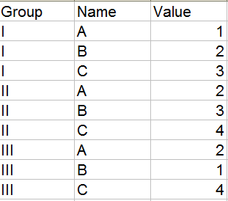
I have two different pages with data on an Excel file. Let's call them P1 and P2:
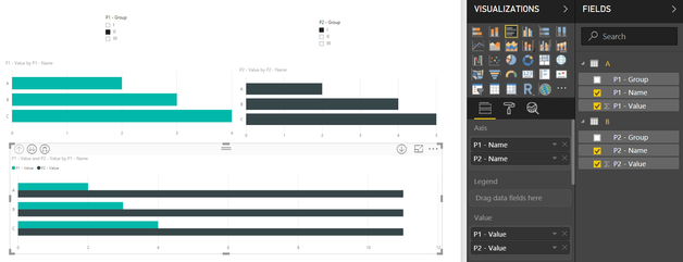
I want to create a graph that compares the values of a group from P1 and a group from P2 with the help of slicers. Here's what I got.
At the top there's a slicer to select a Group (I, II or III) from both P1 and P2 each. In the image, group II is selected for P1 and group I is selected for P2.
In the middle there are two graphs from P1 and P2 respectively, showing the values of each name (A, B and C) from the group selected in each splicer. Both of these are correct, and I want to combine them in a single graph.
At the bottom you can see my attempt at the combined graph (selected). The values from P1 are showed correctly but the values from P2 are wrong, showing the total instead of each value.
This is probably a simple problem but I can't seem to figure it out. I'm trying to find a solution that doesn't require editing the Excel file, but if that's not possible then it doesn't matter.
Thanks in advance.
Solved! Go to Solution.
- Mark as New
- Bookmark
- Subscribe
- Mute
- Subscribe to RSS Feed
- Permalink
- Report Inappropriate Content
Create a Names table like:
Name
A
B
C
Make the obvious relationships to P1 and P2 tables. Use Names[Name] as your Axis.
Follow on LinkedIn
@ me in replies or I'll lose your thread!!!
Instead of a Kudo, please vote for this idea
Become an expert!: Enterprise DNA
External Tools: MSHGQM
YouTube Channel!: Microsoft Hates Greg
Latest book!: DAX For Humans
DAX is easy, CALCULATE makes DAX hard...
- Mark as New
- Bookmark
- Subscribe
- Mute
- Subscribe to RSS Feed
- Permalink
- Report Inappropriate Content
Worked like a charm.
Cheers!
Helpful resources

Power BI Dataviz World Championships
The Power BI Data Visualization World Championships is back! Get ahead of the game and start preparing now!

Power BI Monthly Update - November 2025
Check out the November 2025 Power BI update to learn about new features.

| User | Count |
|---|---|
| 59 | |
| 46 | |
| 42 | |
| 23 | |
| 18 |
| User | Count |
|---|---|
| 193 | |
| 123 | |
| 99 | |
| 67 | |
| 49 |


