FabCon is coming to Atlanta
Join us at FabCon Atlanta from March 16 - 20, 2026, for the ultimate Fabric, Power BI, AI and SQL community-led event. Save $200 with code FABCOMM.
Register now!- Power BI forums
- Get Help with Power BI
- Desktop
- Service
- Report Server
- Power Query
- Mobile Apps
- Developer
- DAX Commands and Tips
- Custom Visuals Development Discussion
- Health and Life Sciences
- Power BI Spanish forums
- Translated Spanish Desktop
- Training and Consulting
- Instructor Led Training
- Dashboard in a Day for Women, by Women
- Galleries
- Data Stories Gallery
- Themes Gallery
- Contests Gallery
- QuickViz Gallery
- Quick Measures Gallery
- Visual Calculations Gallery
- Notebook Gallery
- Translytical Task Flow Gallery
- TMDL Gallery
- R Script Showcase
- Webinars and Video Gallery
- Ideas
- Custom Visuals Ideas (read-only)
- Issues
- Issues
- Events
- Upcoming Events
The Power BI Data Visualization World Championships is back! Get ahead of the game and start preparing now! Learn more
- Power BI forums
- Forums
- Get Help with Power BI
- Desktop
- Create a Matrix that Gathers Dates for each catego...
- Subscribe to RSS Feed
- Mark Topic as New
- Mark Topic as Read
- Float this Topic for Current User
- Bookmark
- Subscribe
- Printer Friendly Page
- Mark as New
- Bookmark
- Subscribe
- Mute
- Subscribe to RSS Feed
- Permalink
- Report Inappropriate Content
Create a Matrix that Gathers Dates for each category, not vice versa (like in Excel)
Hi everyone,
I have data in PowerBI that looks a bit like this:
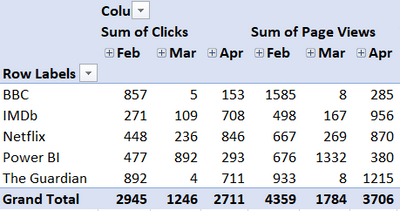
and I want to display it in a matrix like you can in a pivot table like this:
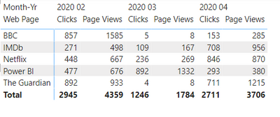
Basically, I want it to gather dates under each category, (rather than what Power BI does which is gather the categories under each date/month like this:
Is there any way around this? It seems kinda basic, but also not really possible.
[I did wonder if a measure could be created which would switch depending on the column, but lack the DAX skills + I'm not sure it gets me any further forward]
Any ideas?
Thank you,
Matt
Solved! Go to Solution.
- Mark as New
- Bookmark
- Subscribe
- Mute
- Subscribe to RSS Feed
- Permalink
- Report Inappropriate Content
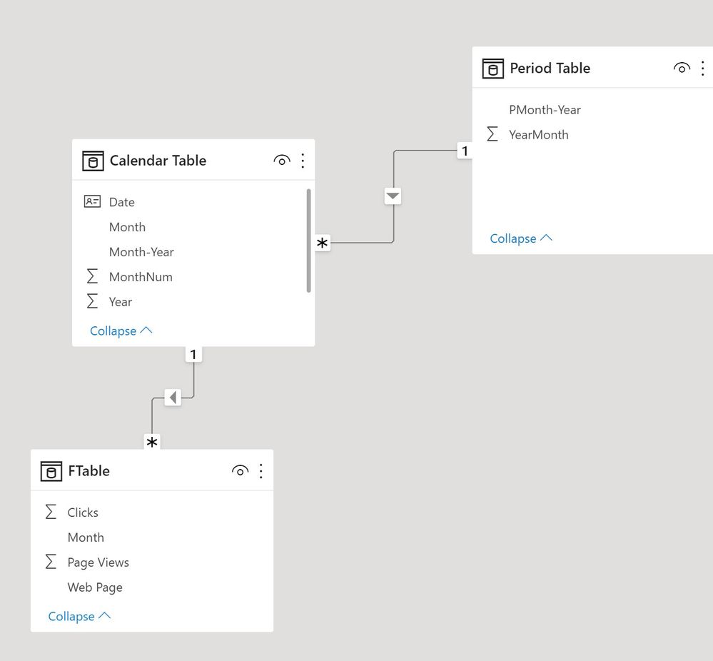
Here is a way. I'm assuming the periods are actual dates, for which I've created a Calendar Table and a Period Table (the latter needed to link to a new header table). If the periods are not dates, all you need in the model is the Period Table.
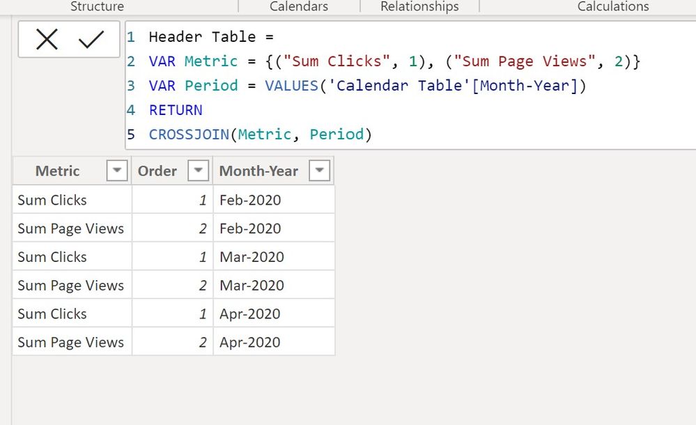
Create a new table using the "New Table" option under Modeling in the ribbon and the following code:
Header Table =
VAR Metric = {("Sum Clicks", 1), ("Sum Page Views", 2)}
VAR Period = VALUES('Calendar Table'[Month-Year])
RETURN
CROSSJOIN(Metric, Period)
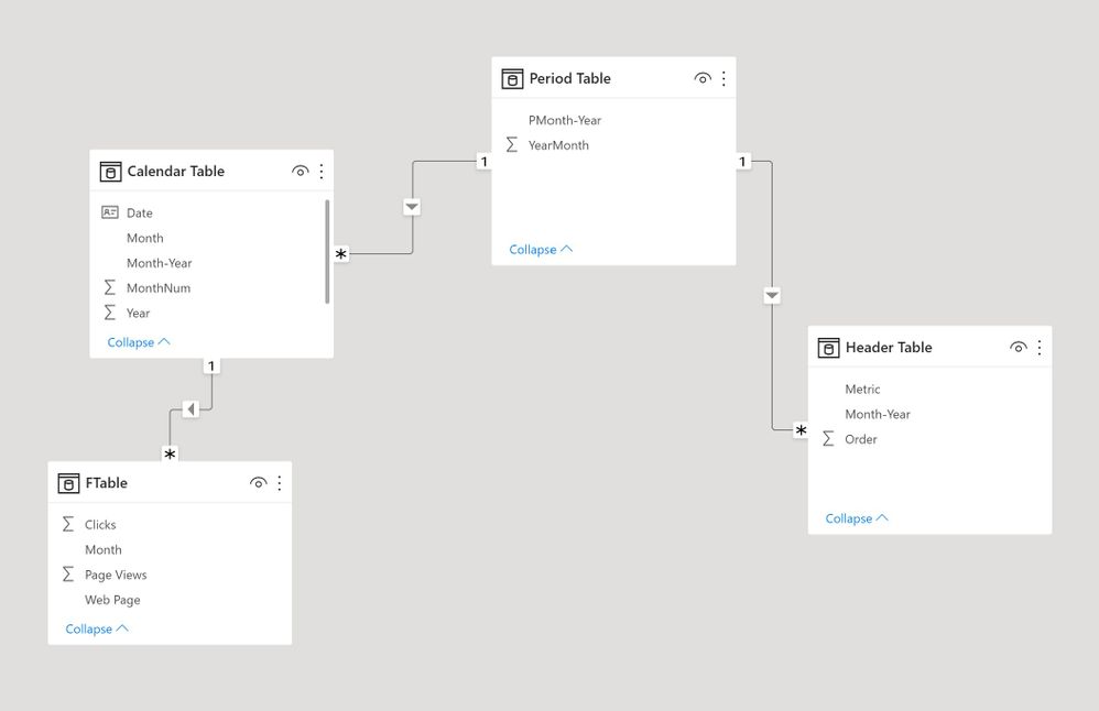
Create a relationship between the period table and the corresponding field in the Header Table. The model is as follows:
With simple SUM measures for Clicks and Page Views, create the following measure to use in the matrix visual:
Matrix values =
SWITCH (
    SELECTEDVALUE ( 'Header Table'[Order] ),
    1, [Sum CLicks],
    2, [Sum Page Views]
)
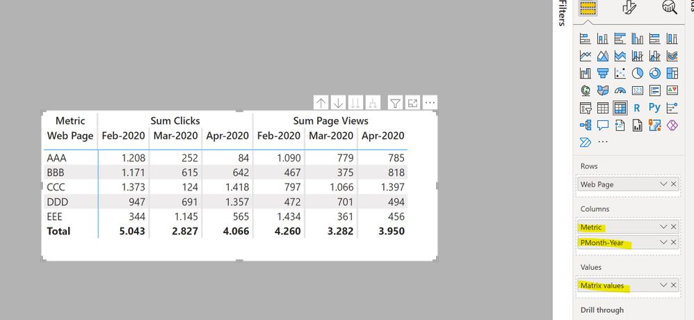
Now create the matrix visual using the web page field, the Metric field from the header table, the Period field from the Period table and the [Matrix Values] measure to get:
Did I answer your question? Mark my post as a solution!
In doing so, you are also helping me. Thank you!
Proud to be a Super User!
Paul on Linkedin.
- Mark as New
- Bookmark
- Subscribe
- Mute
- Subscribe to RSS Feed
- Permalink
- Report Inappropriate Content
Here is a way. I'm assuming the periods are actual dates, for which I've created a Calendar Table and a Period Table (the latter needed to link to a new header table). If the periods are not dates, all you need in the model is the Period Table.
Create a new table using the "New Table" option under Modeling in the ribbon and the following code:
Header Table =
VAR Metric = {("Sum Clicks", 1), ("Sum Page Views", 2)}
VAR Period = VALUES('Calendar Table'[Month-Year])
RETURN
CROSSJOIN(Metric, Period)
Create a relationship between the period table and the corresponding field in the Header Table. The model is as follows:
With simple SUM measures for Clicks and Page Views, create the following measure to use in the matrix visual:
Matrix values =
SWITCH (
    SELECTEDVALUE ( 'Header Table'[Order] ),
    1, [Sum CLicks],
    2, [Sum Page Views]
)
Now create the matrix visual using the web page field, the Metric field from the header table, the Period field from the Period table and the [Matrix Values] measure to get:

Did I answer your question? Mark my post as a solution!
In doing so, you are also helping me. Thank you!
Proud to be a Super User!
Paul on Linkedin.
- Mark as New
- Bookmark
- Subscribe
- Mute
- Subscribe to RSS Feed
- Permalink
- Report Inappropriate Content
Hi @PaulDBrown,
Thank you so much for all the effort you put into explaining that and making the sample pbix as well. It works!! I even managed to tweak it to include info from two different query tables. I will be bookmarking this one as I know I will use it again.
Just off now to try and find out about CROSSJOIN as I haven't come across that before.
With many thanks and much appreciation,
Matt
- Mark as New
- Bookmark
- Subscribe
- Mute
- Subscribe to RSS Feed
- Permalink
- Report Inappropriate Content
- Mark as New
- Bookmark
- Subscribe
- Mute
- Subscribe to RSS Feed
- Permalink
- Report Inappropriate Content
Thank you. I did see that one (as was going to use it as a fall-back option). I just already have a lot going on in Power Query (15 min refresh time) so I was hoping for something more DAX based. It just seems like it should be more straightforward to do this so I was hoping someone might have a different approach.
Matt
Helpful resources

Power BI Dataviz World Championships
The Power BI Data Visualization World Championships is back! Get ahead of the game and start preparing now!

Power BI Monthly Update - November 2025
Check out the November 2025 Power BI update to learn about new features.

| User | Count |
|---|---|
| 59 | |
| 46 | |
| 42 | |
| 23 | |
| 17 |
| User | Count |
|---|---|
| 190 | |
| 122 | |
| 96 | |
| 66 | |
| 47 |

