Join us at the 2025 Microsoft Fabric Community Conference
Microsoft Fabric Community Conference 2025, March 31 - April 2, Las Vegas, Nevada. Use code FABINSIDER for a $400 discount.
Register now- Power BI forums
- Get Help with Power BI
- Desktop
- Service
- Report Server
- Power Query
- Mobile Apps
- Developer
- DAX Commands and Tips
- Custom Visuals Development Discussion
- Health and Life Sciences
- Power BI Spanish forums
- Translated Spanish Desktop
- Training and Consulting
- Instructor Led Training
- Dashboard in a Day for Women, by Women
- Galleries
- Webinars and Video Gallery
- Data Stories Gallery
- Themes Gallery
- Power BI DataViz World Championships Gallery
- Quick Measures Gallery
- R Script Showcase
- COVID-19 Data Stories Gallery
- Community Connections & How-To Videos
- 2021 MSBizAppsSummit Gallery
- 2020 MSBizAppsSummit Gallery
- 2019 MSBizAppsSummit Gallery
- Events
- Ideas
- Custom Visuals Ideas
- Issues
- Issues
- Events
- Upcoming Events
The Power BI DataViz World Championships are on! With four chances to enter, you could win a spot in the LIVE Grand Finale in Las Vegas. Show off your skills.
- Power BI forums
- Forums
- Get Help with Power BI
- Desktop
- Re: Create Your Own Custom Map for Power BI
- Subscribe to RSS Feed
- Mark Topic as New
- Mark Topic as Read
- Float this Topic for Current User
- Bookmark
- Subscribe
- Printer Friendly Page
- Mark as New
- Bookmark
- Subscribe
- Mute
- Subscribe to RSS Feed
- Permalink
- Report Inappropriate Content
Create Your Own Custom Map for Power BI
Hi, I’m sharing back with community here (I encourage you to do the same as you come across your own useful Power BI tips and recipes)
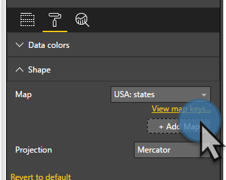
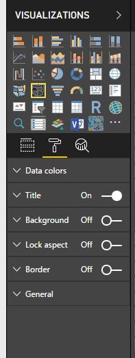
In this post, I will share how to create a custom map file to use in Power BI. To start out, add a Shape Map visual to a report in Power BI Desktop:
Once you add this visual you can pick from lots of included maps as well add your own custom map by clicking Add Map.
That's great, but “Where do I get custom maps or better yet how would I create my own map?” you may ask. Lots of organizations need custom maps for sales districts, service areas, and regions that don't always align nicely to states and zip codes.
How to create your own map
Let's walk through the steps to create your own custom maps using Google Maps and a couple open source tools. When we’re done, you will know how to make a professional looking map that works extremely well with Power BI.
Shape Maps in Power BI use a popular map file format called Topojson. I first encountered TopoJson when I worked as a D3.js developer. If you want to learn more about TopoJson/GeoJson you can go here.
TopoJson is a JSON file that can be quite complex and lengthy. While you could code one in notepad, that would be no fun at best.
Luckily Google Maps provides an on-line tool for creating your own custom maps.
Create a custom map in Google Maps
Go to Google Maps, open "Your Places", Maps, and click Create Map. Start drawing your own map over the area of the world you are interested in tracing. I won't go into the details on how to draw a map, but you will find it fairly intuitive and easy. Use the polygon tool to trace around your custom areas.
IMPORTANT:
To map data to your shapes in Power BI, you want to name your Polygons EXACTLY as they are in your data. For example, if in your data you have a [Region Name] field and it has a value of "Western Region", you want to name the Polygon shape you drew in Google Maps, "Western Region" if that's the field you will bind to your map's location property.
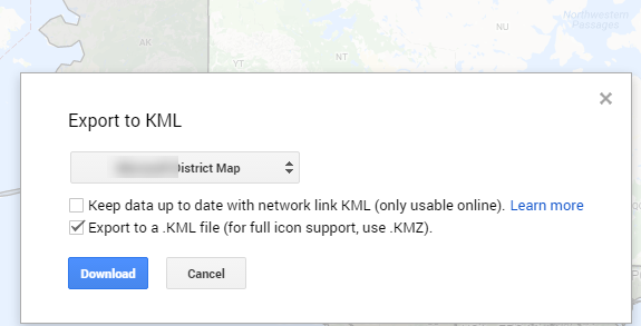
Once you have a saved map, Export to KML.
Pick your map layer instead of the "entire map" and check these options:
Click Download and Save.
Now that you have a KML file (another type of mapping file that is based on XML) we need to convert it to JSON. We must go through a couple of steps to get it into a format Power BI can use.
KML to GeoJson
You can use tools like https://mapbox.github.io/toGeoJson/ to convert KML to GeoJson. In this tool, you cut and paste the contents of your KML file into the KML window and you will get a GeoJson conversion on the right. Save the conversion to your workstation in a file with a .json extension.
GeoJson to TopoJson
We're not done yet. Now that you have a GeoJson file, you need to run this through a couple of conversions to get it to look nice and export to TopoJson. In this example, I'm focusing on getting a custom map of the United States projected as "USA Albers projection" which will, for display purposes, move Alaska and Hawaii and scale them so they can be easily viewed with the other 48 states.
To do this we can use http://mapshaper.org.
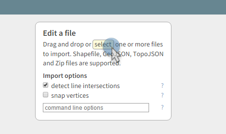
Open your GeoJson file you just created.
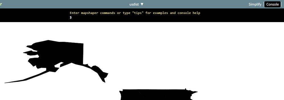
You should now see your custom map displayed.
Depending on your map, you need to do a couple of clean-ups before we're ready to save as TopoJson.
To clean up the file, you need to make sure the map is projected as WGS84. To do this, click the Console button (upper-right)
At the command prompt ($), enter the command -proj wgs84
If you want a map in Albers USA projection also enter -proj albersusa
If your shapes render as black, you may want to get a look at the boundaries before finishing. This command will do this for you.
-svg-style fill="white"
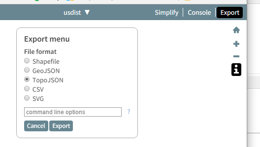
Finally, save the file as TopoJson by clicking export and selecting TopoJson.
Click Export and Save.
We're almost done. I swear!
Open your custom map in Power BI Desktop
Go back to Power BI Desktop and open your custom map in the format properties of a Shape Map visual
Select your previously created TopoJson file. You should now see your map! If you wish, you can play around with the different types of projections.
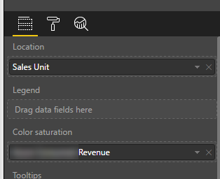
Last thing you need to do is bind data to your map. If you properly named your polygons in Google Maps, you should be able to assign your appropriate data field to the Location property of the map, and then assign a measure value to the color saturation.
At this point you should now be feeling like a B.I. rockstar and have a strong urge to show your boss the cool Power BI trick you just learned.
Enjoy and remember Power BI's Community is one of the main things that makes Power BI a great tool. Take a tip, leave a tip.
- Mark as New
- Bookmark
- Subscribe
- Mute
- Subscribe to RSS Feed
- Permalink
- Report Inappropriate Content
I'm not sure what you mean by background map. I see two shapes rendered. You want to make sure your Default Color Border Color and Border Thickness in the Visual Formatting Options
- Mark as New
- Bookmark
- Subscribe
- Mute
- Subscribe to RSS Feed
- Permalink
- Report Inappropriate Content
Do you find the shape map to be slow? I have a custom map of over 350 region (ploygons). It is a pain trying to zoom in and out on the map or just do anything with the visual.
- Mark as New
- Bookmark
- Subscribe
- Mute
- Subscribe to RSS Feed
- Permalink
- Report Inappropriate Content
You might want to use mapshaper to reduce the number of points and then see if it works.
- Mark as New
- Bookmark
- Subscribe
- Mute
- Subscribe to RSS Feed
- Permalink
- Report Inappropriate Content
Great stuff and perfect timing for a project of mine. Thank you! - Jude C.
- Mark as New
- Bookmark
- Subscribe
- Mute
- Subscribe to RSS Feed
- Permalink
- Report Inappropriate Content
no problem!
- Mark as New
- Bookmark
- Subscribe
- Mute
- Subscribe to RSS Feed
- Permalink
- Report Inappropriate Content
Hi, thanks for the good article. I have issues finding the "add map" button in my visual. After I select the Shape Map visual, under the format tab, I don't see that option. Any idea?
- Mark as New
- Bookmark
- Subscribe
- Mute
- Subscribe to RSS Feed
- Permalink
- Report Inappropriate Content
You have to add at leat one data field onto the fields tab and then it should show up in the format tab. It could be more intuitive...
- Mark as New
- Bookmark
- Subscribe
- Mute
- Subscribe to RSS Feed
- Permalink
- Report Inappropriate Content
Hey, I'm new to PowerBI and I found this very helpful!
Is there a way to add a basemap to the shape map as well? Preferably some satellite data that we have analysed ourselves.
Thanks
- Mark as New
- Bookmark
- Subscribe
- Mute
- Subscribe to RSS Feed
- Permalink
- Report Inappropriate Content
Adding images is not supported with TopoJson. I would look at Bing, ESRI, or MapBox to include satellite views.
- Mark as New
- Bookmark
- Subscribe
- Mute
- Subscribe to RSS Feed
- Permalink
- Report Inappropriate Content
Hi everyone!
I had difficulties to find the maps I needed over the web. It was even impossible when the maps were completly customized to match with my client needs.
I created a tool, ByMapSelf, that you can use to draw your own maps. I would be very proud if it could help others from the community.
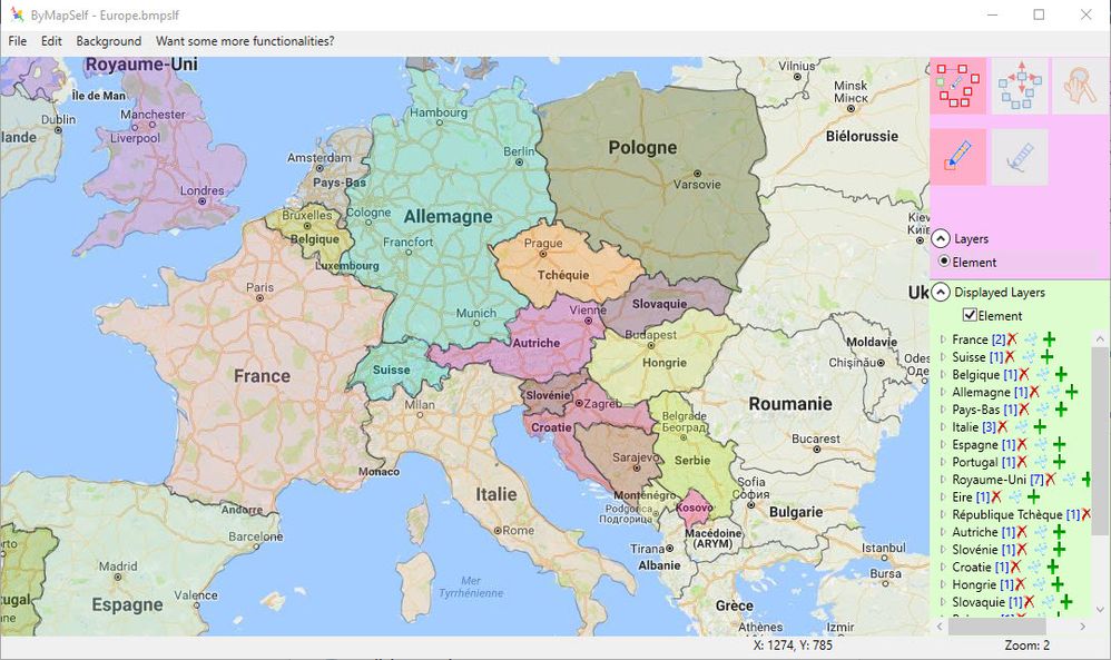
You can read the article I posted on LinkedIn or go directly to the download web site. It's totally free and you don't need to create an account.
Sylvain Driancourt
- Mark as New
- Bookmark
- Subscribe
- Mute
- Subscribe to RSS Feed
- Permalink
- Report Inappropriate Content
Hi All,
I want to create custom india map with all states and union territeries of india .How can i do it.
I have create on topojson file for all india states using that iam able to dispaly india map with all states, Now i want to add 5 union territeries of india in that india custom map.
Can any one help me out on this issue
- Mark as New
- Bookmark
- Subscribe
- Mute
- Subscribe to RSS Feed
- Permalink
- Report Inappropriate Content
Power BI shape map doesn't support drillable map layers right now so you'd have to make two separate maps or define the states and then have a selector to only show all the states in a territory.
- Mark as New
- Bookmark
- Subscribe
- Mute
- Subscribe to RSS Feed
- Permalink
- Report Inappropriate Content
I just updated PowerBI and now I can't use custom shapes in the Shape Map.
Anyone else have this issue? Or am I missing something...?
- Mark as New
- Bookmark
- Subscribe
- Mute
- Subscribe to RSS Feed
- Permalink
- Report Inappropriate Content
Hi All,
I want to create custom india map with all states and union territeries of india .How can i do it.
I have create on topojson file for all india states using that iam able to dispaly india map with all states, Now i want to add 5 union territeries of india in that india custom map.
Can any one help me out on this issue
- Mark as New
- Bookmark
- Subscribe
- Mute
- Subscribe to RSS Feed
- Permalink
- Report Inappropriate Content
@mjfulke wrote:
If you want a map in Albers USA projection also enter -proj albersusa
What if I want a projection of Southwestern Ontario? Is there a list somewhere that I can refer to?
- Mark as New
- Bookmark
- Subscribe
- Mute
- Subscribe to RSS Feed
- Permalink
- Report Inappropriate Content
- Mark as New
- Bookmark
- Subscribe
- Mute
- Subscribe to RSS Feed
- Permalink
- Report Inappropriate Content
Hi, How many map records in your custom map?
Even I reduce the file size, my map of about 2000 records never responded as the state map.
I am so frustructed as there is no place to ask for support.
- Mark as New
- Bookmark
- Subscribe
- Mute
- Subscribe to RSS Feed
- Permalink
- Report Inappropriate Content
@hdunn With that many shapes you're probably running into some limits on the number of shapes that can plotted at one time. Are you able to post a picture of your map? If no, the Support option under the "Learn" may be able to assist you.
- Mark as New
- Bookmark
- Subscribe
- Mute
- Subscribe to RSS Feed
- Permalink
- Report Inappropriate Content
YOU Sir, are an absolute Rock-starring, Data-cruishing, PBI community killing, Map-vizualizing freaking NINJA!
Thank you for your post. Hummanity is better off for you having posted it.
Sincerely,
Alfonso in San Diego, CA.
P.S. California Burrito and IPA on me if you're ever down here ![]()
- Mark as New
- Bookmark
- Subscribe
- Mute
- Subscribe to RSS Feed
- Permalink
- Report Inappropriate Content
Thanks for the tutorial.
I have a question and would appreciate if u please care to answer. My map has 22 zones which is also visible when I look at the "map key" in Power BI (after doing what was suggested in the tutorial). However the tables it generates include only a 3-rows table that I cannot figure out what it is.
How can I get the map keys to appear in columns so that I can correspont other sources like density to these 22 zone?
ps: If it can help to understand my problem better, this is the link to the site I get the map data from.
https://www.google.com/maps/d/viewer?mid=1-6HQGXmwwew02zeDR5KpY1OA1mc&hl=en_US&ll=35.71139552629039%...
- Mark as New
- Bookmark
- Subscribe
- Mute
- Subscribe to RSS Feed
- Permalink
- Report Inappropriate Content
Helpful resources

Join us at the Microsoft Fabric Community Conference
March 31 - April 2, 2025, in Las Vegas, Nevada. Use code MSCUST for a $150 discount!

Power BI Monthly Update - February 2025
Check out the February 2025 Power BI update to learn about new features.

Join our Community Sticker Challenge 2025
If you love stickers, then you will definitely want to check out our Community Sticker Challenge!

| User | Count |
|---|---|
| 84 | |
| 69 | |
| 68 | |
| 39 | |
| 37 |


