New Offer! Become a Certified Fabric Data Engineer
Check your eligibility for this 50% exam voucher offer and join us for free live learning sessions to get prepared for Exam DP-700.
Get Started- Power BI forums
- Get Help with Power BI
- Desktop
- Service
- Report Server
- Power Query
- Mobile Apps
- Developer
- DAX Commands and Tips
- Custom Visuals Development Discussion
- Health and Life Sciences
- Power BI Spanish forums
- Translated Spanish Desktop
- Training and Consulting
- Instructor Led Training
- Dashboard in a Day for Women, by Women
- Galleries
- Community Connections & How-To Videos
- COVID-19 Data Stories Gallery
- Themes Gallery
- Data Stories Gallery
- R Script Showcase
- Webinars and Video Gallery
- Quick Measures Gallery
- 2021 MSBizAppsSummit Gallery
- 2020 MSBizAppsSummit Gallery
- 2019 MSBizAppsSummit Gallery
- Events
- Ideas
- Custom Visuals Ideas
- Issues
- Issues
- Events
- Upcoming Events
Don't miss out! 2025 Microsoft Fabric Community Conference, March 31 - April 2, Las Vegas, Nevada. Use code MSCUST for a $150 discount. Prices go up February 11th. Register now.
- Power BI forums
- Forums
- Get Help with Power BI
- Desktop
- Re: Create A Stacked Column Chart that Shows Month...
- Subscribe to RSS Feed
- Mark Topic as New
- Mark Topic as Read
- Float this Topic for Current User
- Bookmark
- Subscribe
- Printer Friendly Page
- Mark as New
- Bookmark
- Subscribe
- Mute
- Subscribe to RSS Feed
- Permalink
- Report Inappropriate Content
Create A Stacked Column Chart that Shows Monthly Counts
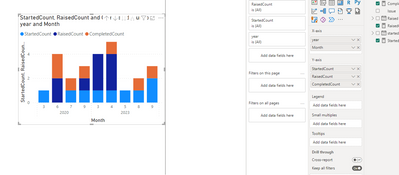
I have a simple table of data that shows an "Issue_#" and three dates for each row. All I want to be able to do is create a stacked column chart that will show the number of "Issue_#"s that were "Raised", "Started" and "Completed" each Year and Month with the respective breakdowns.
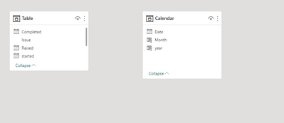
I have tried building a calendar table and making the relatioships, but nothing I seem to do gives me the right information. Can someone provide a simple step by step explanation to what I need to do to make this work?
Solved! Go to Solution.
- Mark as New
- Bookmark
- Subscribe
- Mute
- Subscribe to RSS Feed
- Permalink
- Report Inappropriate Content
Hi @Anonymous
You can achieve it with disonacted date table and 3 dax dormulas for evrery "status":
1.
2.
3.

Link to a sample file
If this post helps, then please consider Accepting it as the solution to help the other members find it more quickly
Rita Fainshtein | Microsoft MVP
https://www.linkedin.com/in/rita-fainshtein/
Blog : https://www.madeiradata.com/profile/ritaf/profile
- Mark as New
- Bookmark
- Subscribe
- Mute
- Subscribe to RSS Feed
- Permalink
- Report Inappropriate Content
Hello, I didn't quite understand the format of the date you displayed.
In general, you should create a numeric column that allows you to sort the column you use on your graph from the calendar table.
Here is an example from my answer in another discussion, you should use the same logic, refer to your format:
https://community.fabric.microsoft.com/t5/Desktop/Trend-lines-Month-Name-by-year-are-not-in-ascendin...
If this post helps, then please consider Accepting it as the solution to help the other members find it more quickly
Rita Fainshtein | Microsoft MVP
https://www.linkedin.com/in/rita-fainshtein/
Blog : https://www.madeiradata.com/profile/ritaf/profile
- Mark as New
- Bookmark
- Subscribe
- Mute
- Subscribe to RSS Feed
- Permalink
- Report Inappropriate Content
@Ritaf1983 Thank you again! That was a simple solution. I didn't even think of adding in a sort column. All is good now!
- Mark as New
- Bookmark
- Subscribe
- Mute
- Subscribe to RSS Feed
- Permalink
- Report Inappropriate Content
I was happy to assist 🙂
Rita Fainshtein | Microsoft MVP
https://www.linkedin.com/in/rita-fainshtein/
Blog : https://www.madeiradata.com/profile/ritaf/profile
- Mark as New
- Bookmark
- Subscribe
- Mute
- Subscribe to RSS Feed
- Permalink
- Report Inappropriate Content
Hi @Anonymous
You can achieve it with disonacted date table and 3 dax dormulas for evrery "status":
1.
2.
3.

Link to a sample file
If this post helps, then please consider Accepting it as the solution to help the other members find it more quickly
Rita Fainshtein | Microsoft MVP
https://www.linkedin.com/in/rita-fainshtein/
Blog : https://www.madeiradata.com/profile/ritaf/profile
- Mark as New
- Bookmark
- Subscribe
- Mute
- Subscribe to RSS Feed
- Permalink
- Report Inappropriate Content
That worked! Thank you!
One more question.....I can't seem to get my visual to sort the year/month correctly, and also there is another "0" being added after each year. Do you know how to fix this? I have tried changing the sort criteria, but it's always jumbled.
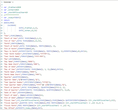
Is there something wrong with my calendar table setup for "Year Month Number"?
Thanks again!
- Mark as New
- Bookmark
- Subscribe
- Mute
- Subscribe to RSS Feed
- Permalink
- Report Inappropriate Content
Hello, I didn't quite understand the format of the date you displayed.
In general, you should create a numeric column that allows you to sort the column you use on your graph from the calendar table.
Here is an example from my answer in another discussion, you should use the same logic, refer to your format:
https://community.fabric.microsoft.com/t5/Desktop/Trend-lines-Month-Name-by-year-are-not-in-ascendin...
If this post helps, then please consider Accepting it as the solution to help the other members find it more quickly
Rita Fainshtein | Microsoft MVP
https://www.linkedin.com/in/rita-fainshtein/
Blog : https://www.madeiradata.com/profile/ritaf/profile
Helpful resources

Join us at the Microsoft Fabric Community Conference
March 31 - April 2, 2025, in Las Vegas, Nevada. Use code MSCUST for a $150 discount! Prices go up Feb. 11th.

Power BI Monthly Update - January 2025
Check out the January 2025 Power BI update to learn about new features in Reporting, Modeling, and Data Connectivity.

| User | Count |
|---|---|
| 146 | |
| 85 | |
| 66 | |
| 52 | |
| 47 |
| User | Count |
|---|---|
| 215 | |
| 90 | |
| 83 | |
| 66 | |
| 58 |


