FabCon is coming to Atlanta
Join us at FabCon Atlanta from March 16 - 20, 2026, for the ultimate Fabric, Power BI, AI and SQL community-led event. Save $200 with code FABCOMM.
Register now!- Power BI forums
- Get Help with Power BI
- Desktop
- Service
- Report Server
- Power Query
- Mobile Apps
- Developer
- DAX Commands and Tips
- Custom Visuals Development Discussion
- Health and Life Sciences
- Power BI Spanish forums
- Translated Spanish Desktop
- Training and Consulting
- Instructor Led Training
- Dashboard in a Day for Women, by Women
- Galleries
- Data Stories Gallery
- Themes Gallery
- Contests Gallery
- Quick Measures Gallery
- Notebook Gallery
- Translytical Task Flow Gallery
- TMDL Gallery
- R Script Showcase
- Webinars and Video Gallery
- Ideas
- Custom Visuals Ideas (read-only)
- Issues
- Issues
- Events
- Upcoming Events
Join the Fabric FabCon Global Hackathon—running virtually through Nov 3. Open to all skill levels. $10,000 in prizes! Register now.
- Power BI forums
- Forums
- Get Help with Power BI
- Desktop
- Re: Count rows with criteria x and value less than...
- Subscribe to RSS Feed
- Mark Topic as New
- Mark Topic as Read
- Float this Topic for Current User
- Bookmark
- Subscribe
- Printer Friendly Page
- Mark as New
- Bookmark
- Subscribe
- Mute
- Subscribe to RSS Feed
- Permalink
- Report Inappropriate Content
Count rows with criteria x and value less than threshold y
Hi all,
We are trying to automatically catch messages sent on our website that we deem inappropriate. Every message is reviewed by a computer and given a score, usually between -200 and +200.
A subset of these messages is then reviewed by a person to see if they agree with the computer score. They are given a class of 'good' or 'bad' depending on if they were actually appropriate or not.
I currently have a table with columns message_id, score and class. 'Score' is computer given and 'class' is human given.
I have made a number of visualisations, but this one evades me:
- I want to review how many messages have a class of 'good' or 'bad' under each score threshold. i.e. what % of messages with a score <=50 have a class of 'bad'?
- I would ideally like to plot 'score' on the x axis of a graph and see how the above changes as the score threshold increases.
I have managed to create this in excel but I'm not sure how this would look in Power BI. I'm currently trying to do it by making a new table and column 'ScoreKey'[Score Key] which consists of just the distinct score values, ordered smallest to largest, and then using a combination of CALCULATE, COUNTROWS and FILTER to compare my messages table to this, but nothing seems to work!
Any ideas?
Thanks in advance for any help!
Tom
Solved! Go to Solution.
- Mark as New
- Bookmark
- Subscribe
- Mute
- Subscribe to RSS Feed
- Permalink
- Report Inappropriate Content
Hi Tom,
Try the following.
1. Create a Column in the table called
NumberofRecsbyScore = =COUNTAX ( FILTER( 'Table1',Table1[score] <= EARLIER ( Table1[score] ) && [class] = "bad" ) ,[class] )
2. Create a Measure called
NumberByScore = MAx([NumberofRecsbyScore])
3. Create a Measure called
TotalRecsbad = Calculate(MAX([NumberofRecsbyScore]),ALL('Table1'))
4. Create a measure called
Percentage = divide ([NumberByScore],[TotalRecsbad ])
If this works for you please accept this as solution and also give KUDOS.
CheenuSing
- Mark as New
- Bookmark
- Subscribe
- Mute
- Subscribe to RSS Feed
- Permalink
- Report Inappropriate Content
According to your description, I have made a sample for your reference.
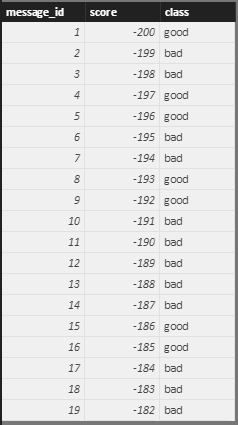
I assume you have a table called Message like below.
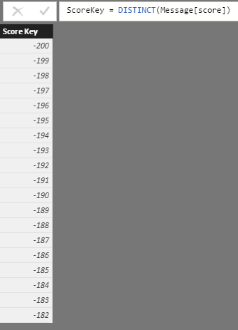
Firstly, create a new calculate table called ScoreKey with a column "Score Key" which consists of just the distinct score values in Message table as you mentioned above.
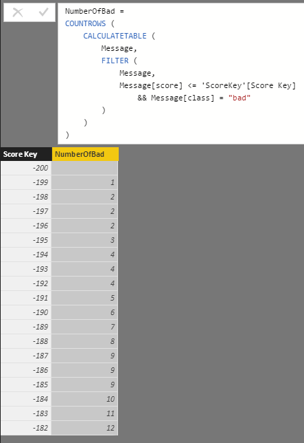
Then use the formula below to create calculate column NumberOfBad within ScoreKey table.
NumberOfBad =
COUNTROWS (
    CALCULATETABLE (
        Message,
        FILTER (
            Message,
            Message[score] <= 'ScoreKey'[Score Key]
                && Message[class] = "bad"
        )
    )
)
The result looks like below:
Regards
- Mark as New
- Bookmark
- Subscribe
- Mute
- Subscribe to RSS Feed
- Permalink
- Report Inappropriate Content
- Mark as New
- Bookmark
- Subscribe
- Mute
- Subscribe to RSS Feed
- Permalink
- Report Inappropriate Content
Hi,
I'm afraid I can't share the data itself, and I can't seem to upload a sample csv either (I am new to this forum). However the dataset itself is very simple. The only relevant columns are the Primary Key 'message_id' column (integers), a 'score' column with whole integers between -200 and 200, and the 'class' column where the rows are text values of either 'good' or 'bad'.
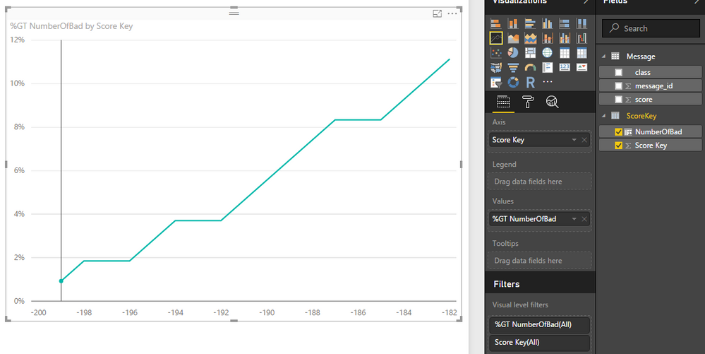
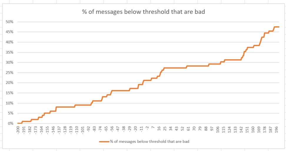
The kind of output I want in BI is displayed in the graph below. This was generated very quickly in excel using randomly generated data. I created a column with all of the possible score values from -200 to +200 in ascending order. I then wrote a COUNTIFS formula to calculate (for each score value) the percentage of messages with a class of "bad" and a score <= the corresponding value in the score column.
The graph shows how this percentage changes as the score value increases (the graph will be more meaningful with the real data) - score is on the x value.
I hope this makes things clearer.
Tom
- Mark as New
- Bookmark
- Subscribe
- Mute
- Subscribe to RSS Feed
- Permalink
- Report Inappropriate Content
Hi Tom,
Try the following.
1. Create a Column in the table called
NumberofRecsbyScore = =COUNTAX ( FILTER( 'Table1',Table1[score] <= EARLIER ( Table1[score] ) && [class] = "bad" ) ,[class] )
2. Create a Measure called
NumberByScore = MAx([NumberofRecsbyScore])
3. Create a Measure called
TotalRecsbad = Calculate(MAX([NumberofRecsbyScore]),ALL('Table1'))
4. Create a measure called
Percentage = divide ([NumberByScore],[TotalRecsbad ])
If this works for you please accept this as solution and also give KUDOS.
CheenuSing
