FabCon is coming to Atlanta
Join us at FabCon Atlanta from March 16 - 20, 2026, for the ultimate Fabric, Power BI, AI and SQL community-led event. Save $200 with code FABCOMM.
Register now!- Power BI forums
- Get Help with Power BI
- Desktop
- Service
- Report Server
- Power Query
- Mobile Apps
- Developer
- DAX Commands and Tips
- Custom Visuals Development Discussion
- Health and Life Sciences
- Power BI Spanish forums
- Translated Spanish Desktop
- Training and Consulting
- Instructor Led Training
- Dashboard in a Day for Women, by Women
- Galleries
- Data Stories Gallery
- Themes Gallery
- Contests Gallery
- Quick Measures Gallery
- Notebook Gallery
- Translytical Task Flow Gallery
- TMDL Gallery
- R Script Showcase
- Webinars and Video Gallery
- Ideas
- Custom Visuals Ideas (read-only)
- Issues
- Issues
- Events
- Upcoming Events
To celebrate FabCon Vienna, we are offering 50% off select exams. Ends October 3rd. Request your discount now.
- Power BI forums
- Forums
- Get Help with Power BI
- Desktop
- Count and Group Multiple Columns
- Subscribe to RSS Feed
- Mark Topic as New
- Mark Topic as Read
- Float this Topic for Current User
- Bookmark
- Subscribe
- Printer Friendly Page
- Mark as New
- Bookmark
- Subscribe
- Mute
- Subscribe to RSS Feed
- Permalink
- Report Inappropriate Content
Count and Group Multiple Columns
Hello,
I have not been able to find an answer to this question and hope someone can help me out. Thank you.
I have the following data.
| Gender Group 1 | Gender Group 2 | Gender Group 3 |
| F | F | M |
| F | F | M |
| M | F | F |
| M | F | F |
| M | M | F |
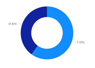
I would like to create a pie chart that shows two categories "M" and "F" across three columns and the total number of males and females for each category. For example Pie chart shows M = 6 and F = 9. Is this possible in PBI? Thank you.
Thank you.
Solved! Go to Solution.
- Mark as New
- Bookmark
- Subscribe
- Mute
- Subscribe to RSS Feed
- Permalink
- Report Inappropriate Content
Hi,
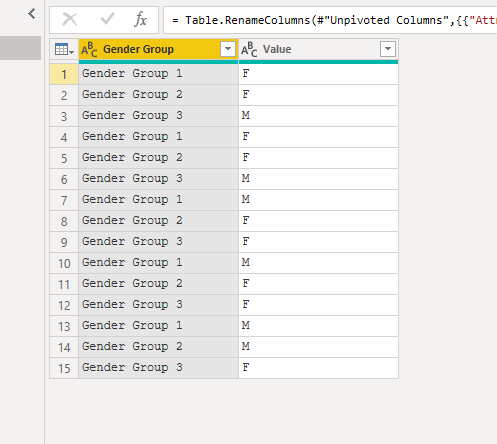
To achieve this you can unpivot the table in Power Query Editor:
1. Highlight the 3 columns and use the 'unpivot columns' button in the 'transform' menu:
2. Add a new column called something like 'count' and add the value 1 to each row
3. Set the new column format to 'whole number'
4. You can now create a pie chart like this, setting the 'count' column as the value and the male/female column as the legend:
Hope this helps.
Jo
- Mark as New
- Bookmark
- Subscribe
- Mute
- Subscribe to RSS Feed
- Permalink
- Report Inappropriate Content
- Mark as New
- Bookmark
- Subscribe
- Mute
- Subscribe to RSS Feed
- Permalink
- Report Inappropriate Content
Hi,
To achieve this you can unpivot the table in Power Query Editor:
1. Highlight the 3 columns and use the 'unpivot columns' button in the 'transform' menu:
2. Add a new column called something like 'count' and add the value 1 to each row
3. Set the new column format to 'whole number'
4. You can now create a pie chart like this, setting the 'count' column as the value and the male/female column as the legend:
Hope this helps.
Jo
- Mark as New
- Bookmark
- Subscribe
- Mute
- Subscribe to RSS Feed
- Permalink
- Report Inappropriate Content
It worked. Thank you so much!


