- Power BI forums
- Updates
- News & Announcements
- Get Help with Power BI
- Desktop
- Service
- Report Server
- Power Query
- Mobile Apps
- Developer
- DAX Commands and Tips
- Custom Visuals Development Discussion
- Health and Life Sciences
- Power BI Spanish forums
- Translated Spanish Desktop
- Power Platform Integration - Better Together!
- Power Platform Integrations (Read-only)
- Power Platform and Dynamics 365 Integrations (Read-only)
- Training and Consulting
- Instructor Led Training
- Dashboard in a Day for Women, by Women
- Galleries
- Community Connections & How-To Videos
- COVID-19 Data Stories Gallery
- Themes Gallery
- Data Stories Gallery
- R Script Showcase
- Webinars and Video Gallery
- Quick Measures Gallery
- 2021 MSBizAppsSummit Gallery
- 2020 MSBizAppsSummit Gallery
- 2019 MSBizAppsSummit Gallery
- Events
- Ideas
- Custom Visuals Ideas
- Issues
- Issues
- Events
- Upcoming Events
- Community Blog
- Power BI Community Blog
- Custom Visuals Community Blog
- Community Support
- Community Accounts & Registration
- Using the Community
- Community Feedback
Register now to learn Fabric in free live sessions led by the best Microsoft experts. From Apr 16 to May 9, in English and Spanish.
- Power BI forums
- Forums
- Get Help with Power BI
- Desktop
- Connect 2 related markers on scatter plot
- Subscribe to RSS Feed
- Mark Topic as New
- Mark Topic as Read
- Float this Topic for Current User
- Bookmark
- Subscribe
- Printer Friendly Page
- Mark as New
- Bookmark
- Subscribe
- Mute
- Subscribe to RSS Feed
- Permalink
- Report Inappropriate Content
Connect 2 related markers on scatter plot
Hello,
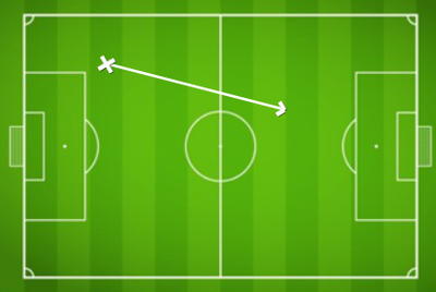
I am analysising a football/ soccer game where I record where the ball is kicked from and where it is kicked to. As a result I record 2 x XY cooardinates, for each event (kick of the ball). These are then displayed in a scatter plot with a football pitch image set as the background.
Is it possible to have these 2 XY coordinates connected to eachother with a line? This would allow me to see the trajectory of the ball.
Please see below for a sample of my data:
| Event | Field Position | Start XY | End XY | Start X | Start Y | End X | End Y |
| Pass | 16;20;37;38 | 16;20 | 37;38 | 16 | 20 | 37 | 38 |
Pass | 20;24;27;49 | 20;24 | 27;49 | 20 | 24 | 27 | 49 |
| Pass | 14;84;55;83 | 14;84 | 55;83 | 14 | 84 | 55 | 83 |
| Pass | 62;28;31;82 | 62;28 | 31;82 | 62 | 28 | 31 | 82 |
An example output of a single pass would look like:
TIA
- Mark as New
- Bookmark
- Subscribe
- Mute
- Subscribe to RSS Feed
- Permalink
- Report Inappropriate Content
Hi @mkins ,
Please refer below document, it provides a way to achieve your demand:
2022 Week 31 | Power BI: Connected Scatter with PlotlyJS – Workout Wednesday (workout-wednesday.com)
Best regards,
Community Support Team_Binbin Yu
If this post helps, then please consider Accept it as the solution to help the other members find it more quickly.
Helpful resources

Microsoft Fabric Learn Together
Covering the world! 9:00-10:30 AM Sydney, 4:00-5:30 PM CET (Paris/Berlin), 7:00-8:30 PM Mexico City

Power BI Monthly Update - April 2024
Check out the April 2024 Power BI update to learn about new features.

| User | Count |
|---|---|
| 104 | |
| 95 | |
| 80 | |
| 67 | |
| 62 |
| User | Count |
|---|---|
| 147 | |
| 109 | |
| 107 | |
| 85 | |
| 63 |

