FabCon is coming to Atlanta
Join us at FabCon Atlanta from March 16 - 20, 2026, for the ultimate Fabric, Power BI, AI and SQL community-led event. Save $200 with code FABCOMM.
Register now!- Power BI forums
- Get Help with Power BI
- Desktop
- Service
- Report Server
- Power Query
- Mobile Apps
- Developer
- DAX Commands and Tips
- Custom Visuals Development Discussion
- Health and Life Sciences
- Power BI Spanish forums
- Translated Spanish Desktop
- Training and Consulting
- Instructor Led Training
- Dashboard in a Day for Women, by Women
- Galleries
- Data Stories Gallery
- Themes Gallery
- Contests Gallery
- Quick Measures Gallery
- Visual Calculations Gallery
- Notebook Gallery
- Translytical Task Flow Gallery
- TMDL Gallery
- R Script Showcase
- Webinars and Video Gallery
- Ideas
- Custom Visuals Ideas (read-only)
- Issues
- Issues
- Events
- Upcoming Events
Calling all Data Engineers! Fabric Data Engineer (Exam DP-700) live sessions are back! Starting October 16th. Sign up.
- Power BI forums
- Forums
- Get Help with Power BI
- Desktop
- Conditional formating based on a relation to other...
- Subscribe to RSS Feed
- Mark Topic as New
- Mark Topic as Read
- Float this Topic for Current User
- Bookmark
- Subscribe
- Printer Friendly Page
- Mark as New
- Bookmark
- Subscribe
- Mute
- Subscribe to RSS Feed
- Permalink
- Report Inappropriate Content
Conditional formating based on a relation to other datasources
Hey there,
i want to highline the data in my matrix which is out of the specification:
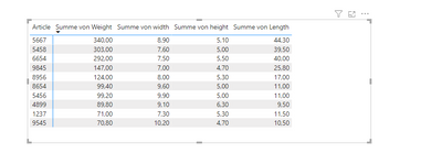
for example the weight for the article 8956 (formating of the column is text) should be between 125 - 128. In my case it is 124 so it has to be marked with a red backround. I tried the standard conditional formating but it did not work, it is easy to made in excel so it should also work in Power bi. Anyone an idea?
regards
Solved! Go to Solution.
- Mark as New
- Bookmark
- Subscribe
- Mute
- Subscribe to RSS Feed
- Permalink
- Report Inappropriate Content
Hey @MakingBreaddata ,
the matrix visual shows values for different numeric columns or measures like "Summe von Weight". Without knowing the exact "source" of the values it's difficult to provide 100% exact guidance.
However, if the numeric expression is "coming" from a column (my assumption) then you can replace the line
var currentValue = [a measure returning the value you want to check]with this line
var currentValue = SUM( 'FactOnlineSales'[SalesAmount] )Please keep in mind that creating explicit measures instead of using implicit measures is considered a best practice (one of the many readings: https://towardsdatascience.com/understanding-explicit-vs-implicit-measures-in-power-bi-e35b578808ca).
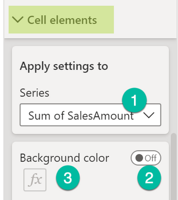
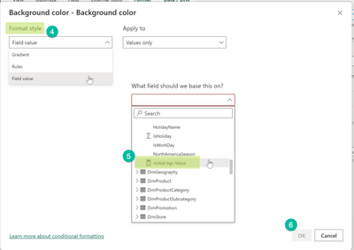
After you created the measure that returns the "colorname" or a color hexcode as a string "#eb7134" you have to select the measure for the color coding. Make sure that the data tpye of the measure is "text." If this is not the case it can not be selected in a later step:
Here are the steps to select the measure for the color coding:
- Mark the table or matrix visual
- Enable the conditional formatting in the formatting pane, for matrix visuals you will find this on the Cell elements card
- Choose the "Field value" format style and select the measure
Hopefully this provides what you are looking for.
Regards,
Tom
Did I answer your question? Mark my post as a solution, this will help others!
Proud to be a Super User!
I accept Kudos 😉
Hamburg, Germany
- Mark as New
- Bookmark
- Subscribe
- Mute
- Subscribe to RSS Feed
- Permalink
- Report Inappropriate Content
Hey @MakingBreaddata ,
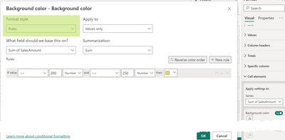
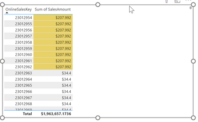
I'm wondering why it's not possible to use Rules for the conditional formatting like so:
The result:
Here you will find the article that explains the conditional formatting: https://learn.microsoft.com/en-us/power-bi/create-reports/desktop-conditional-table-formatting
Hopefully, this provides what you are looking for.
Regards,
Tom
Did I answer your question? Mark my post as a solution, this will help others!
Proud to be a Super User!
I accept Kudos 😉
Hamburg, Germany
- Mark as New
- Bookmark
- Subscribe
- Mute
- Subscribe to RSS Feed
- Permalink
- Report Inappropriate Content
Hey @TomMartens ,
but how can i set up a specific Rule for each article. In your example you set up a range between 200 - 250 $ for every article. But i want to set up a different range for every article. In your table this would mean that the range for 23012961 is between 200 - 250 $ (it gets an yellow backround) and for 23012962 the range should be between 180 - 200 $ (the backround is still blank, it would dye when the value is between 180 - 200 $).
or formulated as a rule: if the line in the coulumn OnlineSalesKey is 23012961, all values between 200 - 250 should be marked; if the line in the coulumn OnlineSalesKey is 23012961 all values betwenn 180 - 200 should be marked; and so on for every article.
Hope this is understandable. Thank you in advance.
- Mark as New
- Bookmark
- Subscribe
- Mute
- Subscribe to RSS Feed
- Permalink
- Report Inappropriate Content
Hey @MakingBreaddata ,
you must provide a table containing the min and max value per article, I assume this table is called rangeTable and has the columns: Article | lowerbound | upperbound.
Then you can create a measure that returns the backglround color like so:
vizAid bgc Value =
var currentArticle = SELECTEDVALUE( '<dimTable>'[Article] )
var currentValue = [a measure returning the value you want to check]
var lowerbound = CALCULATE( MIN( 'rangeTable'[lowerbound] ) , '<dimTable>'[Article] = currentArticle )
var upperbound = CALCULATE( MAX( 'rangeTable'[upperbound] ) , '<dimTable>'[Article] = currentArticle )
return
IF( currentValue >= lowerbound && currentValue <= upperbound
    , "red"
    , BLANK()
)
Make sure the measure is of data type string.
Choose the conditional formatting option Field value and select the measure.
Hopefully, this provides what you are looking for.
Regards,
Tom
Did I answer your question? Mark my post as a solution, this will help others!
Proud to be a Super User!
I accept Kudos 😉
Hamburg, Germany
- Mark as New
- Bookmark
- Subscribe
- Mute
- Subscribe to RSS Feed
- Permalink
- Report Inappropriate Content
(English below)
Hallo Tom,
was ist mit
var currentValue = [a measure returning the value you want to check]
gemeint, könntest du das an einem Beispiel festmachen? Und wo gebe ich das Measure ein ("Choose the conditional formatting option Field value and select the measure.") Vielen Dank im Voraus.
English:
Hello Tom,
what do you mean with
var currentValue = [a measure returning the value you want to check]
could you give me an example for that? Where should i have to put in the measure ("Choose the conditional formatting option Field value and select the measure.") ? Thank you in advance!
- Mark as New
- Bookmark
- Subscribe
- Mute
- Subscribe to RSS Feed
- Permalink
- Report Inappropriate Content
Hey @MakingBreaddata ,
the matrix visual shows values for different numeric columns or measures like "Summe von Weight". Without knowing the exact "source" of the values it's difficult to provide 100% exact guidance.
However, if the numeric expression is "coming" from a column (my assumption) then you can replace the line
var currentValue = [a measure returning the value you want to check]with this line
var currentValue = SUM( 'FactOnlineSales'[SalesAmount] )Please keep in mind that creating explicit measures instead of using implicit measures is considered a best practice (one of the many readings: https://towardsdatascience.com/understanding-explicit-vs-implicit-measures-in-power-bi-e35b578808ca).
After you created the measure that returns the "colorname" or a color hexcode as a string "#eb7134" you have to select the measure for the color coding. Make sure that the data tpye of the measure is "text." If this is not the case it can not be selected in a later step:
Here are the steps to select the measure for the color coding:
- Mark the table or matrix visual
- Enable the conditional formatting in the formatting pane, for matrix visuals you will find this on the Cell elements card
- Choose the "Field value" format style and select the measure
Hopefully this provides what you are looking for.
Regards,
Tom
Did I answer your question? Mark my post as a solution, this will help others!
Proud to be a Super User!
I accept Kudos 😉
Hamburg, Germany
Helpful resources

FabCon Global Hackathon
Join the Fabric FabCon Global Hackathon—running virtually through Nov 3. Open to all skill levels. $10,000 in prizes!

Power BI Monthly Update - October 2025
Check out the October 2025 Power BI update to learn about new features.

