Huge last-minute discounts for FabCon Vienna from September 15-18, 2025
Supplies are limited. Contact info@espc.tech right away to save your spot before the conference sells out.
Get your discount- Power BI forums
- Get Help with Power BI
- Desktop
- Service
- Report Server
- Power Query
- Mobile Apps
- Developer
- DAX Commands and Tips
- Custom Visuals Development Discussion
- Health and Life Sciences
- Power BI Spanish forums
- Translated Spanish Desktop
- Training and Consulting
- Instructor Led Training
- Dashboard in a Day for Women, by Women
- Galleries
- Data Stories Gallery
- Themes Gallery
- Contests Gallery
- Quick Measures Gallery
- Notebook Gallery
- Translytical Task Flow Gallery
- TMDL Gallery
- R Script Showcase
- Webinars and Video Gallery
- Ideas
- Custom Visuals Ideas (read-only)
- Issues
- Issues
- Events
- Upcoming Events
Score big with last-minute savings on the final tickets to FabCon Vienna. Secure your discount
- Power BI forums
- Forums
- Get Help with Power BI
- Desktop
- Conditional format of bar chart based on a table w...
- Subscribe to RSS Feed
- Mark Topic as New
- Mark Topic as Read
- Float this Topic for Current User
- Bookmark
- Subscribe
- Printer Friendly Page
- Mark as New
- Bookmark
- Subscribe
- Mute
- Subscribe to RSS Feed
- Permalink
- Report Inappropriate Content
Conditional format of bar chart based on a table with HEX colour code
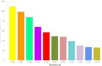
I am trying to create a bar chart where the bars have a standard colour based on a sales territory code
Each territoy has a code such as 2101. I have a table that has the territory code and a unique HEX number for a colour such as
#75CFD1 for each territory. When I try and add in the conditional format I can only get the max or min of the hex code, therefore one colour for all the bars. Works OK if you are just formating a cell in a table. Thoughts?
Thanks in advance
Matthew
Solved! Go to Solution.
- Mark as New
- Bookmark
- Subscribe
- Mute
- Subscribe to RSS Feed
- Permalink
- Report Inappropriate Content
Hello @reestv ,
Change your measurement like this:
Measure =
IF (
    MAX ( Sales[territoy code] ) IN VALUES ( HEX[territory code] ),
    CALCULATE (
        MAX ( HEX[HEX number] ),
        FILTER ( HEX, HEX[territory code] = MAX ( Sales[territoy code] ) )
    )
)
For more information, check the attached PBIX file.
Best regards
Icey
If this postHelp, then please considerAccept it as the solutionto help other members find it more quickly.
- Mark as New
- Bookmark
- Subscribe
- Mute
- Subscribe to RSS Feed
- Permalink
- Report Inappropriate Content
That was an awesome solution! Worked perfectly for the bar chart I was formatting. Thank you so much for your input!
- Mark as New
- Bookmark
- Subscribe
- Mute
- Subscribe to RSS Feed
- Permalink
- Report Inappropriate Content
Thanks Icey works a treat, much appreciated, need to go back and see what code is doing 🙂
You're a life saver.
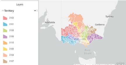
Now I need to see if I can do the same in the mapping!
- Mark as New
- Bookmark
- Subscribe
- Mute
- Subscribe to RSS Feed
- Permalink
- Report Inappropriate Content
Create a color measure using your table. I have used color like red and tested it both table and bar visual. You should be able to use your hex code
Color sales = if(AVERAGE(Sales[Sales Amount])<170,"green","red")
Refer:
https://docs.microsoft.com/en-us/power-bi/desktop-conditional-table-formatting#color-by-color-values
- Mark as New
- Bookmark
- Subscribe
- Mute
- Subscribe to RSS Feed
- Permalink
- Report Inappropriate Content
Hi @reestv,
I belive that if you already have categorized by regions you can drag the region code on the Legend and after you can go on format Tab and change the colours as you may want.
If this helped please mark aas solution.
Thanks
Alin Oprita
- Mark as New
- Bookmark
- Subscribe
- Mute
- Subscribe to RSS Feed
- Permalink
- Report Inappropriate Content
Thanks, I want the colours to be looked up from the colour table.


