FabCon is coming to Atlanta
Join us at FabCon Atlanta from March 16 - 20, 2026, for the ultimate Fabric, Power BI, AI and SQL community-led event. Save $200 with code FABCOMM.
Register now!- Power BI forums
- Get Help with Power BI
- Desktop
- Service
- Report Server
- Power Query
- Mobile Apps
- Developer
- DAX Commands and Tips
- Custom Visuals Development Discussion
- Health and Life Sciences
- Power BI Spanish forums
- Translated Spanish Desktop
- Training and Consulting
- Instructor Led Training
- Dashboard in a Day for Women, by Women
- Galleries
- Data Stories Gallery
- Themes Gallery
- Contests Gallery
- QuickViz Gallery
- Quick Measures Gallery
- Visual Calculations Gallery
- Notebook Gallery
- Translytical Task Flow Gallery
- TMDL Gallery
- R Script Showcase
- Webinars and Video Gallery
- Ideas
- Custom Visuals Ideas (read-only)
- Issues
- Issues
- Events
- Upcoming Events
The Power BI Data Visualization World Championships is back! Get ahead of the game and start preparing now! Learn more
- Power BI forums
- Forums
- Get Help with Power BI
- Desktop
- Conditional column PowerBI
- Subscribe to RSS Feed
- Mark Topic as New
- Mark Topic as Read
- Float this Topic for Current User
- Bookmark
- Subscribe
- Printer Friendly Page
- Mark as New
- Bookmark
- Subscribe
- Mute
- Subscribe to RSS Feed
- Permalink
- Report Inappropriate Content
Conditional column PowerBI
So basically first column you see with the time values, but in format as a whole number. Second column should be the drive time norm that should not be exceeded. Now the third column should do the following: If first column(klaipėda - radviliškis) exceeds second column value, then we should return the difference between the two(actual first column and second column). If first column value does not exceed second column, then we should just return actual time in the first column.
- Mark as New
- Bookmark
- Subscribe
- Mute
- Subscribe to RSS Feed
- Permalink
- Report Inappropriate Content
Hi @Anonymous ,
It is suggested to convert the two columns of time values into time types. Then you can easily calculate the difference.
The measure is this. Then you need to select Time formats as the format of the measure.
Difference =
IF (
    MAX ( 'Table'[klaipėda - radviliškis] ) > MAX ( 'Table'[earliest] ),
    MAX ( 'Table'[klaipėda - radviliškis] ) - MAX ( 'Table'[earliest] )
)
The result is this.
You can check more details from here.
Best Regards,
Stephen Tao
If this post helps, then please consider Accept it as the solution to help the other members find it more quickly.
- Mark as New
- Bookmark
- Subscribe
- Mute
- Subscribe to RSS Feed
- Permalink
- Report Inappropriate Content
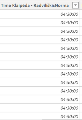
@v-stephen-msft Many thanks for your help, one more thing: I created a custom column to return the actual time value if the time exceeds the norm and if it did not, then just return the actual time value, like shown below. If the Time column exceeds 4:30, then it shows difference, if not, it returns the actual time value.
However, i need to display it into the histogram and show the actual value below 4:30 or 4:30 in the green color and then if it exceeds it would add on the column and show it in red, something like that below. Any ideas what measure should be created?
- Mark as New
- Bookmark
- Subscribe
- Mute
- Subscribe to RSS Feed
- Permalink
- Report Inappropriate Content
Hi @Anonymous ,
Because if you put the value of the time type in the Values of the histogram, there can only be two aggregation operations, Count and Count (Distinct), so I changed it to display the percentage of time.
1.Add an index column and create these calculated columns.
TIME = TIME(23,59,59)Percentage = [klaipėda - radviliškis]/[TIME]below 4:30 or 4:30 = IF([klaipėda - radviliškis]>[klaipėda - radviliškisNorma],[klaipėda - radviliškisNorma]/[TIME],[Percentage])above 4:30 = [Percentage]-[below 4:30 or 4:30]
2.Create a Stacked column chart and a martix. Then combine them.
You can check more details from here.
Best Regards,
Stephen Tao
If this post helps, then please consider Accept it as the solution to help the other members find it more quickly.
- Mark as New
- Bookmark
- Subscribe
- Mute
- Subscribe to RSS Feed
- Permalink
- Report Inappropriate Content
@Anonymous Many thanks for your help, one more thing: I created a custom column to return the actual time value if the time exceeds the norm and if it did not, then just return the actual time value, like shown below. If the Time column exceeds 4:30, then it shows difference, if not, it returns the actual time value.
However, i need to display it into the histogram and show the actual value below 4:30 or 4:30 in the green color and then if it exceeds it would add on the column and show it in red, something like that below. Any ideas what measure should be created?
Helpful resources

Power BI Dataviz World Championships
The Power BI Data Visualization World Championships is back! Get ahead of the game and start preparing now!

| User | Count |
|---|---|
| 38 | |
| 37 | |
| 34 | |
| 31 | |
| 27 |
| User | Count |
|---|---|
| 136 | |
| 99 | |
| 73 | |
| 66 | |
| 65 |


