- Power BI forums
- Updates
- News & Announcements
- Get Help with Power BI
- Desktop
- Service
- Report Server
- Power Query
- Mobile Apps
- Developer
- DAX Commands and Tips
- Custom Visuals Development Discussion
- Health and Life Sciences
- Power BI Spanish forums
- Translated Spanish Desktop
- Power Platform Integration - Better Together!
- Power Platform Integrations (Read-only)
- Power Platform and Dynamics 365 Integrations (Read-only)
- Training and Consulting
- Instructor Led Training
- Dashboard in a Day for Women, by Women
- Galleries
- Community Connections & How-To Videos
- COVID-19 Data Stories Gallery
- Themes Gallery
- Data Stories Gallery
- R Script Showcase
- Webinars and Video Gallery
- Quick Measures Gallery
- 2021 MSBizAppsSummit Gallery
- 2020 MSBizAppsSummit Gallery
- 2019 MSBizAppsSummit Gallery
- Events
- Ideas
- Custom Visuals Ideas
- Issues
- Issues
- Events
- Upcoming Events
- Community Blog
- Power BI Community Blog
- Custom Visuals Community Blog
- Community Support
- Community Accounts & Registration
- Using the Community
- Community Feedback
Register now to learn Fabric in free live sessions led by the best Microsoft experts. From Apr 16 to May 9, in English and Spanish.
- Power BI forums
- Forums
- Get Help with Power BI
- Desktop
- Conditional Formatting the colours of a bubble map...
- Subscribe to RSS Feed
- Mark Topic as New
- Mark Topic as Read
- Float this Topic for Current User
- Bookmark
- Subscribe
- Printer Friendly Page
- Mark as New
- Bookmark
- Subscribe
- Mute
- Subscribe to RSS Feed
- Permalink
- Report Inappropriate Content
Conditional Formatting the colours of a bubble map (Wrong colour being displayed)
Good Morning
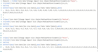
I wonder if I could have a bit of support regarding the below I’ve been using the bubble map visualisation conditionally formatted to turn a set of colours based on a measurement that we have created which I have shown below.
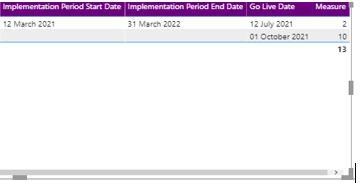
Unfortunately it appeared that the measurement wasn’t working to show the colours on the map the correct way and as an example I can show you the below. As you can see the“Measurement (The heat map uses a combination of the amount of things happening in a place at once as well as a timeframe to work out the total)is 12 if you add 10 and 2 together r however you can see below this it is adding up to 13
underneath the two in the summary.
I did notice this with other areas as well for example in the below you can see the "Measurement" should be two but overall it's coming up as 13 which is what is being used within the heatmap so while the bubble should be showing as Green it is instead displaying black.
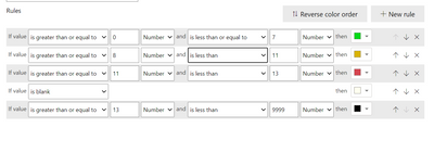
The map is conditionally formatted to the measure as per the below
The little issue being it seems to be the “Summary” number appearing at the bottom which the map seems to be taking rather than the sum of the measures individually (I.e so in the first table it should be showing as “Red” with 10 + 2= 12 and in the second should be showing as “Green” taking the number “2” yet but is coming up as black on the map taking the “13” number. In both of these cases the bubble on the map is showing up as black because the map is formatting to that overall measurement rather than the breakdown of what is shown in the measurement column
Do you possibly know why this may be the case and if there is a quick solution to this problem?
Thank you.
- Mark as New
- Bookmark
- Subscribe
- Mute
- Subscribe to RSS Feed
- Permalink
- Report Inappropriate Content
Hi @DanH2000,
Can you please share a pbix or some dummy data that keep raw data structure? It should help us clarify your scenario and test to troubleshoot.
How to Get Your Question Answered Quickly
Regards,
Xiaoxin Sheng
If this post helps, please consider accept as solution to help other members find it more quickly.
- Mark as New
- Bookmark
- Subscribe
- Mute
- Subscribe to RSS Feed
- Permalink
- Report Inappropriate Content
Good Evening.
I have since tried to research how to attach a file on to the community support group and have found that it appears the solution is to attach the link via one drive and because of security within my organisation this would be a bit of a challenge, is there an alternative way for me to attach the Pbi File?
Thank you
Kind Regards
- Mark as New
- Bookmark
- Subscribe
- Mute
- Subscribe to RSS Feed
- Permalink
- Report Inappropriate Content
HI @DanH2000,
It seems like your account does not has permission to attach files, perhaps you can upload it to your network driver and share the link here.
Notice: Please remove/replace all sensitive data or build some dummy data with a similar data structure for share.
Regards,
Xiaoxin Sheng
If this post helps, please consider accept as solution to help other members find it more quickly.
- Mark as New
- Bookmark
- Subscribe
- Mute
- Subscribe to RSS Feed
- Permalink
- Report Inappropriate Content
Good Morning.
Thanks for the response.
Hopefully this link works below for the test file.
So basically I want the measure in the table below
to reflect the two numbers shown added together (so 11) rather than 13. I have a map visualisation which you should be able to see which is conditionally formatted so that if the measure hits the number "13" it will be black (this can be based on timelines as seen on the timeline slicer below this visualisation so the value of the measure changes depending on which slice of time is picked). So when picking the slice of time I have picked in September the colour should be showing as "Red" rather than "black".
Hope this makes sense
Kind Regards 🙂
- Mark as New
- Bookmark
- Subscribe
- Mute
- Subscribe to RSS Feed
- Permalink
- Report Inappropriate Content
Good Morning
Sure no problem, can you please tell me how to attach as I can't see an "Insert attachment" option when I reply? Or do I need to e-mail
Thank you
Kind Regards
Helpful resources

Microsoft Fabric Learn Together
Covering the world! 9:00-10:30 AM Sydney, 4:00-5:30 PM CET (Paris/Berlin), 7:00-8:30 PM Mexico City

Power BI Monthly Update - April 2024
Check out the April 2024 Power BI update to learn about new features.

| User | Count |
|---|---|
| 96 | |
| 95 | |
| 82 | |
| 71 | |
| 64 |
| User | Count |
|---|---|
| 116 | |
| 106 | |
| 94 | |
| 79 | |
| 72 |


