FabCon is coming to Atlanta
Join us at FabCon Atlanta from March 16 - 20, 2026, for the ultimate Fabric, Power BI, AI and SQL community-led event. Save $200 with code FABCOMM.
Register now!- Power BI forums
- Get Help with Power BI
- Desktop
- Service
- Report Server
- Power Query
- Mobile Apps
- Developer
- DAX Commands and Tips
- Custom Visuals Development Discussion
- Health and Life Sciences
- Power BI Spanish forums
- Translated Spanish Desktop
- Training and Consulting
- Instructor Led Training
- Dashboard in a Day for Women, by Women
- Galleries
- Data Stories Gallery
- Themes Gallery
- Contests Gallery
- QuickViz Gallery
- Quick Measures Gallery
- Visual Calculations Gallery
- Notebook Gallery
- Translytical Task Flow Gallery
- TMDL Gallery
- R Script Showcase
- Webinars and Video Gallery
- Ideas
- Custom Visuals Ideas (read-only)
- Issues
- Issues
- Events
- Upcoming Events
Get Fabric Certified for FREE during Fabric Data Days. Don't miss your chance! Request now
- Power BI forums
- Forums
- Get Help with Power BI
- Desktop
- Compare & Graph a series of tests that are compose...
- Subscribe to RSS Feed
- Mark Topic as New
- Mark Topic as Read
- Float this Topic for Current User
- Bookmark
- Subscribe
- Printer Friendly Page
- Mark as New
- Bookmark
- Subscribe
- Mute
- Subscribe to RSS Feed
- Permalink
- Report Inappropriate Content
Compare & Graph a series of tests that are composed of a start time, stop time,
I am a novice to Power BI, and Dax. I could not find an example, or question related to my challenge. I have a series of test as follows:
Test 1, date, time, value
Test 1, date, time, value
Test 1, date, time, value
Test 1, date, time, value
Test 2, date, time, value
Test 2, date, time, value
Test 2, date, time, value
Test 2, date, time, value
Test 3, date, time, value
Test 3, date, time, value
Test 3, date, time, value
Test 3, date, time, value
Test 3, date, time, value
Test 3, date, time, value
Test 3, date, time, value
Test 3, date, time, value
I want to graph the lapse time in hours from FIRSTDATE [date],[time] to LASTDATE [date],[time] of each test set, and then while using a single graph, plot each hour for each test, showing a comparison overtime to itself, as well as to the other test sets.
The first entry for each test set (Test 1, Test 2, Test 3) would have a lapse time of ZERO hours, as this entry is the starting point, the subsequencial entries would caculate the lapse time between the starting point, and the current entry date/time.
I just cannot seem to an example or similiar question that demos my outcome.
- Mark as New
- Bookmark
- Subscribe
- Mute
- Subscribe to RSS Feed
- Permalink
- Report Inappropriate Content
@sport wrote:I am a novice to Power BI, and Dax. I could not find an example, or question related to my challenge. I have a series of test as follows:
Test 1, date, time, value
Test 1, date, time, value
Test 1, date, time, value
Test 1, date, time, value
Test 2, date, time, value
Test 2, date, time, value
Test 2, date, time, value
Test 2, date, time, value
Test 3, date, time, value
Test 3, date, time, value
Test 3, date, time, value
Test 3, date, time, value
Test 3, date, time, value
Test 3, date, time, value
Test 3, date, time, value
Test 3, date, time, value
I want to graph the lapse time in hours from FIRSTDATE [date],[time] to LASTDATE [date],[time] of each test set, and then while using a single graph, plot each hour for each test, showing a comparison overtime to itself, as well as to the other test sets.
The first entry for each test set (Test 1, Test 2, Test 3) would have a lapse time of ZERO hours, as this entry is the starting point, the subsequencial entries would caculate the lapse time between the starting point, and the current entry date/time.
I just cannot seem to an example or similiar question that demos my outcome.
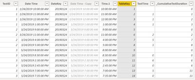
I used 2 calculated columns:
TestTime = length of each test
_CumulativeTestTime = cumulative sum of the individual test entries by Test set

Use DateDiff to measure the time change
DATEDIFF (
CALCULATE (
MAX ( 'TestResults'[Date Time] ),
FILTER (
'TestResults',
'TestResults'[TestID] = EARLIER ( 'TestResults'[TestID] )
&& 'TestResults'[TableKey]
= EARLIER ( 'TestResults'[TableKey] ) - 1
)
),
'TestResults'[Date Time],
HOUR
)
_CumulativeTestDuration =
DATEDIFF (
CALCULATE (
MIN ( 'TestResults'[Date Time] ),
FILTER (
'TestResults',
'TestResults'[TestID] = EARLIER ( 'TestResults'[TestID] )
)
),
'TestResults'[Date Time],
HOUR
)
End Visualization

Helpful resources

Power BI Monthly Update - November 2025
Check out the November 2025 Power BI update to learn about new features.

Fabric Data Days
Advance your Data & AI career with 50 days of live learning, contests, hands-on challenges, study groups & certifications and more!

