Join the #PBI10 DataViz contest
Power BI is turning 10, and we’re marking the occasion with a special community challenge. Use your creativity to tell a story, uncover trends, or highlight something unexpected.
Get started- Power BI forums
- Get Help with Power BI
- Desktop
- Service
- Report Server
- Power Query
- Mobile Apps
- Developer
- DAX Commands and Tips
- Custom Visuals Development Discussion
- Health and Life Sciences
- Power BI Spanish forums
- Translated Spanish Desktop
- Training and Consulting
- Instructor Led Training
- Dashboard in a Day for Women, by Women
- Galleries
- Webinars and Video Gallery
- Data Stories Gallery
- Themes Gallery
- Contests Gallery
- Quick Measures Gallery
- Notebook Gallery
- Translytical Task Flow Gallery
- R Script Showcase
- Ideas
- Custom Visuals Ideas (read-only)
- Issues
- Issues
- Events
- Upcoming Events
Power BI is turning 10! Let’s celebrate together with dataviz contests, interactive sessions, and giveaways. Register now.
- Power BI forums
- Forums
- Get Help with Power BI
- Desktop
- Compare Forecast and Actual Date Ranges
- Subscribe to RSS Feed
- Mark Topic as New
- Mark Topic as Read
- Float this Topic for Current User
- Bookmark
- Subscribe
- Printer Friendly Page
- Mark as New
- Bookmark
- Subscribe
- Mute
- Subscribe to RSS Feed
- Permalink
- Report Inappropriate Content
Compare Forecast and Actual Date Ranges
I need a visual that compare Actual and Forecast numbers. The data is a table of dates and I have caluclated the DATEDIFF values. Currently I have two stacked bar charts, one for Actual, one Forecast. The problem is that separate visuals distort the scale and occupy too much screen space. Is there a way to create one visual with my data which looks like this (x2)? Thanks!
| Shutdown Start | Shutdown End | Maintenance Start | Maintenance End | Restart Start | Restart End |
| 8/1/2021 | 9/10/2021 | 11/23/2021 | 12/17/2021 | 11/14/2021 | 3/21/2022 |
| 6/26/2021 | 5/25/2021 | 3/16/2021 | 3/4/2021 | 6/23/2021 | 1/13/2021 |
| 8/18/2021 | 10/31/2021 | 3/22/2022 | 5/2/2022 | 1/21/2022 | 10/11/2022 |
| 7/5/2021 | 6/21/2021 | 5/18/2021 | 5/15/2021 | 7/29/2021 | 5/1/2021 |

Solved! Go to Solution.
- Mark as New
- Bookmark
- Subscribe
- Mute
- Subscribe to RSS Feed
- Permalink
- Report Inappropriate Content
Hi @maranz,
You may try the solution suggested by @bcdobbs.
Alternatively, you may also look at creating custom visual specific to your need at the site https://pbivizedit.com
Given the data:
| Type | Head | Days |
| Actual | Shutdown | 12 |
| Actual | Maintenance | 9 |
| Actual | Restart | 4 |
| Forecast | Shutdown | 12 |
| Forecast | Maintenance | 13 |
| Forecast | Restart | 4 |
I am capable of creating this:
You can have a look at https://pbivizedit.com/gallery/actual-vs-forecast
Please note, these visuals do not support native Power BI tooltips and selection.
Thanks,
-R
- Mark as New
- Bookmark
- Subscribe
- Mute
- Subscribe to RSS Feed
- Permalink
- Report Inappropriate Content
Hi, @maranz ;
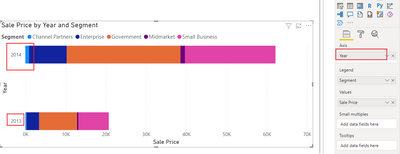
You could create a column or a table So that the values of "actual" and "Forecast" are put into different categories respectively, just like 2013 and 2014 below.
Or could you share simple file and expected result? It makes it easier to give you a solution.
Best Regards,
Community Support Team_ Yalan Wu
If this post helps, then please consider Accept it as the solution to help the other members find it more quickly.
- Mark as New
- Bookmark
- Subscribe
- Mute
- Subscribe to RSS Feed
- Permalink
- Report Inappropriate Content
Thank you. This was very helpful.
- Mark as New
- Bookmark
- Subscribe
- Mute
- Subscribe to RSS Feed
- Permalink
- Report Inappropriate Content
Hi @maranz,
You may try the solution suggested by @bcdobbs.
Alternatively, you may also look at creating custom visual specific to your need at the site https://pbivizedit.com
Given the data:
| Type | Head | Days |
| Actual | Shutdown | 12 |
| Actual | Maintenance | 9 |
| Actual | Restart | 4 |
| Forecast | Shutdown | 12 |
| Forecast | Maintenance | 13 |
| Forecast | Restart | 4 |
I am capable of creating this:
You can have a look at https://pbivizedit.com/gallery/actual-vs-forecast
Please note, these visuals do not support native Power BI tooltips and selection.
Thanks,
-R
- Mark as New
- Bookmark
- Subscribe
- Mute
- Subscribe to RSS Feed
- Permalink
- Report Inappropriate Content
How is the data structured for forecast and actual. If you can get the data into a single table where you can slice by forecast/actual then stacked bars have a "small multiple" option which will do what you want. Just drop the forecast/actual column in there.
Helpful resources

Join our Fabric User Panel
This is your chance to engage directly with the engineering team behind Fabric and Power BI. Share your experiences and shape the future.

Power BI Monthly Update - June 2025
Check out the June 2025 Power BI update to learn about new features.

| User | Count |
|---|---|
| 77 | |
| 76 | |
| 57 | |
| 36 | |
| 34 |
| User | Count |
|---|---|
| 99 | |
| 56 | |
| 56 | |
| 46 | |
| 40 |


