FabCon is coming to Atlanta
Join us at FabCon Atlanta from March 16 - 20, 2026, for the ultimate Fabric, Power BI, AI and SQL community-led event. Save $200 with code FABCOMM.
Register now!- Power BI forums
- Get Help with Power BI
- Desktop
- Service
- Report Server
- Power Query
- Mobile Apps
- Developer
- DAX Commands and Tips
- Custom Visuals Development Discussion
- Health and Life Sciences
- Power BI Spanish forums
- Translated Spanish Desktop
- Training and Consulting
- Instructor Led Training
- Dashboard in a Day for Women, by Women
- Galleries
- Data Stories Gallery
- Themes Gallery
- Contests Gallery
- QuickViz Gallery
- Quick Measures Gallery
- Visual Calculations Gallery
- Notebook Gallery
- Translytical Task Flow Gallery
- TMDL Gallery
- R Script Showcase
- Webinars and Video Gallery
- Ideas
- Custom Visuals Ideas (read-only)
- Issues
- Issues
- Events
- Upcoming Events
View all the Fabric Data Days sessions on demand. View schedule
- Power BI forums
- Forums
- Get Help with Power BI
- Desktop
- Coming chart issue
- Subscribe to RSS Feed
- Mark Topic as New
- Mark Topic as Read
- Float this Topic for Current User
- Bookmark
- Subscribe
- Printer Friendly Page
- Mark as New
- Bookmark
- Subscribe
- Mute
- Subscribe to RSS Feed
- Permalink
- Report Inappropriate Content
Coming chart issue
Hello experts,
i need help in finding solution or workaround for an issue.
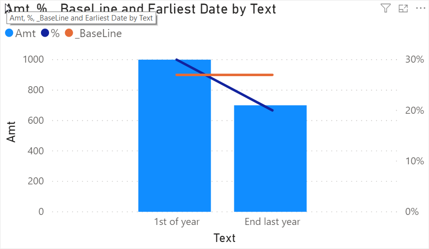
so I have a cluster column line chart where x axis is text type, left Y axis for column is amount in thpusands ranging from 0 to 1500 K, right Y axis for line is % ranging 0 to 100%.
Now, baseline data came as a new field and as amount in K and it should be added as line in same chart.
how do I accomplish that? Number for baseline is 900 k. How can I add a flat horizontal line at 900 k?
thanks a lot,
Solved! Go to Solution.
- Mark as New
- Bookmark
- Subscribe
- Mute
- Subscribe to RSS Feed
- Permalink
- Report Inappropriate Content
Hi @Anonymous ,
maybe this dirty trick will help
Please mark my post as solution, this will also help others.
Please give Kudos for support.
Marcus Wegener works as Full Stack Power BI Engineer at BI or DIE.
His mission is clear: "Get the most out of data, with Power BI."
twitter - LinkedIn - YouTube - website - podcast - Power BI Tutorials
- Mark as New
- Bookmark
- Subscribe
- Mute
- Subscribe to RSS Feed
- Permalink
- Report Inappropriate Content
Hi @Anonymous ,
can you provide sample data and a screenshot?
Maybe a constant line can be used?
https://docs.microsoft.com/en-us/power-bi/transform-model/desktop-analytics-pane
Please mark my post as solution, this will also help others.
Please give Kudos for support.
Marcus Wegener works as Full Stack Power BI Engineer at BI or DIE.
His mission is clear: "Get the most out of data, with Power BI."
twitter - LinkedIn - YouTube - website - podcast - Power BI Tutorials
- Mark as New
- Bookmark
- Subscribe
- Mute
- Subscribe to RSS Feed
- Permalink
- Report Inappropriate Content
Thanks. In combo chart, there is nothing in analytics pane.
sample data looks like below:
Date. Text. Amt. %. Baseline
01012017. 1st of year. 1000. 30. 900
12312016. End last year. 700. 20. 900
X axis text, y left axis for column amount, y right axis %, tooltip date.
howdo I put baseline date as a horizontal line which is amount data?
thanks
- Mark as New
- Bookmark
- Subscribe
- Mute
- Subscribe to RSS Feed
- Permalink
- Report Inappropriate Content
Hi @Anonymous ,
maybe this dirty trick will help
Please mark my post as solution, this will also help others.
Please give Kudos for support.
Marcus Wegener works as Full Stack Power BI Engineer at BI or DIE.
His mission is clear: "Get the most out of data, with Power BI."
twitter - LinkedIn - YouTube - website - podcast - Power BI Tutorials
- Mark as New
- Bookmark
- Subscribe
- Mute
- Subscribe to RSS Feed
- Permalink
- Report Inappropriate Content
Thanks a lot for your help. So you converted baseline amount to percentage and then placed it. I do not know the back end calculation in data base for creating baseline .So, converting it to percentage based on whole table might be complex. Will think about it.
thanks again.
- Mark as New
- Bookmark
- Subscribe
- Mute
- Subscribe to RSS Feed
- Permalink
- Report Inappropriate Content
Hi @Anonymous ,
Excellent solution from @mwegener ,better check it,if there's any question,you can also ask me.I'm also available and willing to solve any problem from you.
Kelly
- Mark as New
- Bookmark
- Subscribe
- Mute
- Subscribe to RSS Feed
- Permalink
- Report Inappropriate Content
Thank you @v-kelly-msft.
Do not be shy and give Kudos. 😉
Please mark my post as solution, this will also help others.
Please give Kudos for support.
Marcus Wegener works as Full Stack Power BI Engineer at BI or DIE.
His mission is clear: "Get the most out of data, with Power BI."
twitter - LinkedIn - YouTube - website - podcast - Power BI Tutorials
- Mark as New
- Bookmark
- Subscribe
- Mute
- Subscribe to RSS Feed
- Permalink
- Report Inappropriate Content
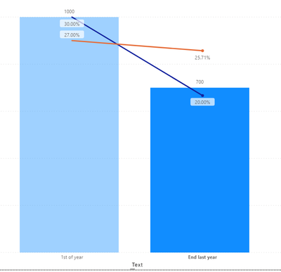
I tried it. Yes, the line is coming around 900 in left Y axis. But it came around 60% in Y right axis in PBI. The graph I have in Tableau for verification shows the same line passes around 40% in Y right axis. Soon probably I am close . But not there yet.
thanks again
- Mark as New
- Bookmark
- Subscribe
- Mute
- Subscribe to RSS Feed
- Permalink
- Report Inappropriate Content
Hi @Anonymous ,
How to get the value of around 40%?Can you upload a pic showing the line in Tableau ? Based on the data you showed in the post,the line should be as below:
Best Regards,
Kelly
- Mark as New
- Bookmark
- Subscribe
- Mute
- Subscribe to RSS Feed
- Permalink
- Report Inappropriate Content
Hi ,
I could make the value 42% now. Used same idea but only added some filters instead of All. Thanks for the trick.
So in card it is showing 42%. But when I am putting in visual as line, it's not coming as a straight line thru the span of months in X Axis. Instead showing a curvy line with numbers ranging from 36 to 89% for different months.
how do I get straight line?
- Mark as New
- Bookmark
- Subscribe
- Mute
- Subscribe to RSS Feed
- Permalink
- Report Inappropriate Content
Actually I solved my issue, created a column with same Dax and did average, and that worked nicely. Thanks a lot
- Mark as New
- Bookmark
- Subscribe
- Mute
- Subscribe to RSS Feed
- Permalink
- Report Inappropriate Content
Thanks Kelly,
the data I post only 3 rows from dataset. I have thousands of rows. And as I mentioned, I do not know the backend calculation for baseline. The average amount for baseline is coming as 900.
do you thing Xviz multiple axes chart might work here?
- Mark as New
- Bookmark
- Subscribe
- Mute
- Subscribe to RSS Feed
- Permalink
- Report Inappropriate Content
Hi @Anonymous ,
I‘ve tried Xviz multiple axes chart,but seems not a good solution for you,see below:
As you said in the last reply,the sample data has only 3 rows from dataset,but there are thousands of rows actually.So just try the method we suggested,you may get the value you need.
Best Regards,
Kelly
Helpful resources

Power BI Monthly Update - November 2025
Check out the November 2025 Power BI update to learn about new features.

Fabric Data Days
Advance your Data & AI career with 50 days of live learning, contests, hands-on challenges, study groups & certifications and more!


