FabCon is coming to Atlanta
Join us at FabCon Atlanta from March 16 - 20, 2026, for the ultimate Fabric, Power BI, AI and SQL community-led event. Save $200 with code FABCOMM.
Register now!- Power BI forums
- Get Help with Power BI
- Desktop
- Service
- Report Server
- Power Query
- Mobile Apps
- Developer
- DAX Commands and Tips
- Custom Visuals Development Discussion
- Health and Life Sciences
- Power BI Spanish forums
- Translated Spanish Desktop
- Training and Consulting
- Instructor Led Training
- Dashboard in a Day for Women, by Women
- Galleries
- Data Stories Gallery
- Themes Gallery
- Contests Gallery
- QuickViz Gallery
- Quick Measures Gallery
- Visual Calculations Gallery
- Notebook Gallery
- Translytical Task Flow Gallery
- TMDL Gallery
- R Script Showcase
- Webinars and Video Gallery
- Ideas
- Custom Visuals Ideas (read-only)
- Issues
- Issues
- Events
- Upcoming Events
The Power BI Data Visualization World Championships is back! Get ahead of the game and start preparing now! Learn more
- Power BI forums
- Forums
- Get Help with Power BI
- Desktop
- Combo Chart Line Series
- Subscribe to RSS Feed
- Mark Topic as New
- Mark Topic as Read
- Float this Topic for Current User
- Bookmark
- Subscribe
- Printer Friendly Page
- Mark as New
- Bookmark
- Subscribe
- Mute
- Subscribe to RSS Feed
- Permalink
- Report Inappropriate Content
Combo Chart Line Series
Hi There,
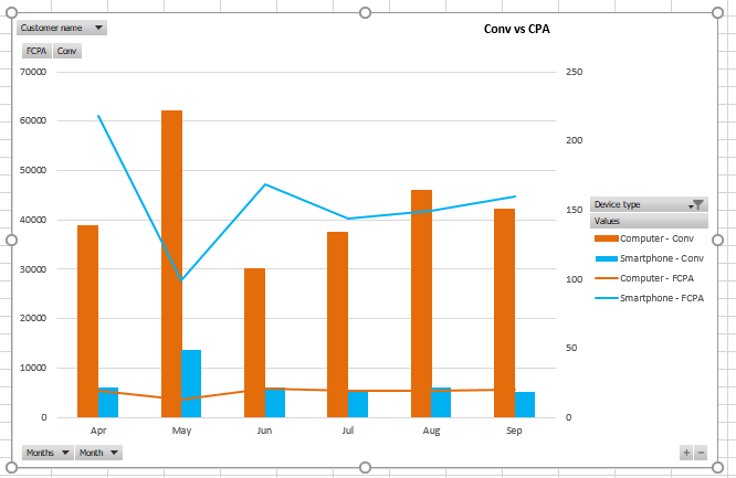
I'm trying to create a combo chart in Power BI such that I can see both a clustered column set and two line series, similar to what you see in the screengrab from excel attached.
In Power BI I am able to create the clustered column chart which shows the conversion breakdown in columns with the device type as a series however I'm unable to add a line series to the FCPA measure. I created the FCPA measure within Power BI - FCPA = SUM(Table1[Spend])/SUM(Table1[Conversions]) - I presume in order to create the chart I want I need to create a seperate measure for both Smartphone FCPA and Computer FCPA? If this is the case can someone advise me as to the formula I should use here - Just an FYI my data set does include a column which specifies device type.
Kind regards,
David
Solved! Go to Solution.
- Mark as New
- Bookmark
- Subscribe
- Mute
- Subscribe to RSS Feed
- Permalink
- Report Inappropriate Content
Create the following measures in your table, then drag them to Line values of Line and clustered column chart and check if you get expected result.
Smartphone FCPA = CALCULATE([FCPA],Table1[Device]="Smartphone")
Computer FCPA = CALCULATE([FCPA],Table1[Device]="Computer")
Regards,
Lydia
- Mark as New
- Bookmark
- Subscribe
- Mute
- Subscribe to RSS Feed
- Permalink
- Report Inappropriate Content
Thanks Lydia that worked 🙂
Helpful resources

Power BI Dataviz World Championships
The Power BI Data Visualization World Championships is back! Get ahead of the game and start preparing now!

| User | Count |
|---|---|
| 38 | |
| 36 | |
| 33 | |
| 33 | |
| 29 |
| User | Count |
|---|---|
| 132 | |
| 86 | |
| 85 | |
| 68 | |
| 64 |


