FabCon is coming to Atlanta
Join us at FabCon Atlanta from March 16 - 20, 2026, for the ultimate Fabric, Power BI, AI and SQL community-led event. Save $200 with code FABCOMM.
Register now!- Power BI forums
- Get Help with Power BI
- Desktop
- Service
- Report Server
- Power Query
- Mobile Apps
- Developer
- DAX Commands and Tips
- Custom Visuals Development Discussion
- Health and Life Sciences
- Power BI Spanish forums
- Translated Spanish Desktop
- Training and Consulting
- Instructor Led Training
- Dashboard in a Day for Women, by Women
- Galleries
- Data Stories Gallery
- Themes Gallery
- Contests Gallery
- QuickViz Gallery
- Quick Measures Gallery
- Visual Calculations Gallery
- Notebook Gallery
- Translytical Task Flow Gallery
- TMDL Gallery
- R Script Showcase
- Webinars and Video Gallery
- Ideas
- Custom Visuals Ideas (read-only)
- Issues
- Issues
- Events
- Upcoming Events
The Power BI Data Visualization World Championships is back! Get ahead of the game and start preparing now! Learn more
- Power BI forums
- Forums
- Get Help with Power BI
- Desktop
- Combine two waterfall charts
- Subscribe to RSS Feed
- Mark Topic as New
- Mark Topic as Read
- Float this Topic for Current User
- Bookmark
- Subscribe
- Printer Friendly Page
- Mark as New
- Bookmark
- Subscribe
- Mute
- Subscribe to RSS Feed
- Permalink
- Report Inappropriate Content
Combine two waterfall charts
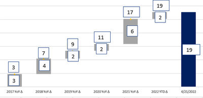
Requesting experts to suggest an idea to solve this. I have 2 waterfall charts to be clubbed into one. Below is the data sample data. In first waterfall, i want to show yearly count data ( in the middle of bar) and cumulative total in the second one (outside of bar) as shown in below image. I tried working with background and colors to make it white in the 2nd chart and overlay it on the first waterfall. But i am not able to make the white bars transparent and i tried line chart to overlay on waterfall chart. But unable to get proper alignment between the 2 charts. I explored marketplace but not able to find one. Is there any workaround solution that you are aware of ? or if there is a way to solve this, could you please let me know ?
| Year | Count | Cumulative Count |
| 2017 | 3 | 3 |
| 2018 | 4 | 7 |
| 2019 | 2 | 9 |
| 2020 | 2 | 11 |
| 2021 | 6 | 17 |
| 2022 | 2 | 19 |
Thanks,
Srini
Solved! Go to Solution.
- Mark as New
- Bookmark
- Subscribe
- Mute
- Subscribe to RSS Feed
- Permalink
- Report Inappropriate Content
Hi @ksrini ,
You need to turn off the background of the visuals to make them transparent, and then resize the line graphs so they overlap.
Or you can try to use the Ultimate Waterfall custom visual, but it will have a watermark and the position of the data labels of the line graph cannot be adjusted.
If the problem is still not resolved, please provide detailed error information or the expected result you expect. Let me know immediately, looking forward to your reply.
Best Regards,
Winniz
If this post helps, then please consider Accept it as the solution to help the other members find it more quickly.
Helpful resources

Power BI Dataviz World Championships
The Power BI Data Visualization World Championships is back! Get ahead of the game and start preparing now!

| User | Count |
|---|---|
| 41 | |
| 38 | |
| 36 | |
| 30 | |
| 28 |
| User | Count |
|---|---|
| 128 | |
| 88 | |
| 79 | |
| 67 | |
| 62 |


