Fabric Data Days starts November 4th!
Advance your Data & AI career with 50 days of live learning, dataviz contests, hands-on challenges, study groups & certifications and more!
Get registered- Power BI forums
- Get Help with Power BI
- Desktop
- Service
- Report Server
- Power Query
- Mobile Apps
- Developer
- DAX Commands and Tips
- Custom Visuals Development Discussion
- Health and Life Sciences
- Power BI Spanish forums
- Translated Spanish Desktop
- Training and Consulting
- Instructor Led Training
- Dashboard in a Day for Women, by Women
- Galleries
- Data Stories Gallery
- Themes Gallery
- Contests Gallery
- QuickViz Gallery
- Quick Measures Gallery
- Visual Calculations Gallery
- Notebook Gallery
- Translytical Task Flow Gallery
- TMDL Gallery
- R Script Showcase
- Webinars and Video Gallery
- Ideas
- Custom Visuals Ideas (read-only)
- Issues
- Issues
- Events
- Upcoming Events
Get Fabric Certified for FREE during Fabric Data Days. Don't miss your chance! Request now
- Power BI forums
- Forums
- Get Help with Power BI
- Desktop
- Combine column entries and count into single calcu...
- Subscribe to RSS Feed
- Mark Topic as New
- Mark Topic as Read
- Float this Topic for Current User
- Bookmark
- Subscribe
- Printer Friendly Page
- Mark as New
- Bookmark
- Subscribe
- Mute
- Subscribe to RSS Feed
- Permalink
- Report Inappropriate Content
Combine column entries and count into single calculated column to enable labelling on Bubble Map
Hi all,
I have a map with various locations on it - e.g.:
| UK | Dave |
| France | Gill |
| Spain | Francis |
| UK | Moira |
| Finland | Han |
(it goes on for longer...)
And I'd like to label the bubble map with more than just the country name when I use it as a location, so thought that I could combine the country name and a count of the country name into a single calcuated column so the end result would be
UK 2
France 1
Spain 1
Finland 1
And I could then combine these into the single field that I could use as location so that the data labels would read "UK: 2" as opposed to just "UK".
I feel like I am missing an obvious trick here and being dim, but any guidance would be appreciated.
Solved! Go to Solution.
- Mark as New
- Bookmark
- Subscribe
- Mute
- Subscribe to RSS Feed
- Permalink
- Report Inappropriate Content
Sorry for the slow reply, I had issues logging in.
I wanted to data to be displayed on the map without requiring a tooltip (so I could capture the image and share it and not lose the info), so I needed a calculated column:
- Mark as New
- Bookmark
- Subscribe
- Mute
- Subscribe to RSS Feed
- Permalink
- Report Inappropriate Content
If you create the measure

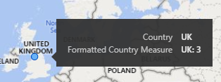
If you want just the formatted measure as the tooltip you can get that using a custom tooltip page.
Quickly the result would be

But once you get into custom tooltips there are plenty of options available to make the tooltip look/say what you want.
Proud to be a Super User! |  |
Helpful resources

Fabric Data Days
Advance your Data & AI career with 50 days of live learning, contests, hands-on challenges, study groups & certifications and more!

Power BI Monthly Update - October 2025
Check out the October 2025 Power BI update to learn about new features.

