- Power BI forums
- Updates
- News & Announcements
- Get Help with Power BI
- Desktop
- Service
- Report Server
- Power Query
- Mobile Apps
- Developer
- DAX Commands and Tips
- Custom Visuals Development Discussion
- Health and Life Sciences
- Power BI Spanish forums
- Translated Spanish Desktop
- Power Platform Integration - Better Together!
- Power Platform Integrations (Read-only)
- Power Platform and Dynamics 365 Integrations (Read-only)
- Training and Consulting
- Instructor Led Training
- Dashboard in a Day for Women, by Women
- Galleries
- Community Connections & How-To Videos
- COVID-19 Data Stories Gallery
- Themes Gallery
- Data Stories Gallery
- R Script Showcase
- Webinars and Video Gallery
- Quick Measures Gallery
- 2021 MSBizAppsSummit Gallery
- 2020 MSBizAppsSummit Gallery
- 2019 MSBizAppsSummit Gallery
- Events
- Ideas
- Custom Visuals Ideas
- Issues
- Issues
- Events
- Upcoming Events
- Community Blog
- Power BI Community Blog
- Custom Visuals Community Blog
- Community Support
- Community Accounts & Registration
- Using the Community
- Community Feedback
Register now to learn Fabric in free live sessions led by the best Microsoft experts. From Apr 16 to May 9, in English and Spanish.
- Power BI forums
- Forums
- Get Help with Power BI
- Desktop
- Combine Cluster and Stacked Bar Charts
- Subscribe to RSS Feed
- Mark Topic as New
- Mark Topic as Read
- Float this Topic for Current User
- Bookmark
- Subscribe
- Printer Friendly Page
- Mark as New
- Bookmark
- Subscribe
- Mute
- Subscribe to RSS Feed
- Permalink
- Report Inappropriate Content
Combine Cluster and Stacked Bar Charts
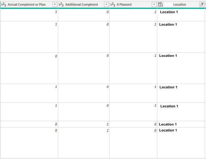
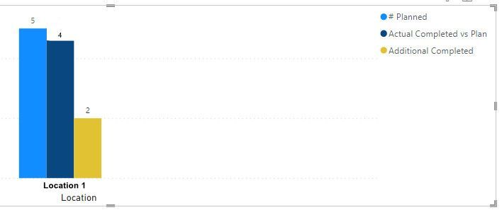
Below is a sample of my data set. I am able to create a cluster bar chart with 3 separate bars for each column (# Planned, Actual Completed vs Plan, and Additional Completed).
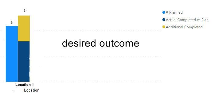
I would like to make two bars....One with the # Planned and the other with the Actual Completed vs Plan and Additional Completed combined into one bar. Does anyone know if this is possible? Thank you!
Solved! Go to Solution.
- Mark as New
- Bookmark
- Subscribe
- Mute
- Subscribe to RSS Feed
- Permalink
- Report Inappropriate Content
Hi @geauxtigers71
Please refer to a linked blog post, seems it can help ( note: it has a sample file)
https://www.villezekeviking.com/how-to-combine-a-clustered-and-stacked-chart-in-power-bi/
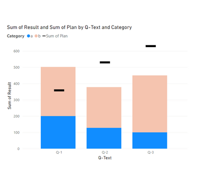
Or Consider changing it to a combo chart where planned will be a marker line, it is much more reader-friendly:
A sample file for this option: Here
If this post helps, then please consider Accepting it as the solution to help the other members find it more quickly
- Mark as New
- Bookmark
- Subscribe
- Mute
- Subscribe to RSS Feed
- Permalink
- Report Inappropriate Content
There is a workaround where you use a measure to get this to work out of the box in Power BI Desktop.
https://www.villezekeviking.com/how-to-combine-a-clustered-and-stacked-chart-in-power-bi/
I've described the solution in here and you can tweak it for your labels.
- Mark as New
- Bookmark
- Subscribe
- Mute
- Subscribe to RSS Feed
- Permalink
- Report Inappropriate Content
Hi @geauxtigers71
Please refer to a linked blog post, seems it can help ( note: it has a sample file)
https://www.villezekeviking.com/how-to-combine-a-clustered-and-stacked-chart-in-power-bi/
Or Consider changing it to a combo chart where planned will be a marker line, it is much more reader-friendly:
A sample file for this option: Here
If this post helps, then please consider Accepting it as the solution to help the other members find it more quickly
Helpful resources

Microsoft Fabric Learn Together
Covering the world! 9:00-10:30 AM Sydney, 4:00-5:30 PM CET (Paris/Berlin), 7:00-8:30 PM Mexico City

Power BI Monthly Update - April 2024
Check out the April 2024 Power BI update to learn about new features.

| User | Count |
|---|---|
| 100 | |
| 99 | |
| 80 | |
| 77 | |
| 66 |
| User | Count |
|---|---|
| 134 | |
| 106 | |
| 105 | |
| 86 | |
| 72 |


