FabCon is coming to Atlanta
Join us at FabCon Atlanta from March 16 - 20, 2026, for the ultimate Fabric, Power BI, AI and SQL community-led event. Save $200 with code FABCOMM.
Register now!- Power BI forums
- Get Help with Power BI
- Desktop
- Service
- Report Server
- Power Query
- Mobile Apps
- Developer
- DAX Commands and Tips
- Custom Visuals Development Discussion
- Health and Life Sciences
- Power BI Spanish forums
- Translated Spanish Desktop
- Training and Consulting
- Instructor Led Training
- Dashboard in a Day for Women, by Women
- Galleries
- Data Stories Gallery
- Themes Gallery
- Contests Gallery
- QuickViz Gallery
- Quick Measures Gallery
- Visual Calculations Gallery
- Notebook Gallery
- Translytical Task Flow Gallery
- TMDL Gallery
- R Script Showcase
- Webinars and Video Gallery
- Ideas
- Custom Visuals Ideas (read-only)
- Issues
- Issues
- Events
- Upcoming Events
The Power BI Data Visualization World Championships is back! Get ahead of the game and start preparing now! Learn more
- Power BI forums
- Forums
- Get Help with Power BI
- Desktop
- Colors based on parameters
- Subscribe to RSS Feed
- Mark Topic as New
- Mark Topic as Read
- Float this Topic for Current User
- Bookmark
- Subscribe
- Printer Friendly Page
- Mark as New
- Bookmark
- Subscribe
- Mute
- Subscribe to RSS Feed
- Permalink
- Report Inappropriate Content
Colors based on parameters
Hello Community,
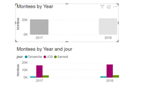
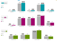
I hope you are doing well, you and your families. I have a question, I found the beginnings of answers on this forum but I can't seem to do what I would like. Here is the background: I have two parameters: "Year analyzed" and "Comparison Year". As you can see from the diagram, the year of comparison is always the same and the other changes a color for the week, another for Saturday and the other Sunday.
Thank you for your help
Solved! Go to Solution.
- Mark as New
- Bookmark
- Subscribe
- Mute
- Subscribe to RSS Feed
- Permalink
- Report Inappropriate Content
Hello
I dont find solution with a measure.
Anytime I put a legend to see year, its not working anymore.
With the measure and if I put the paramter table as legend and not the Year, its working.
Thank you for your help, youre awesome
- Mark as New
- Bookmark
- Subscribe
- Mute
- Subscribe to RSS Feed
- Permalink
- Report Inappropriate Content
Hi @Milozebre ,
Is this what you want?
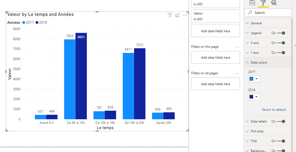
If the visual is Clustered column chart, you can't set conditional formating on it. Conditional formatting applies only to the values of Table or Matrix visuals.
So, I'm afraid what you want is not possible currently.
Best Regards,
Icey
If this post helps, then please consider Accept it as the solution to help the other members find it more quickly.
- Mark as New
- Bookmark
- Subscribe
- Mute
- Subscribe to RSS Feed
- Permalink
- Report Inappropriate Content
Hello @Icey ,
I can put some contionnal formating on clustered column chart as you see with this measure (see image) :
Because I would have to have a 2018 and 2019 file.
And in this case, 2018 should be gray and 2019 the other color.
Basically
year min = always gray
max year = custom color.
It works until I put a field in legend
- Mark as New
- Bookmark
- Subscribe
- Mute
- Subscribe to RSS Feed
- Permalink
- Report Inappropriate Content
Hello
I dont find solution with a measure.
Anytime I put a legend to see year, its not working anymore.
With the measure and if I put the paramter table as legend and not the Year, its working.
Thank you for your help, youre awesome
- Mark as New
- Bookmark
- Subscribe
- Mute
- Subscribe to RSS Feed
- Permalink
- Report Inappropriate Content
Hello,
I try this measure :

- Mark as New
- Bookmark
- Subscribe
- Mute
- Subscribe to RSS Feed
- Permalink
- Report Inappropriate Content
Check color by rule and color by value
https://docs.microsoft.com/en-us/power-bi/desktop-conditional-table-formatting
Few examples of measure that can used in color by values after selecting fields
Color Date = if(FIRSTNONBLANK('Date'[date],TODAY()) <today(),"lightgreen","red")

Color sales = if(AVERAGE(Sales[Sales Amount])<170,"green","red")
Color Year = if(FIRSTNONBLANK('Date'[Year],2014) <=2016,"lightgreen",if(FIRSTNONBLANK('Date'[Year],2014)>2018,"red","yellow"))
- Mark as New
- Bookmark
- Subscribe
- Mute
- Subscribe to RSS Feed
- Permalink
- Report Inappropriate Content
Hello @amitchandak
Thank you for the reply
I create a measure like this :
- Mark as New
- Bookmark
- Subscribe
- Mute
- Subscribe to RSS Feed
- Permalink
- Report Inappropriate Content
Combine with max year and create one or more combinations
If(max(Table[year]) =2007,
SWITCH(
SELECTEDVALUE(Comptage[jour]);
"JOB";"#009AA6";
"Samedi";"#A1006B";
"Dimanche";"#659200"),
///change the color for another year
SWITCH(
SELECTEDVALUE(Comptage[jour]);
"JOB";"#009AA6";
"Samedi";"#A1006B";
"Dimanche";"#659200") )- Mark as New
- Bookmark
- Subscribe
- Mute
- Subscribe to RSS Feed
- Permalink
- Report Inappropriate Content
- Mark as New
- Bookmark
- Subscribe
- Mute
- Subscribe to RSS Feed
- Permalink
- Report Inappropriate Content
Hi @Milozebre
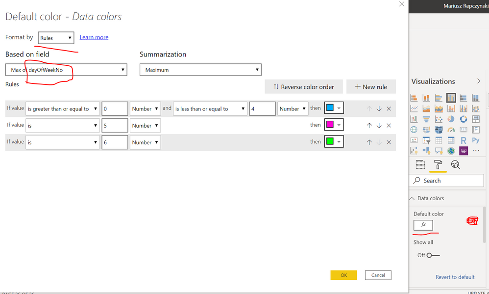
You can add a day of the week number column to your date dimension, later use it for conditional formating of you chart as below
Mariusz
If this post helps, then please consider Accepting it as the solution.
Please feel free to connect with me.
- Mark as New
- Bookmark
- Subscribe
- Mute
- Subscribe to RSS Feed
- Permalink
- Report Inappropriate Content
Hello @Mariusz
thank you for the reply.
As you can see on the chart above, what is gray is the year of analysis ex 2018
and in blue, the year of comparison. Gray can't change.
The analysis year which is a parameter must always be gray and the year of comparison on the basis of days must have the predefined colors.
I wanted to make measurements with Swhith but I don't know how to incorporate the parameters:
Year analyze = "Gray"
If day = "Job" with Year comparison; "Red"
for example
Helpful resources

Power BI Dataviz World Championships
The Power BI Data Visualization World Championships is back! Get ahead of the game and start preparing now!

| User | Count |
|---|---|
| 41 | |
| 39 | |
| 37 | |
| 29 | |
| 24 |
| User | Count |
|---|---|
| 122 | |
| 110 | |
| 83 | |
| 69 | |
| 68 |


