Become a Certified Power BI Data Analyst!
Join us for an expert-led overview of the tools and concepts you'll need to pass exam PL-300. The first session starts on June 11th. See you there!
Get registered- Power BI forums
- Get Help with Power BI
- Desktop
- Service
- Report Server
- Power Query
- Mobile Apps
- Developer
- DAX Commands and Tips
- Custom Visuals Development Discussion
- Health and Life Sciences
- Power BI Spanish forums
- Translated Spanish Desktop
- Training and Consulting
- Instructor Led Training
- Dashboard in a Day for Women, by Women
- Galleries
- Webinars and Video Gallery
- Data Stories Gallery
- Themes Gallery
- Contests Gallery
- Quick Measures Gallery
- Notebook Gallery
- Translytical Task Flow Gallery
- R Script Showcase
- Ideas
- Custom Visuals Ideas (read-only)
- Issues
- Issues
- Events
- Upcoming Events
Power BI is turning 10! Let’s celebrate together with dataviz contests, interactive sessions, and giveaways. Register now.
- Power BI forums
- Forums
- Get Help with Power BI
- Desktop
- Color Dots/Bubbles on Map Based on a Text Field Va...
- Subscribe to RSS Feed
- Mark Topic as New
- Mark Topic as Read
- Float this Topic for Current User
- Bookmark
- Subscribe
- Printer Friendly Page
- Mark as New
- Bookmark
- Subscribe
- Mute
- Subscribe to RSS Feed
- Permalink
- Report Inappropriate Content
Color Dots/Bubbles on Map Based on a Text Field Value - Urgent for COVID Project
Physician Address with Specialty A
Physician Address with Specialty B
Hospital ER
Other healthcare facility
When someone zooms in to look at a Hospital ER on the map, I want them to see the other healthcare facilities and nearby physicians on the map in different colors.
In order to accomplish this, I create ONE table with all of the data combined having these fields:
Category: This is a text field with one of the 4 categories listed above denoting what kind of address it is.
Name: This is EITHER the physician name or the facility name.
Address: This is the address to map.
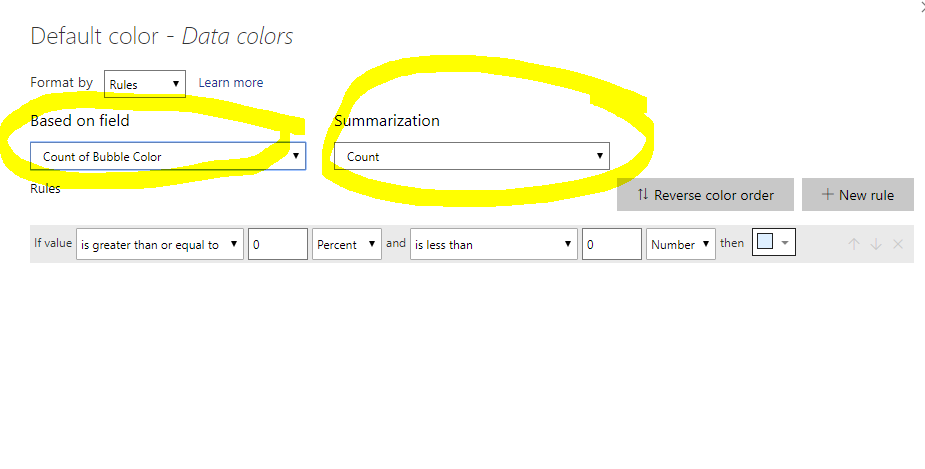
Bubble Color: This is just a number 1, 2, 3 or 4 that corresponds with the category. I created this to try to use conditional formatting based on the color but the FX conditional formatting will only COUNT this number, not look at the value in the field.
So, to summarize, I can map the data but I cannot figure out how to make the colored dots based on the actual text value in the "Category" field or the Bubble color.
The desired end result is that my map should have 4 different colors of dots depending on the category of the address.
Solved! Go to Solution.
- Mark as New
- Bookmark
- Subscribe
- Mute
- Subscribe to RSS Feed
- Permalink
- Report Inappropriate Content
Follow on LinkedIn
@ me in replies or I'll lose your thread!!!
Instead of a Kudo, please vote for this idea
Become an expert!: Enterprise DNA
External Tools: MSHGQM
YouTube Channel!: Microsoft Hates Greg
Latest book!: Power BI Cookbook Third Edition (Color)
DAX is easy, CALCULATE makes DAX hard...
- Mark as New
- Bookmark
- Subscribe
- Mute
- Subscribe to RSS Feed
- Permalink
- Report Inappropriate Content
@Greg_Deckleryou are my HERO today! Thank you. Such a simple thing but I would not have realized that was the issue. My map works now. Thank you so much.
- Mark as New
- Bookmark
- Subscribe
- Mute
- Subscribe to RSS Feed
- Permalink
- Report Inappropriate Content
Follow on LinkedIn
@ me in replies or I'll lose your thread!!!
Instead of a Kudo, please vote for this idea
Become an expert!: Enterprise DNA
External Tools: MSHGQM
YouTube Channel!: Microsoft Hates Greg
Latest book!: Power BI Cookbook Third Edition (Color)
DAX is easy, CALCULATE makes DAX hard...
Helpful resources
| User | Count |
|---|---|
| 81 | |
| 75 | |
| 70 | |
| 42 | |
| 36 |
| User | Count |
|---|---|
| 114 | |
| 56 | |
| 52 | |
| 43 | |
| 42 |


