- Power BI forums
- Updates
- News & Announcements
- Get Help with Power BI
- Desktop
- Service
- Report Server
- Power Query
- Mobile Apps
- Developer
- DAX Commands and Tips
- Custom Visuals Development Discussion
- Health and Life Sciences
- Power BI Spanish forums
- Translated Spanish Desktop
- Power Platform Integration - Better Together!
- Power Platform Integrations (Read-only)
- Power Platform and Dynamics 365 Integrations (Read-only)
- Training and Consulting
- Instructor Led Training
- Dashboard in a Day for Women, by Women
- Galleries
- Community Connections & How-To Videos
- COVID-19 Data Stories Gallery
- Themes Gallery
- Data Stories Gallery
- R Script Showcase
- Webinars and Video Gallery
- Quick Measures Gallery
- 2021 MSBizAppsSummit Gallery
- 2020 MSBizAppsSummit Gallery
- 2019 MSBizAppsSummit Gallery
- Events
- Ideas
- Custom Visuals Ideas
- Issues
- Issues
- Events
- Upcoming Events
- Community Blog
- Power BI Community Blog
- Custom Visuals Community Blog
- Community Support
- Community Accounts & Registration
- Using the Community
- Community Feedback
Register now to learn Fabric in free live sessions led by the best Microsoft experts. From Apr 16 to May 9, in English and Spanish.
- Power BI forums
- Forums
- Get Help with Power BI
- Desktop
- Clustered stacked chart possible?
- Subscribe to RSS Feed
- Mark Topic as New
- Mark Topic as Read
- Float this Topic for Current User
- Bookmark
- Subscribe
- Printer Friendly Page
- Mark as New
- Bookmark
- Subscribe
- Mute
- Subscribe to RSS Feed
- Permalink
- Report Inappropriate Content
Clustered stacked chart possible?
Hi
is it possible to create a clustered stacked chart with a native Power BI visual?
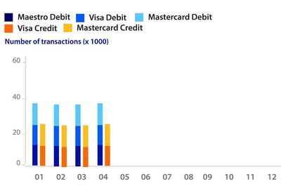
I need to create something like this, whereby the left blue stacked bar represents group A and the right yellow/orange stacked bar represents group B.
If not possible, what would be another way to visualize this?
Regards
Ron
Solved! Go to Solution.
- Mark as New
- Bookmark
- Subscribe
- Mute
- Subscribe to RSS Feed
- Permalink
- Report Inappropriate Content
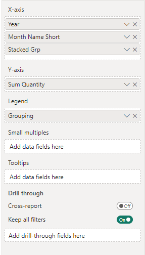
Main issue with your .pbix: Chart type is wrong and also we cannot use the same for both grouping and legend.
Additional details below to modify ...
1. Change the chart type stacked column chart
2. Change these and to use "Grouping"
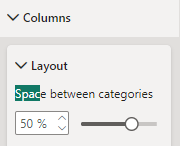
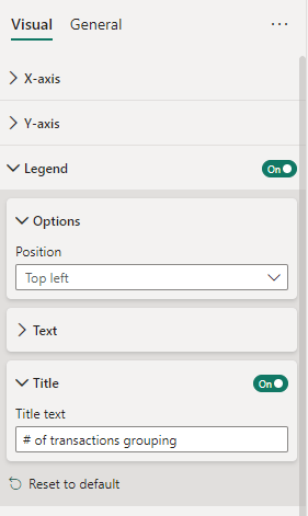
3. Adjust these settings
Drill down to lowest level:
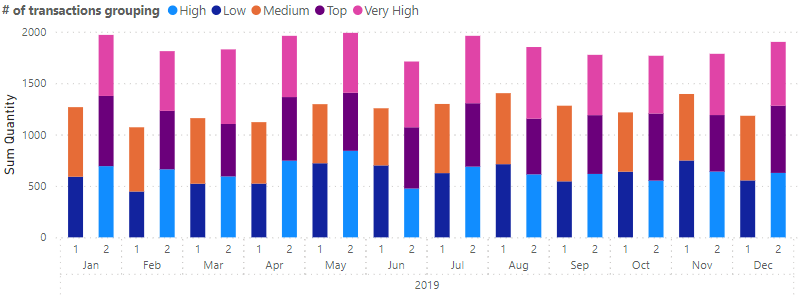
Final output will be like below:
Hope this helps!
- Mark as New
- Bookmark
- Subscribe
- Mute
- Subscribe to RSS Feed
- Permalink
- Report Inappropriate Content
- Mark as New
- Bookmark
- Subscribe
- Mute
- Subscribe to RSS Feed
- Permalink
- Report Inappropriate Content
Glad to hear it works!
------------------------------------------
Appreciate your Kudos 👍
- Mark as New
- Bookmark
- Subscribe
- Mute
- Subscribe to RSS Feed
- Permalink
- Report Inappropriate Content
You cannot get the same like your output chart with native Power BI charts.
Optional: But can tryout this if you are ok:
1. Add this calculated column:
Stacked Grp = SWITCH( TRUE() , Table1[Business Card] in { "Maestro Deibt", "Visa Debit", "Mastercard Debit" }, 1, 2)
2. Use this Stacked Grp in X-axis
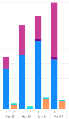
3. Output will be like this (I used my data as Month name, Stacked Grp as 1, 2 values)
- Mark as New
- Bookmark
- Subscribe
- Mute
- Subscribe to RSS Feed
- Permalink
- Report Inappropriate Content
Hi @sevenhills
Yhnx for your reaction.
I don't exactly get it working as you describe.
Maybe you can check the attached pbix and make the necessary changes?
Grouping-pbix
Regards
Ron
- Mark as New
- Bookmark
- Subscribe
- Mute
- Subscribe to RSS Feed
- Permalink
- Report Inappropriate Content
Main issue with your .pbix: Chart type is wrong and also we cannot use the same for both grouping and legend.
Additional details below to modify ...
1. Change the chart type stacked column chart
2. Change these and to use "Grouping"
3. Adjust these settings
Drill down to lowest level:
Final output will be like below:
Hope this helps!
Helpful resources

Microsoft Fabric Learn Together
Covering the world! 9:00-10:30 AM Sydney, 4:00-5:30 PM CET (Paris/Berlin), 7:00-8:30 PM Mexico City

Power BI Monthly Update - April 2024
Check out the April 2024 Power BI update to learn about new features.

| User | Count |
|---|---|
| 111 | |
| 109 | |
| 89 | |
| 76 | |
| 67 |
| User | Count |
|---|---|
| 125 | |
| 111 | |
| 100 | |
| 83 | |
| 71 |
