Huge last-minute discounts for FabCon Vienna from September 15-18, 2025
Supplies are limited. Contact info@espc.tech right away to save your spot before the conference sells out.
Get your discount- Power BI forums
- Get Help with Power BI
- Desktop
- Service
- Report Server
- Power Query
- Mobile Apps
- Developer
- DAX Commands and Tips
- Custom Visuals Development Discussion
- Health and Life Sciences
- Power BI Spanish forums
- Translated Spanish Desktop
- Training and Consulting
- Instructor Led Training
- Dashboard in a Day for Women, by Women
- Galleries
- Data Stories Gallery
- Themes Gallery
- Contests Gallery
- Quick Measures Gallery
- Notebook Gallery
- Translytical Task Flow Gallery
- TMDL Gallery
- R Script Showcase
- Webinars and Video Gallery
- Ideas
- Custom Visuals Ideas (read-only)
- Issues
- Issues
- Events
- Upcoming Events
Score big with last-minute savings on the final tickets to FabCon Vienna. Secure your discount
- Power BI forums
- Forums
- Get Help with Power BI
- Desktop
- Clustered column chart issue with double X axis va...
- Subscribe to RSS Feed
- Mark Topic as New
- Mark Topic as Read
- Float this Topic for Current User
- Bookmark
- Subscribe
- Printer Friendly Page
- Mark as New
- Bookmark
- Subscribe
- Mute
- Subscribe to RSS Feed
- Permalink
- Report Inappropriate Content
Clustered column chart issue with double X axis values
Hi,
The both axis in my clustered column chart don't work and I don't know why.
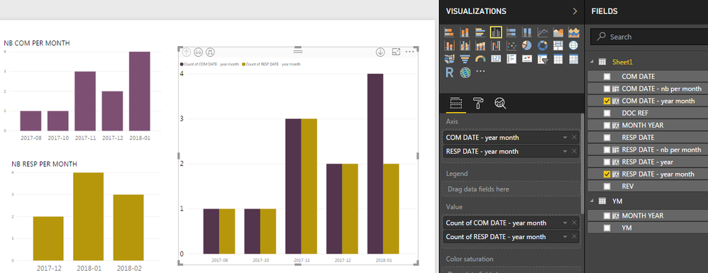
First, I create 2 separate clustered column charts, one for COM, one for RESP (left part).
Then, I tried to get one with both data but, when I add 2 axis (COM and RESP), always the first one is taken into account but not the second one. I guess it is normal but I don't know how to get round it. Somebody has an idea ?
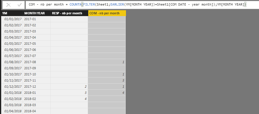
For information, here is a part of the content of the table Sheet1 (very simple).
Regards,
CR
Solved! Go to Solution.
- Mark as New
- Bookmark
- Subscribe
- Mute
- Subscribe to RSS Feed
- Permalink
- Report Inappropriate Content
Hi jthomson,
You're right. I tried to proceed like this and it finally worked!
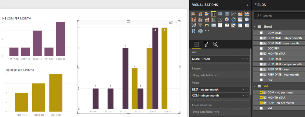
I created a new table with all the YEAR - MONTH combinaison and I count the number of COM and RESP in this table.
Then I drag and drop appropriate columns in the clustered column chart as follows:
So cool...
Regards,
CR
- Mark as New
- Bookmark
- Subscribe
- Mute
- Subscribe to RSS Feed
- Permalink
- Report Inappropriate Content
Hi,
I am trying to show two parameters on x axis region and deposits and y axis has one parameter how I can make graph like that in Power BI Desktop.
- Mark as New
- Bookmark
- Subscribe
- Mute
- Subscribe to RSS Feed
- Permalink
- Report Inappropriate Content
Easier to make a date table, or at least a table with all the relevant months listed, and link to your two tables from that. Then use the new table's column as your x axis
- Mark as New
- Bookmark
- Subscribe
- Mute
- Subscribe to RSS Feed
- Permalink
- Report Inappropriate Content
Hi jthomson,
You're right. I tried to proceed like this and it finally worked!
I created a new table with all the YEAR - MONTH combinaison and I count the number of COM and RESP in this table.
Then I drag and drop appropriate columns in the clustered column chart as follows:
So cool...
Regards,
CR


