Join us at FabCon Vienna from September 15-18, 2025
The ultimate Fabric, Power BI, SQL, and AI community-led learning event. Save €200 with code FABCOMM.
Get registered- Power BI forums
- Get Help with Power BI
- Desktop
- Service
- Report Server
- Power Query
- Mobile Apps
- Developer
- DAX Commands and Tips
- Custom Visuals Development Discussion
- Health and Life Sciences
- Power BI Spanish forums
- Translated Spanish Desktop
- Training and Consulting
- Instructor Led Training
- Dashboard in a Day for Women, by Women
- Galleries
- Data Stories Gallery
- Themes Gallery
- Contests Gallery
- Quick Measures Gallery
- Notebook Gallery
- Translytical Task Flow Gallery
- TMDL Gallery
- R Script Showcase
- Webinars and Video Gallery
- Ideas
- Custom Visuals Ideas (read-only)
- Issues
- Issues
- Events
- Upcoming Events
Enhance your career with this limited time 50% discount on Fabric and Power BI exams. Ends September 15. Request your voucher.
- Power BI forums
- Forums
- Get Help with Power BI
- Desktop
- Clustered Column Chart with two data sets
- Subscribe to RSS Feed
- Mark Topic as New
- Mark Topic as Read
- Float this Topic for Current User
- Bookmark
- Subscribe
- Printer Friendly Page
- Mark as New
- Bookmark
- Subscribe
- Mute
- Subscribe to RSS Feed
- Permalink
- Report Inappropriate Content
Clustered Column Chart with two data sets
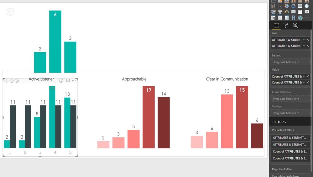
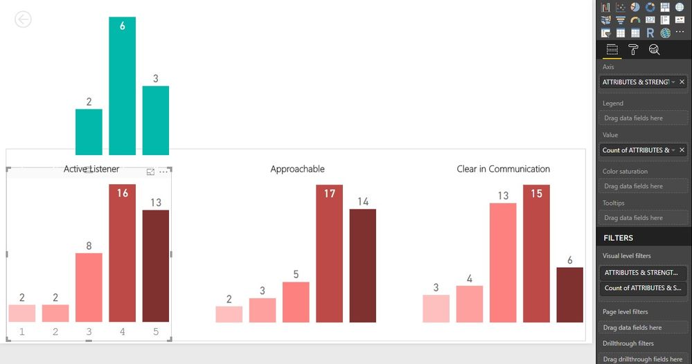
I am relatively new to Power BI and am trying to display some survey results in a bar chart. I have two seperate data sources for two seperate groups of people. The survey questions asked the user to give a rank from 1 to 5 to a group of questions. The bar charts display the rank given along the x axis and a count of how many people chose each rank. I am able to create seperate bar charts that show the data but when I try to do a clustered bar chart it shows up as a count for one group of data (correctly) and a total for the other even though both are set to be counts. I think it has something to do with the Axis fields but I do not fully understand how these work.


Solved! Go to Solution.
- Mark as New
- Bookmark
- Subscribe
- Mute
- Subscribe to RSS Feed
- Permalink
- Report Inappropriate Content
You may take a look at the post below.
https://community.powerbi.com/t5/Desktop/One-slicer-for-two-tables-M-M/td-p/523095
If this post helps, then please consider Accept it as the solution to help the other members find it more quickly.
- Mark as New
- Bookmark
- Subscribe
- Mute
- Subscribe to RSS Feed
- Permalink
- Report Inappropriate Content
Hi
Make sure to use not only the Axis but also the legend to do the break-down.
Thank you
Tomas Santandreu Polanco |Principal Business Intelligence Consultant
www.designmind.com
- Mark as New
- Bookmark
- Subscribe
- Mute
- Subscribe to RSS Feed
- Permalink
- Report Inappropriate Content
That does not seem to help my issue. If I have two Axis and two value data sources, it won't even let me put anything in Legend.
- Mark as New
- Bookmark
- Subscribe
- Mute
- Subscribe to RSS Feed
- Permalink
- Report Inappropriate Content
Hi John
Do you have two tables on this model?
Is there an active relationship between these two tables?
Tomas Santandreu Polanco |Principal Business Intelligence Consultant
www.designmind.com
Helpful resources
| User | Count |
|---|---|
| 69 | |
| 65 | |
| 63 | |
| 48 | |
| 28 |
| User | Count |
|---|---|
| 112 | |
| 82 | |
| 66 | |
| 48 | |
| 43 |


