FabCon is coming to Atlanta
Join us at FabCon Atlanta from March 16 - 20, 2026, for the ultimate Fabric, Power BI, AI and SQL community-led event. Save $200 with code FABCOMM.
Register now!- Power BI forums
- Get Help with Power BI
- Desktop
- Service
- Report Server
- Power Query
- Mobile Apps
- Developer
- DAX Commands and Tips
- Custom Visuals Development Discussion
- Health and Life Sciences
- Power BI Spanish forums
- Translated Spanish Desktop
- Training and Consulting
- Instructor Led Training
- Dashboard in a Day for Women, by Women
- Galleries
- Data Stories Gallery
- Themes Gallery
- Contests Gallery
- QuickViz Gallery
- Quick Measures Gallery
- Visual Calculations Gallery
- Notebook Gallery
- Translytical Task Flow Gallery
- TMDL Gallery
- R Script Showcase
- Webinars and Video Gallery
- Ideas
- Custom Visuals Ideas (read-only)
- Issues
- Issues
- Events
- Upcoming Events
The Power BI Data Visualization World Championships is back! Get ahead of the game and start preparing now! Learn more
- Power BI forums
- Forums
- Get Help with Power BI
- Desktop
- Clustered Column Chart - Secondary Axis - That Is ...
- Subscribe to RSS Feed
- Mark Topic as New
- Mark Topic as Read
- Float this Topic for Current User
- Bookmark
- Subscribe
- Printer Friendly Page
- Mark as New
- Bookmark
- Subscribe
- Mute
- Subscribe to RSS Feed
- Permalink
- Report Inappropriate Content
Clustered Column Chart - Secondary Axis - That Is Also a Clustered Column Chart & Not a Line
Hi Community,
Is there an out-of-the-box method to have a secondary axis in a clustered column chart that is not a line, but rather, part of the same clustered column? If so, how is this accomplished?
Some context: There is one measure from another table (most recent data) that I need to add to the clustered column chart. It would be great to avoid appending/merging queries from separate tables to try to accomplish this (using the standard clustered chart with a single axis).
Thank You!
- Mark as New
- Bookmark
- Subscribe
- Mute
- Subscribe to RSS Feed
- Permalink
- Report Inappropriate Content
Hi @GiveMeArrays ,
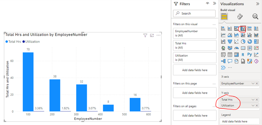
Please check if the following visuals are what you are trying to find...
Two Axis for Clustured Bar/Column Chart
Dual Axis Chart in Microsoft Power BI – Step By Step
Best Regards
- Mark as New
- Bookmark
- Subscribe
- Mute
- Subscribe to RSS Feed
- Permalink
- Report Inappropriate Content
Generally, the bottom chart is what I'm working on, but I'm only able to drag one field into the Y-axis bucket. If I drag a second item into it, the field that's in there gets deleted/replaced by the new (2nd) item. How do I prevent it from being automatically removed?...I see in your pic that two items are in the Y-axis bucket.
Thank You!
- Mark as New
- Bookmark
- Subscribe
- Mute
- Subscribe to RSS Feed
- Permalink
- Report Inappropriate Content
Hi @GiveMeArrays ,
The fields which I apply in Y-axis bucket are measures, could you please provide the related info of the fields which you apply in Y-axis bucket(For example: sample data, Fields setting of your visual and screenshot etc.)?
It is better if you can share a simplified pbix file. You can refer the following link to upload the file to the community. Thank you.
How to upload PBI in Community
Best Regards
- Mark as New
- Bookmark
- Subscribe
- Mute
- Subscribe to RSS Feed
- Permalink
- Report Inappropriate Content
Yep, in my Y-axis I'm trying to put two measures using the clustered column chart; both are count measures relating to dates. For security, I cannot share data or screenshots.
Thank You!
- Mark as New
- Bookmark
- Subscribe
- Mute
- Subscribe to RSS Feed
- Permalink
- Report Inappropriate Content
Hi @GiveMeArrays ,
OK, understand. Could you please just provide some fake data with Text format, the fields applied on the clustered column chart and the formula of these two measures? Later I will make troubleshooting based on your provided info and give you a suitable solution. Thank you.
Best Regards
Helpful resources

Power BI Dataviz World Championships
The Power BI Data Visualization World Championships is back! Get ahead of the game and start preparing now!

Power BI Monthly Update - November 2025
Check out the November 2025 Power BI update to learn about new features.

| User | Count |
|---|---|
| 59 | |
| 46 | |
| 42 | |
| 23 | |
| 17 |
| User | Count |
|---|---|
| 190 | |
| 122 | |
| 96 | |
| 66 | |
| 47 |


