Join us at the 2025 Microsoft Fabric Community Conference
March 31 - April 2, 2025, in Las Vegas, Nevada. Use code MSCUST for a $150 discount! Early bird discount ends December 31.
Register Now- Power BI forums
- Get Help with Power BI
- Desktop
- Service
- Report Server
- Power Query
- Mobile Apps
- Developer
- DAX Commands and Tips
- Custom Visuals Development Discussion
- Health and Life Sciences
- Power BI Spanish forums
- Translated Spanish Desktop
- Training and Consulting
- Instructor Led Training
- Dashboard in a Day for Women, by Women
- Galleries
- Community Connections & How-To Videos
- COVID-19 Data Stories Gallery
- Themes Gallery
- Data Stories Gallery
- R Script Showcase
- Webinars and Video Gallery
- Quick Measures Gallery
- 2021 MSBizAppsSummit Gallery
- 2020 MSBizAppsSummit Gallery
- 2019 MSBizAppsSummit Gallery
- Events
- Ideas
- Custom Visuals Ideas
- Issues
- Issues
- Events
- Upcoming Events
Be one of the first to start using Fabric Databases. View on-demand sessions with database experts and the Microsoft product team to learn just how easy it is to get started. Watch now
- Power BI forums
- Forums
- Get Help with Power BI
- Desktop
- Re: Clustered Column Chart - Grouping by same mont...
- Subscribe to RSS Feed
- Mark Topic as New
- Mark Topic as Read
- Float this Topic for Current User
- Bookmark
- Subscribe
- Printer Friendly Page
- Mark as New
- Bookmark
- Subscribe
- Mute
- Subscribe to RSS Feed
- Permalink
- Report Inappropriate Content
Clustered Column Chart - Grouping by same month over years?
I'm trying to create a clustered column chart that would show a count of leads, by month, with each cluster representing the same month.
I've got the data in the format i want it, the query has two columns one that is start of month date, and next is a sum column that is a count of the amount of leads.
I can't quite get how to group the clusters to show the same months for previous years, such that cluster 1 would contain january 2017, january 2016, january, 2015etc.
I was trying to create a measure that would calculate the same month for the previous year, but can't quite get there. I can calculate previous year, and previous month, but not previous year, same month?
Any advice?
Solved! Go to Solution.
- Mark as New
- Bookmark
- Subscribe
- Mute
- Subscribe to RSS Feed
- Permalink
- Report Inappropriate Content
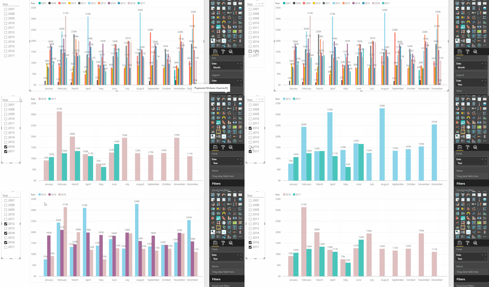
Alternatively you can drag your Date field to the Axis and keep only the MONTH from the resulting Hierarchy
then drag your Date field again but this time to the Legend and keep only the YEAR
and finally place your Measure (which won't need any adjustments now because of the Legend) in the Value
If you have many years - you can limit what shows on the chart with a Slicer or some type of filter limiting the years
One thing to note about this approach is that it will let you compare months of different years not only consecutive years
for example Monthly data in 2016 vs monthly data in 2012 only
Like this...
Hope this helps! ![]()
- Mark as New
- Bookmark
- Subscribe
- Mute
- Subscribe to RSS Feed
- Permalink
- Report Inappropriate Content
You could also try to use Pivot Column in Query Editor.
If this post helps, then please consider Accept it as the solution to help the other members find it more quickly.
- Mark as New
- Bookmark
- Subscribe
- Mute
- Subscribe to RSS Feed
- Permalink
- Report Inappropriate Content
Hi @pe2950,
Do you have some sample data that you can share and perhaps a mock up drawing of what you'd like the chart to look like?
Cheers,
Phil
- Mark as New
- Bookmark
- Subscribe
- Mute
- Subscribe to RSS Feed
- Permalink
- Report Inappropriate Content
Data looks like this:
StartOfMonth LeadCount Year Month
1/1/2017 100 2017 1
2/1/2017 90 2017 2
etc...
Id like a column chart that looks like this:
Column 1 = January 2016, Column 2 = January 107, Column 3 = Febuary 2016, Column 4 = Febuary 2017
I think i need a DAX with same period last year...
- Mark as New
- Bookmark
- Subscribe
- Mute
- Subscribe to RSS Feed
- Permalink
- Report Inappropriate Content
Alternatively you can drag your Date field to the Axis and keep only the MONTH from the resulting Hierarchy
then drag your Date field again but this time to the Legend and keep only the YEAR
and finally place your Measure (which won't need any adjustments now because of the Legend) in the Value
If you have many years - you can limit what shows on the chart with a Slicer or some type of filter limiting the years
One thing to note about this approach is that it will let you compare months of different years not only consecutive years
for example Monthly data in 2016 vs monthly data in 2012 only
Like this...
Hope this helps! ![]()
- Mark as New
- Bookmark
- Subscribe
- Mute
- Subscribe to RSS Feed
- Permalink
- Report Inappropriate Content
What if you have two seperate queries. For example, I have Membership enrollment from last fiscal year in one query and enrollment data from this year in another. I have them separate because I regularly update this year's data as the year progresses. So how can I have a clustered bar chart that has the number of enrollments last year next vs. the current number of enrollments with the queries being separate?
Sincerley,
Trent
- Mark as New
- Bookmark
- Subscribe
- Mute
- Subscribe to RSS Feed
- Permalink
- Report Inappropriate Content
Hi @pe2950
I created some dummy data by creating the following calculated table...
Table = SELECTCOLUMNS(
                    CALENDAR(DATE(2016,1,1),TODAY()),
                    "Start Of Month" , DATE(
                                            YEAR([Date])
                                            ,MONTH([Date]),
                                            1),
                    "Lead Count" , INT(RAND() * 100) )
This just creates a two column table with a bunch of random numbers for the Lead Count.
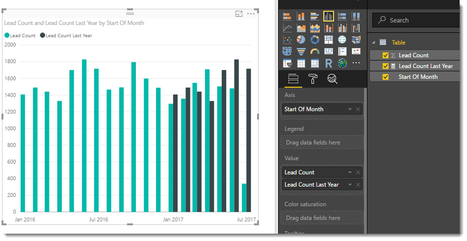
I then added the following measure
Lead Count Last Year = CALCULATE(
                        SUM('Table'[Lead Count]),
                        SAMEPERIODLASTYEAR('Table'[Start Of Month])
                        )
I could then create the following chart.
- Mark as New
- Bookmark
- Subscribe
- Mute
- Subscribe to RSS Feed
- Permalink
- Report Inappropriate Content
This is assuming you have just two years worth of data. What if you have more than two? Same Period Last Year will no longer work... What might then?
Helpful resources

Join us at the Microsoft Fabric Community Conference
March 31 - April 2, 2025, in Las Vegas, Nevada. Use code MSCUST for a $150 discount!

Microsoft Fabric Community Conference 2025
Arun Ulag shares exciting details about the Microsoft Fabric Conference 2025, which will be held in Las Vegas, NV.

| User | Count |
|---|---|
| 114 | |
| 76 | |
| 57 | |
| 52 | |
| 44 |
| User | Count |
|---|---|
| 167 | |
| 117 | |
| 63 | |
| 57 | |
| 50 |


