FabCon is coming to Atlanta
Join us at FabCon Atlanta from March 16 - 20, 2026, for the ultimate Fabric, Power BI, AI and SQL community-led event. Save $200 with code FABCOMM.
Register now!- Power BI forums
- Get Help with Power BI
- Desktop
- Service
- Report Server
- Power Query
- Mobile Apps
- Developer
- DAX Commands and Tips
- Custom Visuals Development Discussion
- Health and Life Sciences
- Power BI Spanish forums
- Translated Spanish Desktop
- Training and Consulting
- Instructor Led Training
- Dashboard in a Day for Women, by Women
- Galleries
- Data Stories Gallery
- Themes Gallery
- Contests Gallery
- QuickViz Gallery
- Quick Measures Gallery
- Visual Calculations Gallery
- Notebook Gallery
- Translytical Task Flow Gallery
- TMDL Gallery
- R Script Showcase
- Webinars and Video Gallery
- Ideas
- Custom Visuals Ideas (read-only)
- Issues
- Issues
- Events
- Upcoming Events
Get Fabric Certified for FREE during Fabric Data Days. Don't miss your chance! Request now
- Power BI forums
- Forums
- Get Help with Power BI
- Desktop
- Clustered Column Chart - Grouping Doubt
- Subscribe to RSS Feed
- Mark Topic as New
- Mark Topic as Read
- Float this Topic for Current User
- Bookmark
- Subscribe
- Printer Friendly Page
- Mark as New
- Bookmark
- Subscribe
- Mute
- Subscribe to RSS Feed
- Permalink
- Report Inappropriate Content
Clustered Column Chart - Grouping Doubt
Helloy Guys.
I facing with a challenge here.
I have a data that is structured in the way bellow:
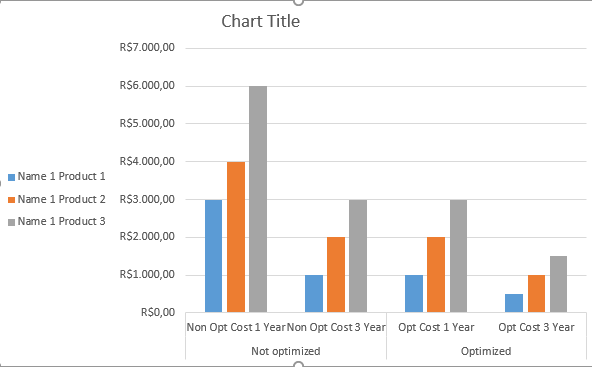
| Name | Product | Non Opt Cost 1 Year | Non Opt Cost 3 Year | Opt Cost 1 Year | Opt Cost 3 Year |
| Name 1 | Product 1 | R$3.000,00 | R$1.000,00 | R$1.000,00 | R$500,00 |
| Name 1 | Product 2 | R$4.000,00 | R$2.000,00 | R$2.000,00 | R$1.000,00 |
| Name 1 | Product 3 | R$6.000,00 | R$3.000,00 | R$3.000,00 | R$1.500,00 |
I want to build a clustered column chart that segregate the non opt costs of the opt costs, like the dash below:
Could anyone help me to archieve that goal?
Solved! Go to Solution.
- Mark as New
- Bookmark
- Subscribe
- Mute
- Subscribe to RSS Feed
- Permalink
- Report Inappropriate Content
@achicoria,
Please check the chart in PBIX file below.
https://1drv.ms/u/s!AhsotbnGu1Nok3Qr6WB2GQVN9rfm
Regards,
Lydia
- Mark as New
- Bookmark
- Subscribe
- Mute
- Subscribe to RSS Feed
- Permalink
- Report Inappropriate Content
@achicoria,
Please check the chart in PBIX file below.
https://1drv.ms/u/s!AhsotbnGu1Nok3Qr6WB2GQVN9rfm
Regards,
Lydia
- Mark as New
- Bookmark
- Subscribe
- Mute
- Subscribe to RSS Feed
- Permalink
- Report Inappropriate Content
you need to have a separate attribute, that would group optimized/non optimized
please check if the solution from this post:
https://community.powerbi.com/t5/Desktop/Dynamic-Measure-selection-Actual-and-Forecast/m-p/432539#M1...
works for you
Thank you for the kudos 🙂
Helpful resources

Power BI Monthly Update - November 2025
Check out the November 2025 Power BI update to learn about new features.

Fabric Data Days
Advance your Data & AI career with 50 days of live learning, contests, hands-on challenges, study groups & certifications and more!


